Twitch gets a brand new look that’s much cleaner, slicker and ‘elevates’ every user
A new logo and font, extra colors, and most importantly a redesigned site layout

Sign up for breaking news, reviews, opinion, top tech deals, and more.
You are now subscribed
Your newsletter sign-up was successful
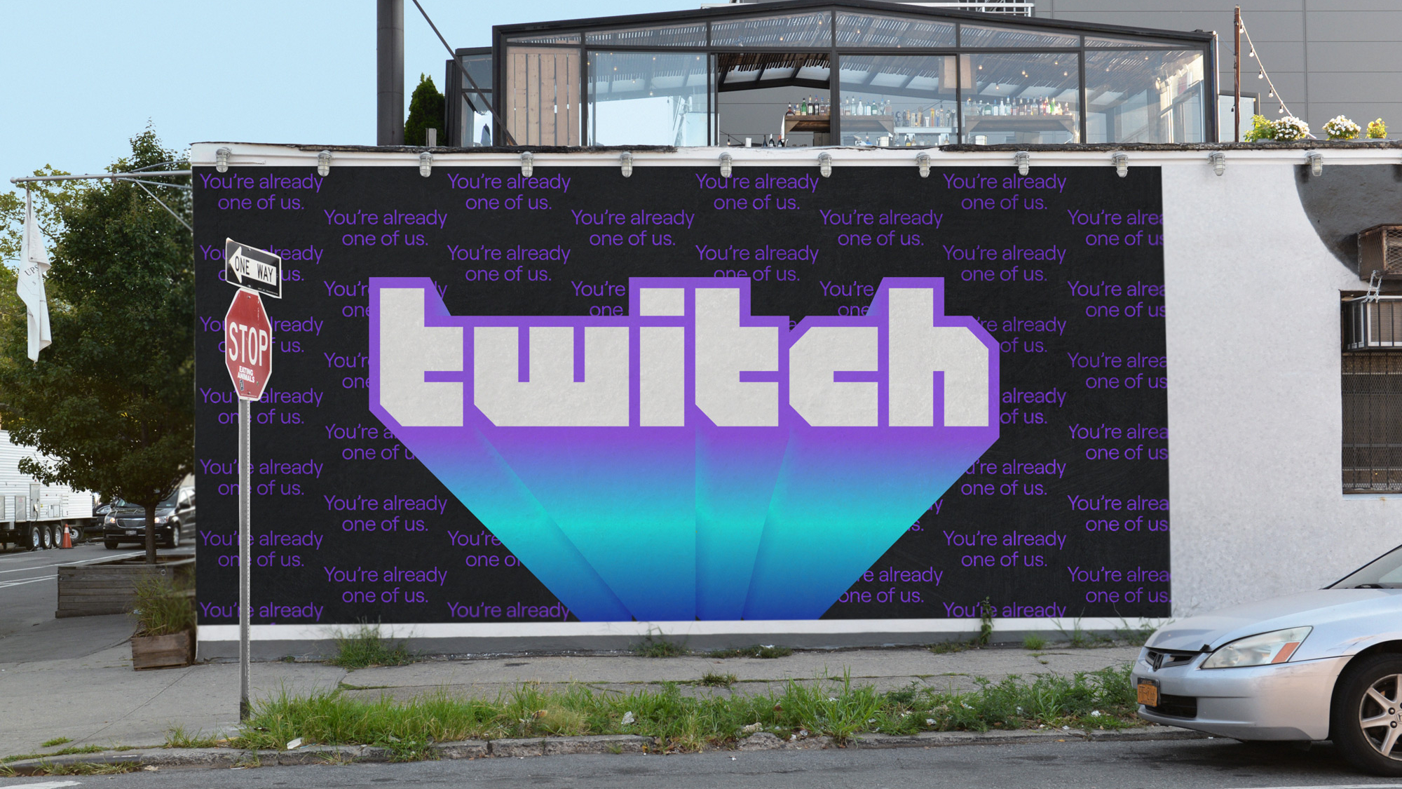
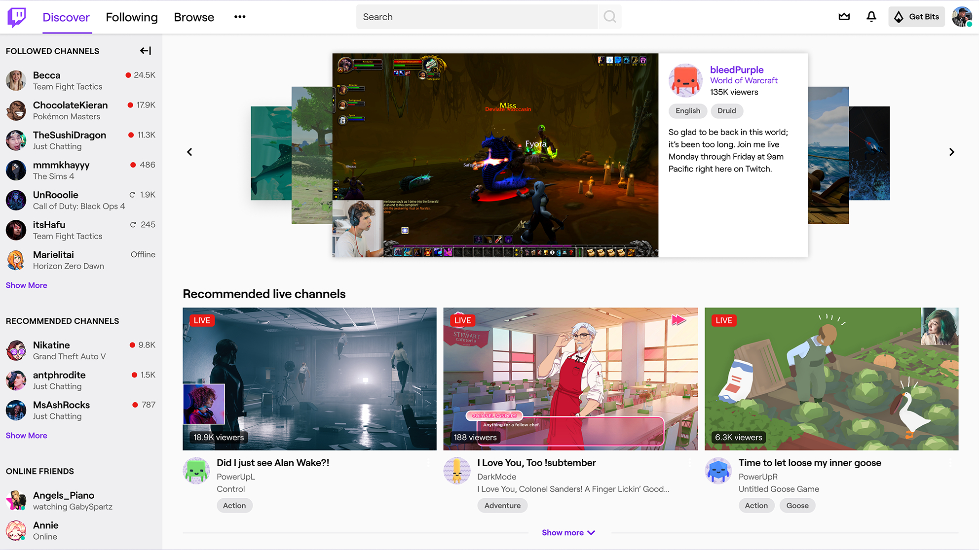
Twitch has been given a redesign that fine-tunes the look of the site, and introduces a new layout with the broad aim being to “elevate every single person on Twitch”, no less.
This includes a new logo and font (‘Roobert’ – inspired by the Moog synthesizer logotype, so it’s quirky, but with a modern feel) for the site, and a fresh color palette.

The latter means a brighter purple and a couple of dozen new colors that will be splashed across the site here and there (with a Creator Color tool being introduced which will let creators set one of these specific colors to represent their brand). The Dark Mode theme has been updated, too.

The redesign will mean that the site is less text-heavy overall, and the site layout has been overhauled in various ways so it looks cleaner and more modern.
Edgier-to-edgier
The front page of the site looks much slicker, and other major moves include making the video player edge-to-edge to put content creators ‘front and center’, with chat being made more user-friendly (although Twitch hasn’t messed with the emotes system).

We can expect more changes in the pipeline, too. In a blog post introducing the redesign, the company explained: “This is the first of many steps we’re taking with our new shared understanding of what Twitch’s brand and product experience should be.”
The redesign comes ahead of TwitchCon, which officially kicks off tomorrow in San Diego, and runs for three days.
Sign up for breaking news, reviews, opinion, top tech deals, and more.
- Twitch vs YouTube Gaming vs Microsoft Mixer: which streaming service is for you?
Darren is a freelancer writing news and features for TechRadar (and occasionally T3) across a broad range of computing topics including CPUs, GPUs, various other hardware, VPNs, antivirus and more. He has written about tech for the best part of three decades, and writes books in his spare time (his debut novel - 'I Know What You Did Last Supper' - was published by Hachette UK in 2013).