 Become a TechRadar Insider


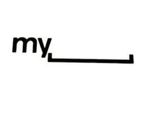
MySpace's new logo draws a blank
What the [____]?
Sign up for breaking news, reviews, opinion, top tech deals, and more.
You are now subscribed
Your newsletter sign-up was successful
Join the club
Get full access to premium articles, exclusive features and a growing list of member rewards.
The makers of MySpace have unveiled a new logo, which replaces the word Space with some, er, space.
The logo, which is certainly a bold statement from the company, was unveiled by MySpace VP of user experience Mike Macadaan at the Warm Gun Design conference in San Francisco.
Macadaan's reasoning for the new, arty logo: "MySpace is a platform for people to be whatever they want, so we've decided to give them the space to do it."
All we heard there was white noise but we're sure that the logo will appeal to the MySpace massive.
Space for change
Like the way Bing changes its image every day, MySpace is hoping to bring some random art to fill the (my)space.
When it is added to the website, you will be able to hover over the blank space and check out some randomly chosen art.
Sign up for breaking news, reviews, opinion, top tech deals, and more.
It will be interesting to see what reaction the new logo brings to the usually second, currently third most popular social network.
The main problem we've got with it is that the logo looks like it is trying to delete the name MySpace entirely.
Let's just hope it's not prophetic.
Via HypeBot

Marc Chacksfield is the Editor In Chief, Shortlist.com at DC Thomson. He started out life as a movie writer for numerous (now defunct) magazines and soon found himself online - editing a gaggle of gadget sites, including TechRadar, Digital Camera World and Tom's Guide UK. At Shortlist you'll find him mostly writing about movies and tech, so no change there then.