
 Become a TechRadar Insider


Whatever Microsoft does, it can't please everyone. Most of the time, it probably feels like it can't please anyone. Usually, that actually means it's not doing enough. But for once has Microsoft gone too far with Windows 8?
That's something I've been thinking about since installing the evaluation version of the final Enterprise edition of Windows 8 on one of my portable PCs. The things that are troubling me involve allowing an obsession with ultra portable and touch computing to compromise Windows 8 as a traditional operating system for desktop and laptop systems.
Before we get into the details, I'll stake my ground by saying that I'd actually be in favour of some compromises if they were necessary to deliver on the ultra-mobile and touch departments. But at least in part, that's clearly not the case.
My main beef is with the changes to the old school desktop part of the Windows 8 interface. Notably, this involves the loss of the Start button and the resulting "kick" back into the touch-optimised Metro interface when you want to access various aspects of what used to be Start Menu.
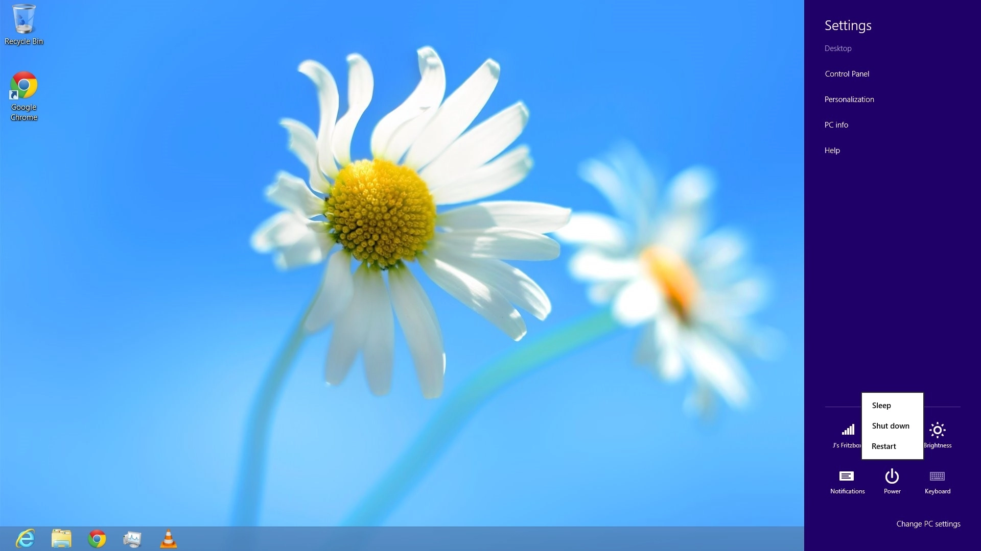
Now admittedly, this does have some advantages, including some longer lists. But it can be very clunky. Try restarting a PC from the desktop in Windows 8. You have to mouse right over to a corner, click "Settings", then click "Power" to access restart. It's a proper palaver and it's far from the only such example.
Metro machinations
The issue here is being kicked back into Metro. It would just about make sense if Microsoft had made an rock-hard rule that functionality may not be duplicated between the desktop and Metro interfaces that both appear in Windows 8.
But that isn't remotely the case. Instead there's duplication all over the place. Which I'm fine with. Just don't ever force me to use Metro if that's the case.
That's not because I have a problem with Metro. I want a little more time with it on a proper touch device to really get a feel for it. But it looks good so far.
What Metro isn't, however, is optimal for mouse and keyboard. Microsoft already did a great interface for that. And since it's still there and will frankly be the interface that everyone uses most of the time on a mouse and keyboard driven machine, why hobble it or force users to jump between it and Metro?
Aero peaked
A related but admittedly much more minor note is the demise of Aero Glass in Windows 8. The benefits for mobile devices are clear enough. Aero Glass is relatively resource intensive and mostly amounted to little more than tinselly window dressing.
Never mind that Microsoft itself gave us all the heavy sell regards the incredible benefits of features like Aero Peek and Flip 3D. It was largely eye candy.
But it does look nice. And since I've got a six-core beast with more pixel shaders than I can count, why not make things look nice. Especially when all it means is carrying over some code as an option?