TechRadar Verdict
Android 4.4 refines a polished platform even further and shows a real commitment to getting the basics right.
Pros
- +
Fast and frictionless
- +
New productivity options
- +
Improved Google Now
Cons
- -
Hopped into bed with Nestle
- -
No split-screen apps
Why you can trust TechRadar We spend hours testing every product or service we review, so you can be sure you're buying the best. Find out more about how we test.
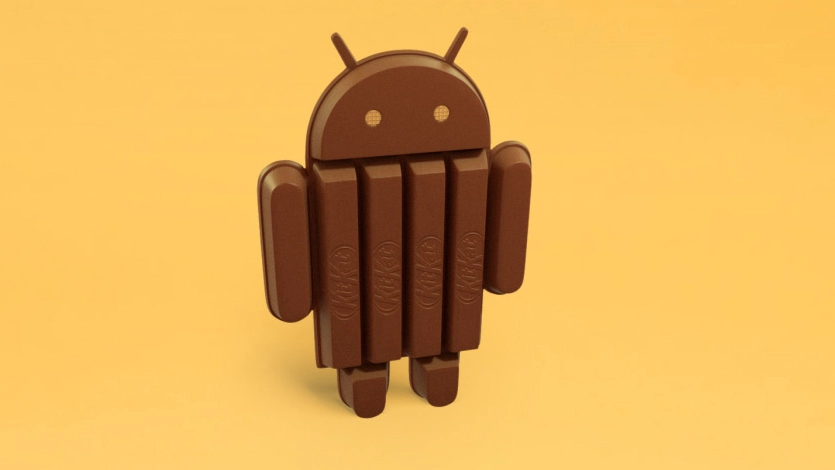
Everyone was expecting Key Lime Pie to serve as the delicious moniker for the next version of Android. Google surprised us all by bucking tradition and releasing Android 4.4 under the name KitKat.
Version 4.0 started life as Ice Cream Sandwich, but the last three decimal additions came under theJelly Bean banner. This new version was obviously deemed different enough to snag a new nickname, but not different enough to merit a jump to version 5.0.

General surprise in the tech world wasn't just based on the erroneous supposition that Key Lime Pie had to be next; there were also some raised eyebrows at the idea of Google entering into a tawdry cross-licensing deal with Nestlé which would see a flood of Android-shaped KitKats hitting the shops offering buyers the chance to win Nexus 7 tablets or Google Play credit.
According to Google the promotion was its idea, and no money changed hands. With Nestlé producing 50 million Android KitKat bars it certainly looks like a sweet deal for them.
Naming conventions aside, the 4.4 update is about addressing some of the Android criticisms that simply won't go away, and it does so very well indeed.
There's a real focus on the consumer here, with a smattering of useful new features, a noticeable bump in performance, and some optimization to ensure that budget hardware is not left behind.
Before Android 5.0 Lollipop dropped, Android 4.4 was easily the best version of the platform to date, which could explain why some smartphone and tablet manufacturers seem to be in no hurry to update their devices.
Android KitKat started out as version 4.4, but it's since had various small updates in the form of 4.4.1, 4.4.2, 4.4.3 and most recently Android 4.4.4 - this review has been updated to reflect the tweaks and changes experienced at each step to give you the most complete overview of the operating system, as well as highlighting how things will change in the move to Android 5.0 Lollipop.

First impressions
KitKat really makes a mockery of the idea that iOS 7 is more refined than Android and even stands up well to iOS 8. This version of the platform is impressively fast, with stylish transitions and an intuitive feel that masks the potential complexity.
There's a paring back of the notification bar that introduces translucency and context awareness, enabling you to reclaim every pixel of your display for whatever you're doing.
There are a few new features here, and not all of them are perfect, but for the most part Google has cherry-picked improvements and refined them.
The contrast between the bloated OEM launchers and stock Android could hardly be starker, but there are still a few things that manufacturers like Samsung and LG could teach Google (split-screen apps is an obvious one) and some of these things have been addressed in Android Lollipop.

The familiar white Google logo, followed by four pulsing colourful circles, still greets you on booting up, but the process has sped up dramatically as the platform has matured. When I checked version 4.1 on a Galaxy Nexus it took 34 seconds. The Nexus 4 running Android 4.2 Jelly Bean clocked in at 19 seconds.
Android 4.4.4 took around 20 seconds to boot up on the Nexus 5used for testing. Not quite as fast as the Nexus 4, but when you consider that my Galaxy S3 running version 4.3 of Android took just shy of 40 seconds to boot up, you get a feel for how speedy that is.
As the home screen comes into view, you can immediately detect the lighter feel that Google was shooting for. The status bar icons at the top are now white.
The custom Roboto font looks like it has been on a diet, which makes it feel that little bit more crisp and elegant. Looking at menu highlights and icons, what once was blue is now generally grey.
All of this has changed again though with Android Lollipop, which gives the OS a 'Material Design' makeover which features a flat look while making everything that little bit more real.
Google Now Launcher
The changes go further on the Nexus 5 because it has the Google Now Launcher. Those black bars top and bottom are gone. A subtle gradient is retained to ensure white icons are clear, even on light backgrounds.
Head into your app drawer and you'll find white dots at the bottom of the screen to illustrate which page you are on. The icons are now much bigger and clearer, at the cost of displaying just four across instead of five.

The widget tab has been dumped, and you won't miss it because a long press anywhere on the home screen gives you access to the widget menu, as well as wallpapers and relevant settings.
Swipe from right to left and you can access additional home screens. There doesn't seem to be any limit, you simply drag an icon to the right to create a new screen. Any home screen you empty will automatically disappear.
The only real surprise is that you have to scroll deliberately through each one; you can't take a shortcut by tapping on the page marker dots at the bottom.
Swiping from left to right on the home screen will bring Google Now into view, but I'll go into that in more detail later.
Initially none of these changes made it beyond the Nexus 5 by default, but the Google Now Launcher has since been made available for other devices in the Play Store.
I was disappointed and surprised that Google initially decided to keep this as a Nexus 5 exclusive, so it's pleasing to see it getting a wider release.
If it doesn't work for you, the good news is that popular launchers, such as the free Nova Launcher, can be used, and the status bar transparency is supported along with a number of other customization options, to help you get the look you want.
- Check out our top ten Android launchers for some ideas on where to start.