Why you can trust TechRadar
Motorola has already upgraded the Razr HD to Android 4.1: Jelly Bean. As with the Razr M, Motorola has laid a few nice tweaks over the Android OS.
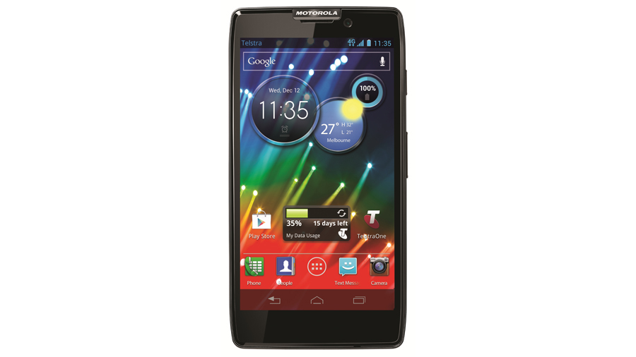
The Razr HD has the standard of seven home screens to deck out with icons and widgets. Generally, the Razr HD's 1.5GHz dual-core and 1GB of RAM are enough to keep the OS running smoothly. You can flick across the seven home screens easily, and apps open in a snap.
Back, home and recent applications are the three capacitive Android buttons that run the show. They respond with a blue glow and haptic feedback when touched.
Touching the home button brings you back to the primary home screen. From there, pressing it again will bring up the Manage Pages screen, which lets you add, delete or rearrange home screens. This is one screen that started to chug a bit with just a couple applications running.
Generally it takes real multitasking to give the Razr HD hiccups. We cooked up a combination of widget-laden home screens, multiple browser tabs and a game running in the background that produced some stuttering when opening and closing apps or adding home screens. Overall, though, performance was very strong.
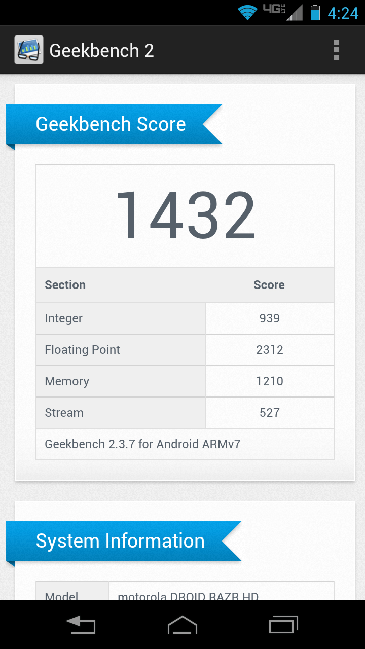
The Razr HD's Geekbench scores were around 1430, which is just shy of the iPhone 5. Considering that the iPhone 5 has a 1.2GHz dual core, which is less than the 1.5GHz on the Razr HD, it's just an OK score. Guess that Apple engineering is good for something.
From a practical standpoint, the Razr HD is peppy and responsive. It starts up in a little over 30 seconds, and needs just a few more seconds to get all its widgets up and running. It would take a quad-core device like the Optimus G or Galaxy S3 to provide much better performance.
Sign up for breaking news, reviews, opinion, top tech deals, and more.
Getting into Motorola's interface tweaks, one its most intuitive choices was adding a Quick Settings menu. Found to the left of the primary home screen, it makes toggling WiFi, GPS, Bluetooth, Airplane Mode or changing your ringtone just a swipe away. Once inside, the full settings menu is just a touch away.
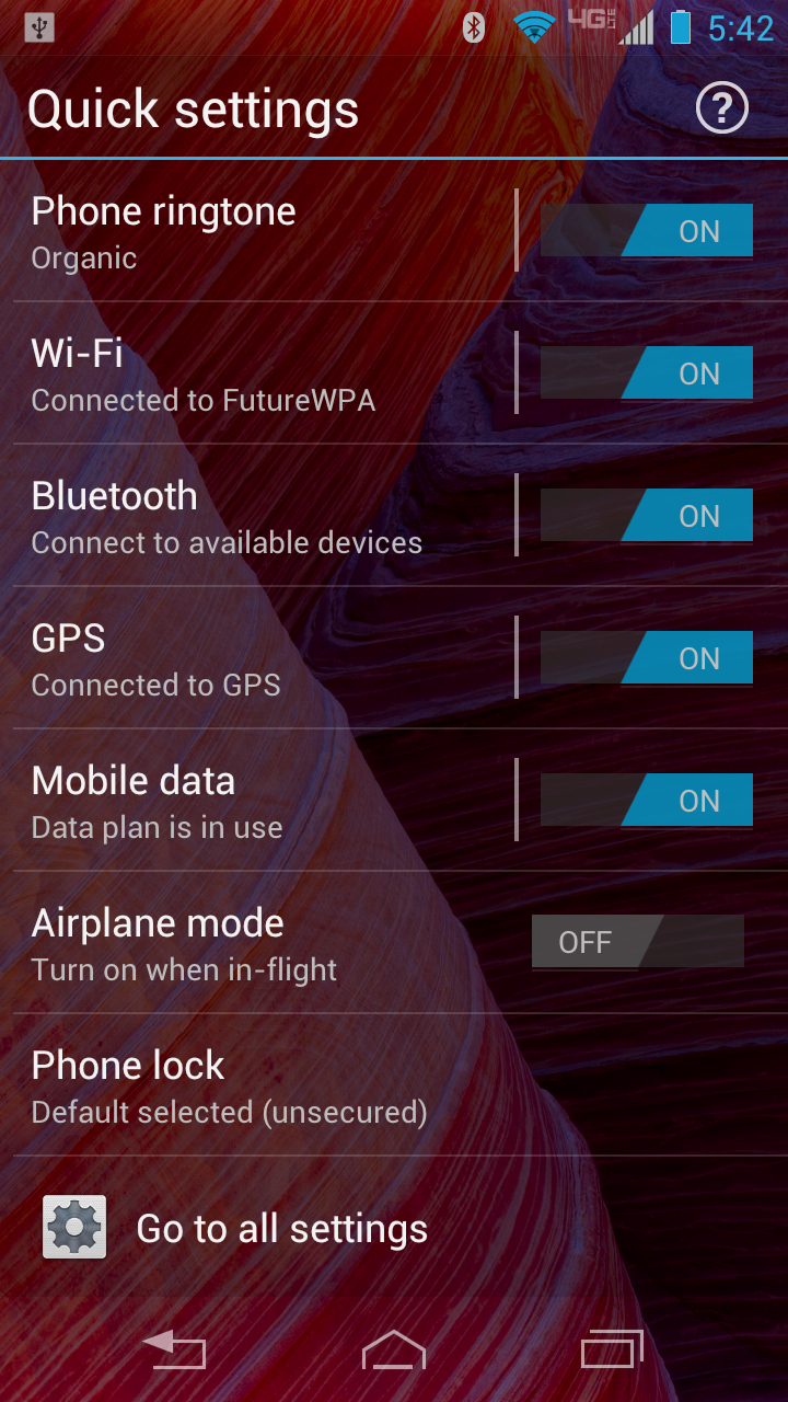
Other manufacturers, like LG with the Optimus G, crowd these options in the notification center. Motorola made a great choice putting this Quick Settings menu to the left. Not only does it make the menu highly accessible, it makes the leftmost home screen the primary page, which feels like a logical choice.
The default dock icons are Phone, People, Messaging and Camera. These icons can be removed or swapped out, but you are limited to just four. We're not sure what the reason for this limitation was, other than possibly reducing visual clutter. However, Android's native support for folders has been extended to the dock, meaning you can stack multiple icons into groupings.
This strikes us a strange choice. The dock is designed for frequent apps that you always want at your fingertips. We don't want to be pressing twice to open a folder and select an app. And while we rarely put more than four icons on our dock, it's a little odd to deny people the choice.
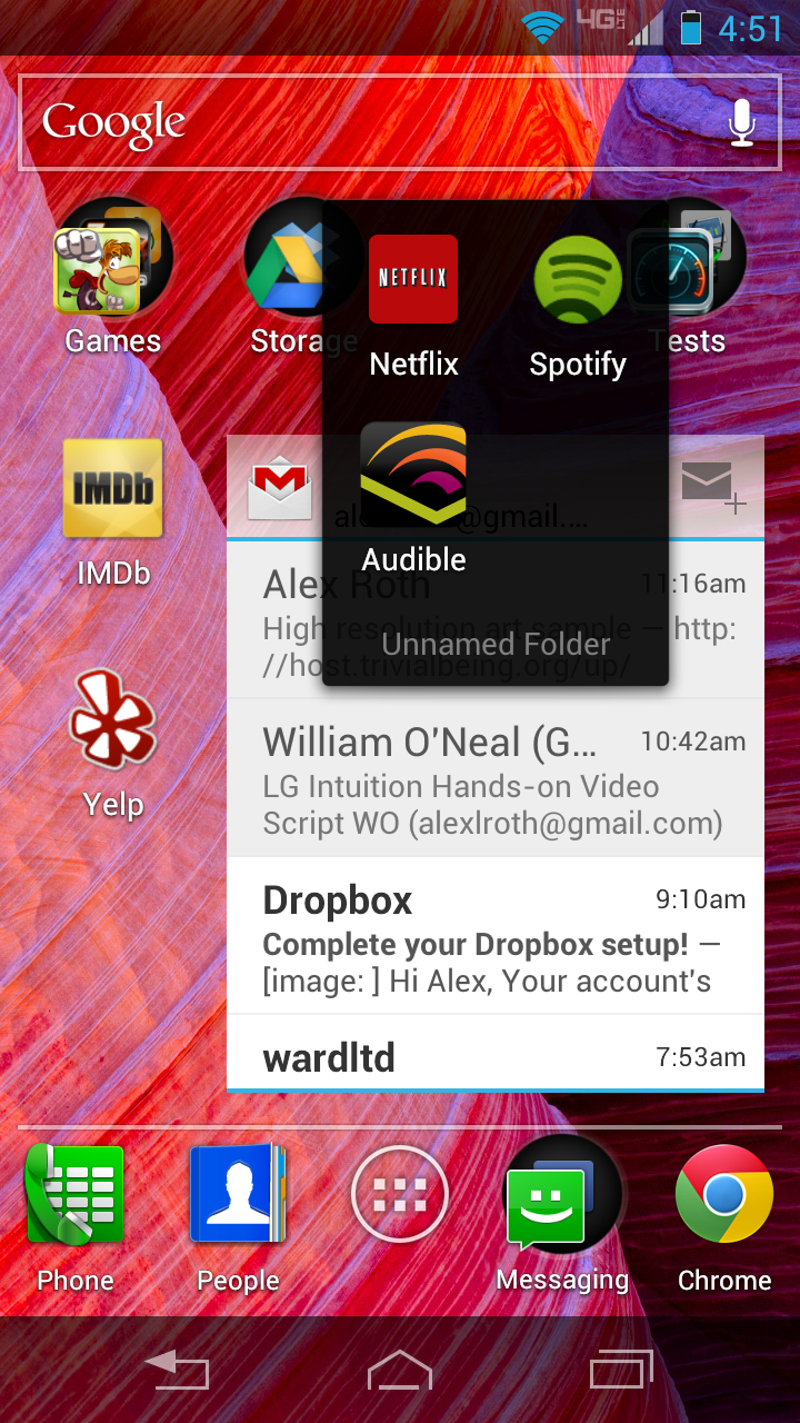
Also, folders on the home screen seemed to require a more dead center tap to open than regular icons. Nothing else we would touch had trouble registering, though.
We did like the way Motorola's UI displayed folders. The primary app is in front, and you can see the edges of the other icons peeking out from behind it, like they're all lined up and waiting. Label a folder and the name appears below it.
By default, Motorola's handsome Circles widget is on the primary home screen. We're big fans this tri-cluster of disc-shaped widgets, which display weather, the time, missed calls, incoming text messages and your battery level, and serve as portals to useful menus.
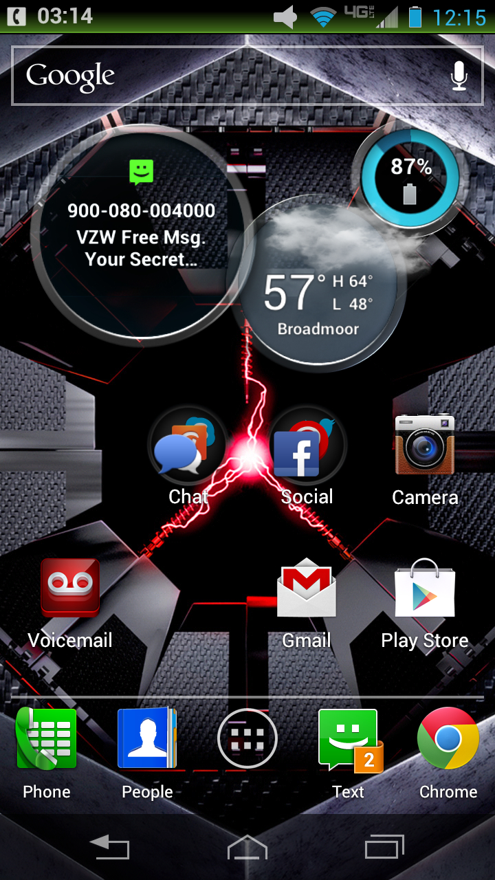
Touching any of them will send you into the respective app to set up alarms, time zones or get a more detailed forecast. Swiping vertically will flip them over, allowing you to toggle between an analog or digital clock, the temperature for regions you've chosen and other information. They're efficient, fun to flip and add another distinctive element to the Razr HD's style.
Again, Circles look great and convey information well, but we found ourselves wishing we could separate the three circles. It's not a big issue, just something the customization-happy Android fan in our hearts thought of. Maybe next time Motorola?
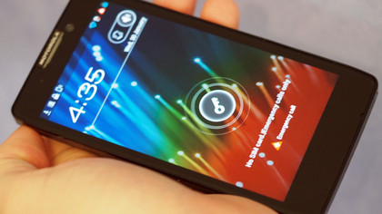
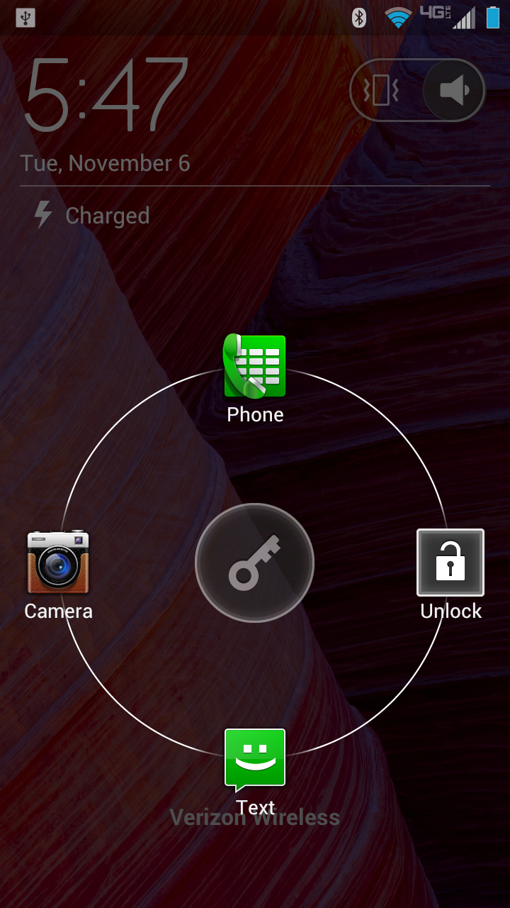
The lock screen is a typical Android style. It displays the date, time and notification icons. To wake the phone, you slide a key icon, and can also jump directly into the Phone, Camera and Text apps. It's clean, simple and private, since it doesn't display incoming messages, just an icon alerting you to their presence. We do wish it were as customisable other lock screens, where you can choose which apps are at the ready.
To wrap up, the Razr HD's interface continues the phone's trend of style and efficiency. Circle widgets and the Quick Settings menu are slick, accessible ways of getting at settings and information
Motorola's tweaks are all thoughtful and unobtrusive. While they seem to have chosen visual simplicity in some places rather than further customisation, it has made for some great looking design.
Performance-wise, the Razr HD is everything you should expect from a dual-core, 1GB of RAM device. It navigates Android very well, and it takes a sizeable workload to slow it down.
