Why you can trust TechRadar
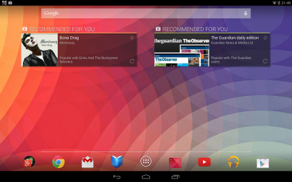
Powering up the Google Nexus 10 sees you greeted by the all-new Android KitKat lockscreen, which features a new Google-colourway touting wallpaper. This can be changed within display settings, however, and another couple have been added to the selection available.
A digital time display is situated about three quarters of the way up the screen (when in landscape orientation) in a bold white font with the day and date in smaller writing positioned directly beneath it.
The ringed padlock icon remains and while the default is set to merely unlock the device with a swipe in any direction, you can change this so that a slide to the left to launches the camera, and an upward swipe launches Google Now.
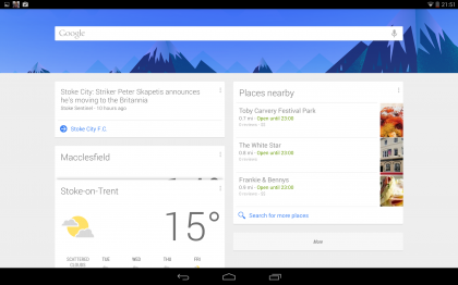
We've seen Google Now before on the first version of Android Jelly Bean 4.1; it shows 'cards' with useful information determined based on the time, day and your location, along with any custom parameters you've put in place. So for example it might display a card with the local weather every morning, along with one showing traffic details for the route you take to work.
Throughout the day it will update with upcoming calendar events and interesting nearby places. It's a great idea, a sort of visual virtual assistant, but it felt a bit too limited as it only had a handful of cards on offer.
Android 4.4 has seen it get a bit of an overhaul with loads more cards added. Users can now access improved real-time travel update information and are granted the option to set voice reminders, to go along with the flight information, event, hotel and restaurant booking confirmations, movie times at local cinemas, interesting photo spots recommendations that the Jelly Bean update added.
The most notable changes here though are the new, cleaner and glacial white interface that replaces the blue 'Holo' effort seen on past iterations, and the fact that it now second guesses your cultural leanings and suggests albums and games you might be interested in..
Sign up for breaking news, reviews, opinion, top tech deals, and more.
You can also now use your voice to tell it to set reminders, which you can set to go off on a specific time and date or even at a specific location. For example you could ask it to remind you to buy eggs next time you're in Tesco.
As before, Google Now can be launched from any screen by dragging the home button upwards, and for anything that isn't covered by your cards you can initiate a voice search, which will either give a spoken answer like Siri or perform a web search and display relevant results.
It can also be used to perform simple actions such as launching apps and it does a pretty good job of understanding what you're asking.
Google Now is a great feature and it's now even more useful; however, it's better suited to phones than tablets, as you're more likely to have your phone on and with you throughout the day. Not to mention the fact that it requires a data connection and right now the Nexus 10 is Wi-Fi only, so you won't be able to use Google Now all that much when out and about.
Once on the homescreen it's standard, familiar Android through and through. There's a search bar at the top which can be used to search both Google and the tablet's contents through text or voice.
The voice search is the same as the one used in Google Now, so you can get spoken answers and launch apps with it.
At the bottom of the screen you'll find the standard Android dock, which initially has icons for the app drawer, the Chrome browser, Gmail, Play Books, Play Movies, Play Music, YouTube, and Google Play in it, along with a folder full of other Google apps such as Google Plus, Maps, and People.
There are five home screens available for you to fill with whatever apps, folders and widgets you want and you just swipe across the screen to flip between them.
The screen is incredibly as smooth and responsive as you'd expect from a device that's over two years old now - not noticeably slow unless you've recently been zipping round the interface of the Nexus 5, Galaxy S5 or even the new Nexus 7 like I have.
There's no sign of judder or slow down, just silky smooth transitions, which is impressive as even the quad core Google Nexus 7 has the occasional hiccup but in our time with the Nexus 10 it performed almost flawlessly.
A bar at the bottom of the screen contains the back button, which cycles back to the previous screen you were on. To the right of it there's the menu button which takes you back to your homescreens; alternatively if you swipe upwards from it Google Now will open.
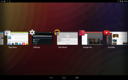
Finally, to the right of that there's the multi-task button. Tapping that brings up thumbnails of all your open apps and windows; tapping on one will switch to it while swiping across it will close it. It's worth re-iterating that none of these are physical buttons, they're software ones.
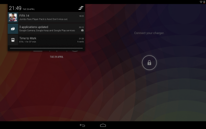
Swiping down across the bar at the top of the screen brings down the notifications bar and this is a bit different to what we're used to. Previously there was just one notifications bar, but since Android 4.2 you now get two.
Slide down across the left side of the screen and you get the familiar one with the time and date at the top and any un-cleared notifications listed. These include things like emails, calendar events and social network updates. It shows you the sender (where applicable) along with the first couple of lines of text to give you a preview of the contents, while tapping on it will open the full message or details. An icon at the top right of the notifications screen will let you clear it.
So far, so familiar, but if you slide down from the top right of the tablet screen you'll get a different notifications bar altogether, or rather, a settings bar. It's a thin black strip that takes up roughly half the width of the screen and is overlaid on top of whatever screen you were on, much like the standard notifications screen.
However rather than notifications it has options to adjust the brightness, turn aeroplane mode on or off, turn Wi-Fi on or off and more. You can also get to the main settings screen from here.
For some inexplicable reason, however, you can't bring both of these bars down at once despite the fact that they would both fit on the screen (in landscape orientation at least) as trying to bring a second one down will close the first.
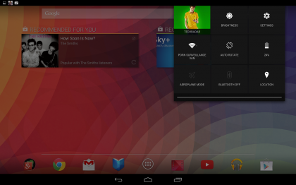
An odd oversight on the developers part and on that I'd hoped would have been addressed with the coming of KitKat. Oh well, it just goes to show that you perhaps can't have your 4-fingered confectionery and eat it.
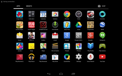
Tapping on the app drawer at the bottom of your home screen brings up a list of all your apps. You can swipe between pages, much like you swipe between homescreens. Tapping on an app will open it while long pressing it will let you add it to one of your homescreens, delete it or view information on it (such as the size).
There's also a widgets tab in the app drawer, which lets you see a preview of how any widgets would look, while long pressing one lets you place it on the homescreen. When placing a widget or app, anything else on the homescreen will move around to accommodate it. You can also create folders to keep things organised.
One major addition that was made to the Google Nexus 10 with the update to Android 4.2 is the Multiple Users feature. This hasn't changed with the arrival of KitKat and you can still create multiple user accounts, each with their own name, apps, accounts, widgets and Google Play logins.
It's a brilliant way of making the tablet more sociable, since you can share it with family and friends without your privacy being threatened and without constantly having to sign in and out of accounts.
You can create new user areas quickly and easily from the settings screen, and once done they'll each have their own circular icon on the lock screen, which you tap on to switch between them.
The settings screen can be accessed either from a button on the notifications screen or from its own dedicated icon and as the name suggests this lets you tweak all the various options on the Google Nexus 10. For the most part it's identical to the settings screen on any other Android device, with options for Bluetooth, Wi-Fi, display, storage, privacy and more.
One particular boon to the power conscious has appeared in the latest Android variant. The battery level indicator now displays a percentage figure, so you know exactly how much juice you've got left to get you through the day.
The Google Nexus 10 is slick, fast and powerful. The current version of Android combined with top flight specs make it almost as smooth to operate as an iOS device albeit one that's not nearly as nice to look at (externally at least).
The file picker interface within KitKat has also been subjected to a bit of a going over too, so that it's now much cleaner and easier to use. When you go to open a file a default file picker menu displaying said files as thumbnails appears and offers you the option to open your selection with apps from a pane down the left-hand side of the interface.
Third party apps are now included in the list and you can even view what's stored in the SD card directory by checking the 'display advanced devices' box. It's almost like a file browser in that respect.
Overall, the KitKat update has made the interface a tad more responsive and the odd tweak here and there has improved the user experience a smidgen - it's just that you wouldn't really notice unless you were a heavy user of the device and/or had a 4.3 running Nexus device to compare it against.
James is a freelance phones, tablets and wearables writer and sub-editor at TechRadar. He has a love for everything ‘smart’, from watches to lights, and can often be found arguing with AI assistants or drowning in the latest apps. James also contributes to 3G.co.uk, 4G.co.uk and 5G.co.uk and has written for T3, Digital Camera World, Clarity Media and others, with work on the web, in print and on TV.


