OS XI: what we'd like to see
The features we'd like in the next, OS X 11, generation of the OS
Sign up for breaking news, reviews, opinion, top tech deals, and more.
You are now subscribed
Your newsletter sign-up was successful
Join the club
Get full access to premium articles, exclusive features and a growing list of member rewards.
The one-size-fits-all interface is the antithesis of Apple's own design and UI ethos, requiring plug-ins to add functionality and tutorials so people can actually use it properly. The single search engine can be frustratingly obdurate unless you know the precise name of the thing you're looking for and, let's be honest, even the name iTunes is now hugely inappropriate.
We'd like to see Apple take a leaf from iOS here (as it appears to be doing elsewhere, judging by Lion and Mountain Lion) and break iTunes into individual apps: Music, Videos, iBooks, iTunes (the store), and so on. It wouldn't be an easy task, and Apple having to support Windows as well suggests it won't happen, but we can dream…
Revamp the desktop
Why not make the desktop more like a real desktop
Article continues below 
The OS X desktop is an oddball. It's really a folder inside your Mac's file system, living at /Desktop, and yet you can put hard drive links on it, along with aliases to folders, and pretty much anything else. It's all too easy for the desktop to become a dumping ground for anything that's not been filed; we regularly make such a mess that unearthing any one file is nigh-on impossible, especially once there's not enough space to display all of the file icons.
With the advent of Spaces and latterly Mission Control, you do have some flexibility over how you view your applications, and store files for easy access, but it still feels like there's more to be had from the basic desktop paradigm.
We're not sure what we want Apple to do here, though. Part of us wants it to just go whole-hog with Launchpad and make that the desktop, while another part of us wants Apple to make the desktop more intelligent. Instead of it being a flat area to randomly dump files and folders, Apple could provide user-definable areas akin to an in-tray and an out-tray. Each area would be 'rubber-banded' so you'd need a distinct effort to move a file to a different area (but without the need for a dialog box).
This would turn the OS X desktop into a digital equivalent of piles of stuff on a real desk, but with the ability to move things around without the hassle of real-world folders. With Quick Look and a 'mini' Exposé, this could be a great time-saver.
Sign up for breaking news, reviews, opinion, top tech deals, and more.
In the meantime, Hazel offers some solace, sorting any folder's content through user-definable rules.
Add more colour

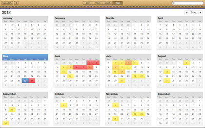
Apple's interfaces appear to be heading towards two extremes. On the one hand, you've got the kind of thing you see in Finder and iTunes - a sea of blue and grey. And then at the opposite end of the scale, you have iCal with its fake-leather toolbar (complete with fake stitching) and Address Book, which is a prime example of how making an application that looks like a book but isn't a book, really isn't a smart move.
Colour is useful for differentiation, but apeing real-world objects in a computer interface - termed 'skeuomorphism' - distracts from the content. We'd like to see Apple aim for something of a happy medium in future, bringing back a little life to Finder and iTunes, but not turning them into another iCal.
Enhance Spotlight

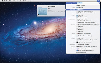
In some ways, Spotlight is great. It provides a central location for finding pretty much anything on your Mac. The big problem with Spotlight is its randomness. You'll type in a search term and, if you're lucky, get what you're looking for as your first choice and click to open it.
But often, you'll click a nanosecond after Spotlight 'helpfully' reorders the list, causing you to launch something else, slowing down your entire Mac while the weightiest application you own grudgingly lurches into life.
 Become a TechRadar Insider


