'If a logo works at 16px, you've cracked it'
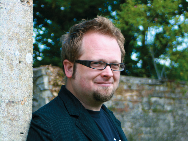
Opera's senior creative and Firefox logo designer, Jon Hicks

Opera's new senior designer Jon Hicks tells Oliver Lindberg of .net magazine why he left freelance life behind and explains the creative process behind Opera 10's user interface
.net: How did you land the job at Opera?
John Hicks: Last May, Opera was looking for designers for its browsers. I didn't need a new job because business was good for Hicksdesign, but I was drawn in. As a browserphile, I'd worked with Firefox, Camino and the early stages of Flock, and Opera was open to the idea of remote workers.
I was very impressed when I visited the company. Not only did I love Oslo, I got on well with the people I met. They offered me a role, but it seemed too hard to leave the freelance life of Hicksdesign and I turned them down. I then had the weekend to think it over again and, luckily, I wasn't too late.
.net: What were your main considerations when you approached the Opera 10 UI?
JH: The main considerations were to make it feel native, while still defining a consistent Opera 'look'. For example, on Windows the default theme scrollbars are directly copied from Vista, but use a muted blue colour scheme.
I've shied away from the bright blue, glassy appearance of Vista and instead followed the lead of Windows 7 with its smoother gradients. I've also put in a lot of work on the Mac version to make it feel more at home. It's a very difficult balance, though!
Sign up for breaking news, reviews, opinion, top tech deals, and more.

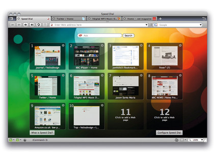
OPERA ON MAC: The simplistic design of the new Opera interface is simply gorgeous in the OS X environment
.net: What have been the biggest challenges since you joined Opera?
JH: In a sense, I've worked remotely for clients for seven years, but remote working full-time for Opera is different. When you're not there, sitting at a desk where colleagues can drop by and talk over an idea or bug, it's harder to work for them. I've had to be very proactive to make sure I'm not forgotten!
.net: What's happening to Hicksdesign while you're at Opera?
JH: Hicksdesign has been a partnership between my wife Leigh and me for almost three years now, and it's been a limited company for one and half. Hicksdesign still exists, it's just that I work full-time for Opera while Leigh handles her work (mainly print design), as well as running hicksmade.com.
.net: Which piece(s) of work are you most proud of and why?
JH: The new mascot for MailChimp is my current favourite. Not just for the end result, but for the process, too. That project was a dream from start to finish, with The Rocket Science Group being among the best clients I've ever worked for.

It didn't end with handing over the final vector files, either; they kept in touch and let me know how they were using it. Judging by the number of work enquiries I've had since, asking for similar work, I'd say it was one of my most successful, too. Sometimes it doesn't come together so easily and you don't always end up with a piece of work that you're proud to show in your portfolio, but that time I did!

 Become a TechRadar Insider


