When Steve Jobs unveiled iTunes 10, he spent a short while going through its best bits.
There are some things to like, notably improved iOS device sync, with a capacity bar that updates in real-time.
However, plenty of gripes remain, and so below are the 11 things we'd like to see Apple change in iTunes 11.
1. Embrace the cloud
iTunes seems rooted in the past, and it's in danger of becoming a dinosaur. The iTunes Store's fine, but with Apple TV moving away from a purchase model, iTunes 11 should in part follow suit and integrate a music-streaming service. Elsewhere, iOS devices should back-up and sync wirelessly, with new purchases optionally being sent simultaneously to all your devices.
2. Make podcast subscriptions stick
iTunes seems to think that if you've not watched a podcast series you subscribe to in a while, it should stop downloading new episodes. 'Subscribe' should mean just that - after all, it's not like magazine publishers stop mailing new issues to your door if you've not read the previous few.
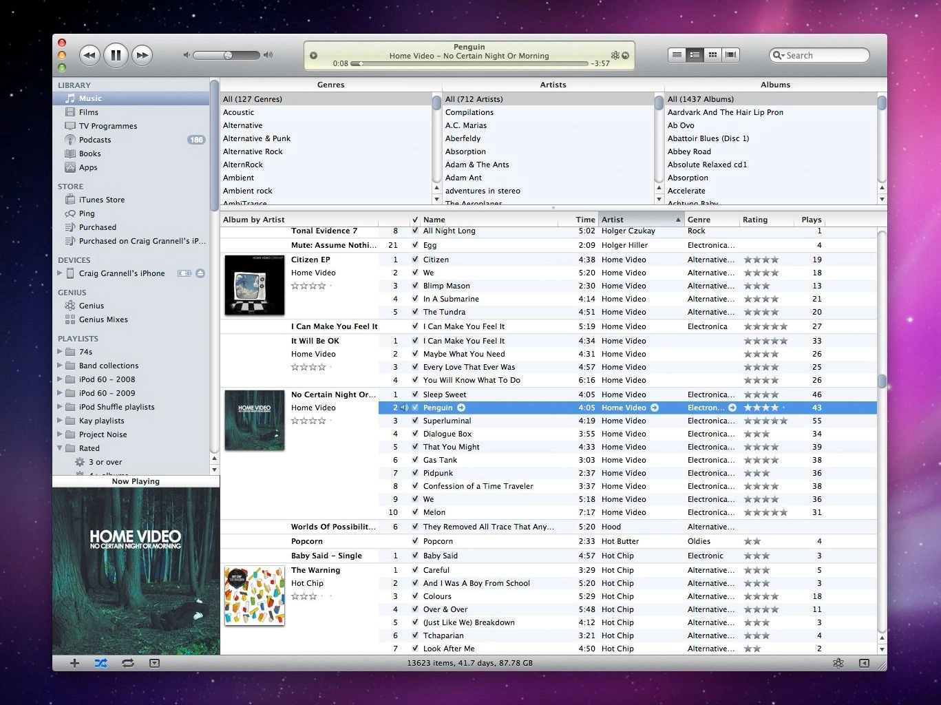
3. Improve app management
Managing apps in iTunes feels like you're using a badly coded web app. You still can't drag-select multiple items (unlike in Windows Explorer and Mac OS X's Finder), moving items between pages is fiddly, and even on powerful hardware the pane Apple's designed is unresponsive and sluggish. App management in iTunes 11 should be as simple as dragging desktop files, not the app equivalent of moving things through treacle.

ANNOYING: Managing apps in iTunes: approximately one per-cent less annoying than doing so on your actual device
4. Enable global view options
Apple makes a big deal about iTunes display options, and when Jobs unveiled iTunes 10, he proudly showed off the new Album List view. (Bonus tip: if you want all albums to show art, even those with only a track or two, View > Always Show Artwork.) However, Apple needs to provide a means for users to set view options for multiple playlists, rather than force you to amend them one at a time.
5. Borrow from iOS
Grid view's jarring when you double-click on an album and get booted to a list view. It'd be good to see iTunes 11's Grid view take a leaf from the iPad iPod app, using 'floating' album windows to display track listings.

BETTER WAY: The iPad iPod app offers an elegant user experience that iTunes's design team should take note of
6. Get non-iTunes artwork
Steve Jobs wants you to buy all your music from the iTunes Store, but that's never going to happen. To that end, iTunes stubbornly refusing to download artwork from music that Apple doesn't sell seems petulant. If iTunes doesn't have relevant art, it should look elsewhere on your behalf.
7. Expand Ping
On Ping's arrival, arguments raged that there's not room for another social network. That's not true, but Ping has too many problems: it's not very social (not integrating with other networks), nor is it flexible, focussing purely on music. In iTunes 11, Apple should allow Ping to embrace Twitter and Facebook, and open Ping to movies, TV shows and - especially - apps.

ANTI-SOCIAL: Ping currently feels like an afterthought and is awkward to use
8. Improve rather than regress usability
There are some questionable usability decisions in iTunes 10, not least removing colour from the sidebar items (resulting in each of them being less distinct), making its bottom-toolbar buttons resemble anything but buttons, and replacing toggle switches with hidden show/hide navigation when you hover the cursor over some (but not all) sidebar headings.
Stuff like this would get a junior UI or web designer reprimanded in most companies; that Apple - often championed for its quality UI design - sees fit to weld these things to iTunes 10 beggars belief.
9. Improve the artwork window
Click on Now Playing and the cover art loads into a separate window. On hovering your mouse over it, you get controls. This is a nice alternative to the mini-player, but in iTunes 11 Apple should improve it, enabling you to float the window and rate a track from it.

NOW PLAYING: The artwork window boasts basic controls, but has potential to be far more useful
10. Sort out the Windows version
More Windows users use iTunes than Mac owners, and many of them feel forced to. Whereas the Mac version dodders on, just about being good enough to not cause Mac users to march on Cupertino, the Windows version is a sluggish, resource-hungry mess. Apple has Windows users worldwide loving its iOS devices and despising iTunes, and this needs to change.
11. Sort out the Mac version
Still, we're not entirely enamoured by the Mac version. It's often slow and somewhat resource-hungry, and showcases truly bizarre decisions on the part of Apple's designers.
The Preferences toolbar is centred, monochrome and not Mac-like (on Windows it uses standard tabs); and the vertically aligned window buttons are bizarre (again, these don't appear on Windows).
Some argue the vertical buttons save space, as per their alignment in the mini-player window, but open a new iTunes window and you get a title-bar anyway, suggesting development of one of Apple's most important products doesn't necessarily go hand-in-hand with concepts like 'attention to detail' and polish.