
 Become a TechRadar Insider


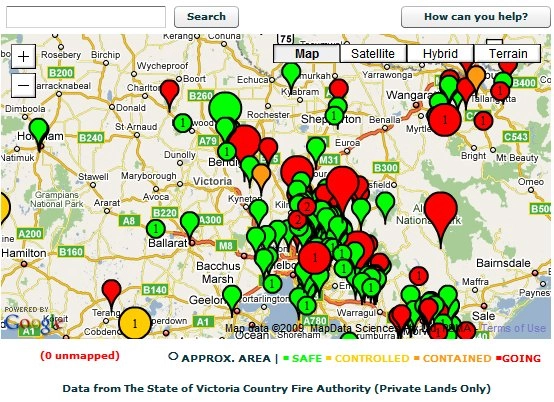
Google has announced it has created a Google Map of the Australian bush fires. The map is being used to aid authorities in battling the fires – helping to reduce traffic to official emergency websites in the State of Victoria.
The site has been created in Flash and is a real-time representation of the fires which have so far killed over 130 people.
The information is being supplied to Google by the State of Victoria's Country Fire Authority via an RSS feed.
Scale of the disaster apparent
Speaking about the website, the folks at Google Engineering said: "We hope that it's of some use to people who may be affected, to emergency services personnel, and that it takes some load off other websites which are being inundated.
"The map certainly makes the scale of this disaster immediately apparent."
To make the map easy to read, Google has used four colours in deciphering the fire: green for 'safe; yellow for 'controlled'; orange for 'contained' and red for 'going'.
The map is being constantly updated, with the latest feature added being 'address search functionality'.
This isn't the first time that Google has used its Maps feature to document disasters taking place.
Back in 2005, images of New Orleans after Hurricane Katrina hit were posted on Google Maps, with a red 'Katrina' button added for easy access.
