How to build faster loading websites
In an age of short attention spans, speed matters
If you've been using the web for a long while, you'll recall that it was once devoid of pretty much anything bar text. And even though dial-up speeds were to broadband what an asthmatic slug is to Usain Bolt, the early web was surprisingly nippy to navigate and use.
But then images arrived, swiftly followed by sound, movies, Flash and other speed sapping technologies. Things slowed down. A lot. And while improved connections have done much to boost speed, designers still could do more to help themselves and their audiences.

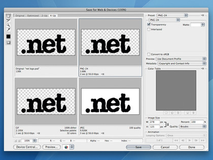
SAVE FOR WEB: Using Photoshop's 'Save for Web' option lets you shrink your images down to size
First and foremost, decide whether multimedia components are required at all. If they don't really add anything, ditch them. If they do, figure out if they can be downloaded on request. Again, this is largely about perception – users who click on something are more willing to wait for content to download than if you essentially force it on them, at which point the same download speed will equate in their minds to a slow site.
Compression is also an important consideration. Use mono sound rather than stereo if you can, since it will hugely increase download speeds. If you can compress any video components without compromise, do so. The issue of compression is just as important with still images.
Designers once spent hours shaving the odd kilobyte off JPEGs, experimenting with various compression techniques. Today, many images appear online without any compression at all, or are uploaded at full size and scaled in HTML.
Even a small amount of compression reduces file sizes dramatically. Only upload full quality images if there's no alternative, and never use an image with dimensions larger than you need. If you're mindful of format and output size, savings soon add up, making for snappier, more responsive web pages, especially on mobile devices.
Sign up for breaking news, reviews, opinion, top tech deals, and more.
Efficient images
Many web design tomes still recommend JPEGs for photos and GIF for everything else, but it's worth experimenting further when outputting images. Often, PNG8 provides better results than GIF for line-art, and PNG optimisation tools can further reduce file sizes. Don't rely solely on your image editor for getting the best results either, since online services can go the extra mile.
"Smush.it is a tool that gets all the images from a page and then uses a bunch of open source tools to optimise everything," says Yahoo evangelist Christian Heilmann. "You then get a zip of your revised images and a report of how many kilobytes you saved. The tool doesn't change the visual display of your images; instead, it packs and removes unnecessary data from the image files."
When applying single images to the page, always remember to specify a width and height, since those attribute values enable browsers to more easily lay out a page and remove the need for internal refreshes once the page loads. If you're applying an image to a page multiple times, consider using CSS Sprites.
The gist is combining commonly used interface components (icons, navigation, etc) into a single image and using CSS background positioning to show the relevant portion of the image in various places throughout a site. This has two major speed benefits.
Firstly, a site feels snappier and more responsive, since multiple images don't have to download when an interface component is interacted with. And secondly, the number of HTTP calls is reduced, which can make downloads faster, since the number of concurrent downloads from server to browser is limited.
Edgeofmyseat.com's Drew McLellan also recommends figuring out if you can replace images with a more efficient technology. "When Tim Van Damme redesigned 24ways.org in 2008, he used cutting-edge CSS3 techniques to reduce the number of images the design needed," he recalls. "We ended up with just one small tiled GIF, with the rest of the design comprising RGBA semitransparent block colour."
Current page: Optimising media for faster downloads
Prev Page Why do we need fast websites? Next Page Coding and hosting considerations