
 Become a TechRadar Insider


Aside from a browser and an email client, the must-have apps on any Mac are those found in an office suite. TextEdit is fine for tapping out quick notes to the milkman, but you need a more weighty solution for complex business documents.
The same can be said of quick sums: Spotlight provides a rudimentary calculator, but falls short when it comes to the family finances.
In your workplace, a comprehensive business bundle is less a luxury and more a necessity, but which one you settle on depends on what you need to do. It's like trying to choose between a smartphone, a tablet and a Mac as your daily working platform. Each has benefits, but are communications options and portability, for example, as vital for you as data storage space or sheer computing muscle?
The six leading office suites we test here all offer significantly different packages. If you want to work on your files on an iOS device as well as a Mac, iWork offers the most seamless experience, with iCloud integration and iOS versions of all three apps. If you want to share documents and files with other users, you should weigh the benefits of Microsoft Office's 'standard' formats against Symphony's Open Document Format or the ease of sharing files over Google Drive.
With the realities of today's business world in mind, we're emphasising two key factors. First is compatibility with the most up-to-date Microsoft formats, because like it or not, these are the cornerstones of modern business communication.
Second is how easy each suite makes it to live the cloud dream of accessing your data in any place, on any device. Other factors include how easy it is to find the tools and options you want and how easy it is to use them, so you can focus on your work and not on the tools themselves. Design is an only slightly lesser factor - after all, who wants to spend every working day wrestling with a clunky interface?
How we tested
To test each suite's compatibility with the established office formats, we created a set of documents using Microsoft Office 2011 and saved them in the latest DOCX, XLSX and PPTX formats.
The Word document was a single page of text set in the Cambria and Arial fonts, with headings in Calibri. We added a table with alternating coloured rows and embedded a PNG image, set to float to the right with text running around it. A line and a half of text was highlighted, two prices were coloured red and some numerals superscript. Three blocks of text were set as columns.
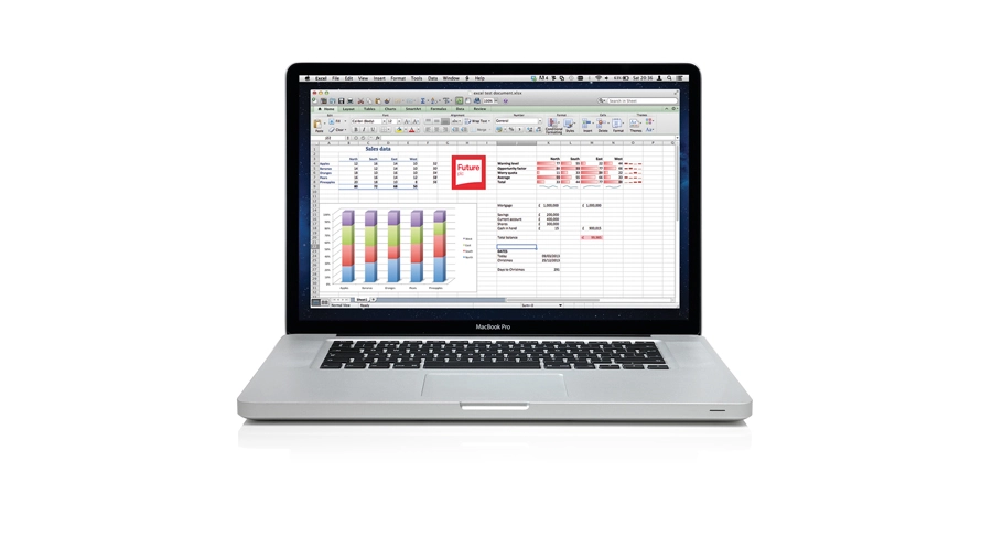
The Excel spreadsheet test was a single sheet with an embedded image and a selection of regular formulae, plus some date-based calculations. We added a 3D chart and some Sparklines in order to test compatibility with the newest features.
The PowerPoint document used a standard template, with some skewed text and a rotated image. We set different transitions between the slides and added handout notes to some of the slides. Finally, we embedded a table and an organisation chart created using the built-in SmartArt tools.
Let's take a look at the suites.
Test one: Compatibility
How well does it work with Office docs?

iWork apps have excellent Office compatibility. Pages had no problems. Numbers opened our Excel document with very few glitches, losing only the Sparklines and in-cell bar charts. Keynote had a bit more trouble, straightening out angled text and cutting transitions.
ThinkFree Office coped well with basic formatting, though Write increased line spacing, Calc swapped dates from UK to US format and Show turned half of our transitions into basic fades. Symphony also fared well, though the Sparklines vanished and our 3D graph lost its x-axis labels.
In our presentation, all but one of the slide transitions had been removed. LibreOffice shares its codebase with Symphony, but had different problems. It rendered the in-cell bar charts and dates, but converted the 3D chart to mono.
Google Drive made a hash of our Word document. It has only eight fonts, so used Times New Roman instead of Cambria. It did better with the spreadsheet, losing only some formatting, and the slide transitions became regular fades.

On the next page we test features, design and connectivity.