User experience design explained
How to get user experience right, without calling in a pro
Sign up for breaking news, reviews, opinion, top tech deals, and more.
You are now subscribed
Your newsletter sign-up was successful
Personal narratives are key for giving us context, but the reality is that people are very bad at telling you the truth about themselves. Put another way, we rarely understand ourselves. That does not invalidate everything you learned in design research; instead it just requires that you balance those qualitative findings with good, hard data.

Web analytics are a quantitative way of answering the question: "What are our users actually doing?" Not just, "What are they saying they're doing?", but "What are we seeing them do with our product?"
Data is a great weapon. Matthew Marco of NavigationArts and formerly a visual designer leading the redesign of House.gov says, "Stats let me refute the client's notion of how their constituents are behaving." It's far more effective to point to actual behaviour than to get in a never-ending battle against presumption.
Article continues belowRemember: while web analytics answers the question of what users are doing, no amount of data will tell you why – that's why you still need to actually talk to people. But numbers can tell you where to start looking for answers, and that's worth a whole lot.
The most common way to collect data is with a service like Google Analytics, Omniture, Statcounter, Mint and others that track the activity on your website in a variety of different ways: page hits, unique visitors, average time on site, bounce rates, referring sites, referring keyword searches and so on.
The charts, graphs and lists of all this rich information are yours for the learning. Use them to identify the recurrent usage patterns – when people are typically coming to the site, what pages they're typically going to, what path of pages they're usually following – and then to recognise the outlying behaviour.
Does one page have way more visits than every other page in the site? Does one page have an inordinately high bounce rate? Do you have really low use on Mondays? Avoid the temptation to answer these questions with your assumptions; instead, get the findings down in writing and use them to inform your research and investigation.
Sign up for breaking news, reviews, opinion, top tech deals, and more.
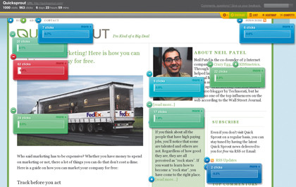
Keep in mind that while the aforementioned page stats are worth knowing, you aren't learning which components on the page are being used, and how. There are lots of free and cheap measurement tools that get you a much deeper view into what people are doing: Crazy Egg overlays visualisations such as heatmaps on your pages to show where users are clicking.

The Confetti feature lets you slice and dice those clicks based on a variety of facets such as referrers, search terms, operating system and browser. Clicktale records full browsing sessions that enable you to replay your users' every mouse movement, click and keystroke. It also tracks how far down the page your users scroll, the performance of your web forms, and other in-depth functionality for a price.
Google Website Optimizer tests design variations of your webpages using an A/B or multivariate testing method (one or multiple variables). Different versions of the page get displayed to different users, and it works in the background without anyone knowing about it but you. The tool will help you determine the duration of the test based on your site traffic, and identifies which variation is most effective at achieving your goal.
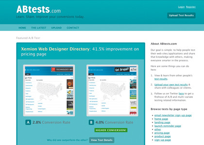
ABtests.com lets you share the results of your A/B tests (conducted elsewhere), and learn from the results of others. You can see the percentage improvement of one variation over the other, as well as browse the examples by page type (home page, landing page, product page and so on).

If the product you work on is not web-based, don't fret. You might not get the pretty pictures automatically generated for you (at least not for free), but you can still rummage through the activity logs of your app to see where people are clicking and what screens they're pulling up.
If your product doesn't currently allow for this, talk to your developers immediately about putting tracking in. Even if the analysis is difficult, there must be a trail of information for you and your team to follow, otherwise you're at a dead-end.
Usability testing
Usability testing is the final technique I urge you to bring into your arsenal. In the most basic terms, it's the act of evaluating whether the design of your product successfully enables people to accomplish the intended tasks.
This answers the question, "How well does our stuff actually work?" And if you don't know the answer to that, you don't really know much about your product, do you?
Quite often, usability testing is referred to as "user testing" instead, and it's a phrasing I want to dissuade you from perpetuating. It may seem like I'm splitting hairs, but the way in which the exercise is perceived – both by your organisation and by your participants – will change dramatically. You aren't testing your users; you're testing the usability of your design. It's a major semantic difference that needs to be popularised.
You may have heard of usability testing, but how many of you are actually doing it on a regular basis? Sometimes it just seems so involved, so costly. Many UX folk advocate for usability testing in formal labs with one-way mirrors and fancy A/V equipment. I assure you, none of this is necessary.
If your product has any users at all, then your company has access to them, somehow someway. But maybe your manager isn't so keen on you taking time out of your schedule to do this work, or maybe the sales team with the customer data just won't return your calls. Not to worry! You don't really need to do usability testing with your existing users in order for it to be valid.
Start with a friend you can rely on for honesty. Academics may tell you that using the same participants again and again will confound your findings, but I say some data is better than no data at all. You need a pressure tester, and using someone you trust is a great way to start.
Most of us are designing systems meant for people with average tech savviness and average intelligence to accomplish average, everyday tasks. Of course, if you're working on an expert system, like a customer service call centre desktop app or a car manufacturer web app, or designing products for kids, it's obviously worth testing with participants drawn from your target audiences. Otherwise, I stand by my premise that conducting usability testing with basically anyone is totally fine.
The best participants are folks who work in your office but don't work on the product: the receptionist, anyone from human resources, guys in the mailroom. Just ask for five minutes of their time. If you'd rather go outside of the company, you can always find willing individuals on Twitter (who'll be more than willing to look at your stuff if you look at theirs) or sitting around at your local Starbucks (who'll be more than willing to look at your stuff for a refill on their latté).
Consider using a process I like to call Usability Testing Light. Sitting side-by-side with your participant, show them build, or a prototype, a comp, a wireframe, a sketch – whatever you have available to you – and start by asking one simple question: "What does this do?" People's answers will probably knock you off your chair, but do your best to maintain your composure.
Whatever you do, don't give them the answer. Don't talk at all, just ask the question and then shut up and listen. Don't settle for their kindness. The guys at Iridesco say, "'It looks good' is the worst feedback we can get."
Encourage harshness. Using the same people time and again can help because they'll learn not to be afraid to speak their mind, so make sure you prompt new participants to do the same.

Give participants one task at a time: for example, "Add a new bank account", or "Find all yellow dresses". Ask them to walk you through how they'd go about achieving it, using the keyboard and mouse if you have a functional or semi-functional prototype, or just using their finger if you're working on paper. Either way, they must think aloud as they are going through it.
If they get quiet, gently remind them to tell you what they're thinking, or just ask, "Why did you do that?" Two things:
1) This is going to hurt;
2) You'll be better for it.
It might be hard to stomach that you and your team created something that doesn't work on your first try, but none of us should be expected to be mind-reading geniuses. Instead, take solace in the fact that you're doing the right thing by testing it in order to make it better.
Most of all, learn to acknowledge your poor design choices. "You need to have humility and listen," says Iridesco. "Users aren't always right, but you need to hear them." It's our job to design the product, not theirs; but to do so, we need to understand where they're struggling and why. Ultimately, nurturing our humility is what we all need to do.
Key takeaways
If you forget everything you've read in this article, I want you to remember this list:
Always listen
Ask questions to get to underlying problems
Use data and anecdotes to inform the design
Test your designs and have the humility to admit you're wrong
Complete the feedback loop
Never stop trying to make things better
I can promise you one thing: If you make your users happy, they will thank you. And being appreciated for what you do makes all this work worth it. Go do it yourself and find out.