The web designer's guide to the iPad
Could Apple's iPad shake up the entire web design industry?

While it remains to be seen if the iPad's initial market success can be maintained, it's possible the device has the potential to be a game-changer in computing and, by extension, browsing the web and designing for it.
Andy Hume, web developer for Clearleft, sees the launch of the iPad as "a significant step in the advancement of consumer computing, locking away the complexities of a powerful operating system beneath a streamlined, polished user interface".
Web design specialist Christopher Schmitt agrees, describing it as "a great tool for people who experience the web – period" and adding that he enjoys being "in an industry where we can have our standards-based designs on this kind of device – fully portable, with a large touchscreen and 10-hour battery life". Schmitt then quips: "Can your laptop do that?" and the answer is "no".
The thing is, the iPad is also more than just a giant iPod touch. "It's the other way around – the iPod touch is a small, cramped iPad," argues web design pioneer Jon Bains. This pair of opinions should trigger your first concern regarding designing for the iPad – if it really is different from everything that's come before, how should you approach creating websites for it?
Damian Proctor, head of design for Redweb, believes much of the challenge is being in unproven territory. "We've no evidence yet whether conventional wisdom regarding desktop web design applies," he says, "or if designers should draw on insight provided by mobile projects." He predicts that a new hybrid will emerge, combining aspects of desktop and mobile design.
Bright screen
Part of the problem is the device itself. Bobby Ghoshal, co-founder of Buckowl, points out that the iPad's screen is so bright that long-term use can fatigue users. "Designers must consider colour contrast," he suggests, "perhaps using light greys instead of white, and dark greys instead of full-on blacks."
Sign up for breaking news, reviews, opinion, top tech deals, and more.
News Corp design director D. Keith Robinson adds that the device's pixel density, combined with screen dimensions that "lie somewhere between a desktop and mobile phone", can mean that neither downscaling desktop sites nor upscaling mobile sites is ideal.

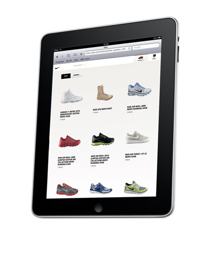
BUILT FOR SPEED: Nike's iPad optimised website is cleaner, sleeker and faster than its desktop equivalent
Most importantly, though, the iPad is a large touchscreen device. "This means the most fundamental long-term difference for people working on the web is the transition from mouse to finger," says Hume – who nonetheless thinks that Safari for iPad does a decent job of delivering web pages that weren't built with touch in mind.
"People don't spend much time thinking about this," he says. "But there's a lot of complexity in rendering an interface that defines hover and mouse-in/mouse-out features on a device that has no pointing mechanism!"
Raluca Budiu, user experience specialist for Nielsen Norman Group feels that such issues, stemming from long-time web design conventions, potentially scupper the iPad from a basic usability standpoint. "Full websites generate read-tap asymmetry – the font size may be big enough to allow comfortable reading, but not precise link selection," she says.
Budiu also questions gestural inconsistencies across the device – for example, a pinch zooms maps but increases font sizes elsewhere – but admits browsing "is closer to using a desktop than an iPhone", an experience that "can definitely be improved, but isn't too bad to start with".
Standards compliance
Although unconventional in interface terms, the iPad is a good citizen when it comes to web standards. "Safari for iPad is one of the most advanced, standards-compliant browsers around," maintains Hume. He also argues that the lack of Flash support doesn't hinder the device, although he's disappointed that the iPad's browser fares poorly regarding font embedding.
"Safari for iPad only supports SVG rendering," he points out. "I hope this will improve in later releases, because font embedding is becoming a high profile technology for web designers."
Another benefit of the iPad is that WebKit is its only browser engine. "This should appeal to designers," enthuses Tom Kershaw, senior art director for Beam, "since you always know exactly what you're designing for, and, much like Flash, you won't have to worry about how your design will appear on several different browsers. While this doesn't mean you should stop designing for other systems, it does mean you can focus more when creating an iPad-specific site."
The iPad's strong support for web standards may also benefit designers in another way when iPhone OS 4 arrives later this year – Apple's iAd platform is based around HTML5, offering opportunities to anyone well-versed in the technology.
Revealed by Jobs at the iPhone OS 4 preview event in April, iAd aims to provide rich-media in-app mobile advertising that, according to Apple, combines the emotion of TV with the interactivity of the web. "I've seen iPhone developers do amazing HTML5 ad tests," says Ghoshal, although he sees such demos having a wider importance.

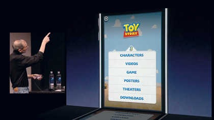
ADDING ADS: Although not iPad-specific, the HTML5-based iAd system could provide opportunities for web designers
"I'm optimistic about the prospect of interactivity in HTML5, even though the demos like the Toy Story 3 carousel Jobs showed would have been easier to make in Flash. The opportunity is not necessarily in design, but in making this interactivity exist with internet standards that have been tried and tested – and without the use of plug-ins."
Back in the browser, designers aren't united regarding optimising for iPad. "I don't see the need unless iPad owners are your core audience – although I can guarantee if you make something look good on the iPad, it'll still look good on a desktop," argues Bains.
Proctor offers a slightly different viewpoint. "Designing specifically for the iPad means users aren't left in the lap of the gods." Removing the need to zoom to read text or ensure the correct link is prodded removes another barrier between the user and content.
"You don't want users having to consciously adjust viewing behaviour because your content doesn't arrive formatted for easy consumption." When working on designs, the nature of the iPad's interface will inevitably inform your work.
"When using a finger and touchscreen, you lose the hover state," says Proctor. "Fitts's Law and the concept of 'mousing' also need new consideration. Will users be as accurate with their finger as a mouse cursor? A finger doesn't stop moving when it slides past the edge of the screen, so having important links at the edge of the page may not help in placing such elements within easy reach."
Ghoshal thinks it's worth thinking about how people hold their device. "I recommend designing any iPad app or website to be navigable with your thumbs," he says. "In my experience, typing and other actions that provide control are more actionable when my thumbs have full access to the buttons."
Ultimately, though, most design styling and layout will arrive from the type of experience the designer wants to deliver, says Ghoshal, who mirrors many in considering the best iPad sites to be those that resemble high-quality magazines.
"Big images, beautiful text, 'scannable' headlines – these all make for the kind of experience that keeps my attention," he says. "I will, though, caution against text-heavy sites on a white background. The backlit iPad screen isn't winning any points for long-term textual consumption. Do your users a favour and mix in photos and video to make for a less strenuous experience."

 Become a TechRadar Insider


