
 Become a TechRadar Insider


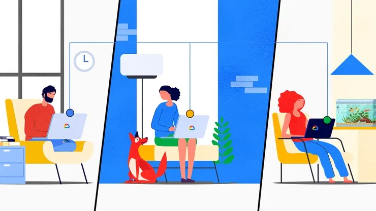
Some of the most popular Google Workspace apps are set to look rather different following the rollout of a new design scheme from the company.
Users of the likes of Google Docs, Sheets, and Slides will soon start seeing a refresh as the company's "Material You" design expands to its office software.
As well as cosmetic changes, the upgrade will also bring some new features for users, including a redesigned Google Docs toolbar and a streamlined design interface across the apps.
Google Workspace changes
"In the coming weeks, you’ll notice a new look and feel for Google Drive, Docs, Sheets, and Slides on the web," a Google Workspace blog post announcing the news noted. "Following the release of Google Material Design 3, the refreshed user interface is purposefully designed to streamline core collaboration journeys across our products."
"These key visual and interactive design changes will help you get your best work done faster by emphasizing the tools within our products used most frequently."
The move is part of Google's campaign to make sure its office software remains intuitive and attractive to use as the company looks to keep pace with competitors such as Microsoft 365.
Inspired by Google’s Material Design 3, the company says the refresh provides some of its most popular tools with a more modern look that will deliver a simpler, more streamlined UI that helps users work more efficiently.
Some of the more obvious changes users will spot include the new Google Docs toolbar, which is now a long "pill" shape that is not just thicker, but also stretches across your browser window. There are more precise options to make your text size bigger or smaller by a single point (rather than by 2x or more) and a number of new dropdown menus that group together similar functions into a single location, such as paragraph formatting.
The ubiquitous "share" button is also a softer, more rounded design, and in a lighter blue/green/yellow shade depending on which program you are using, and the button to start a Google Meet call directly from a document has been simplified from a multi-color option to a basic camera image.
Elsewhere, the status information (including last edit and version history) is now gathered in a single clock-face icon in the top-right hand corner, and there is an improved interface for setting rulers and gridlines.
The changes are rolling out now, and will be available to all Google Workspace customers, as well as legacy G Suite Basic and Business customers, and users with personal Google accounts.
- Here's our list of the best productivity tools on the market
