We asked an expert to redesign Twitter - here's what they came up with
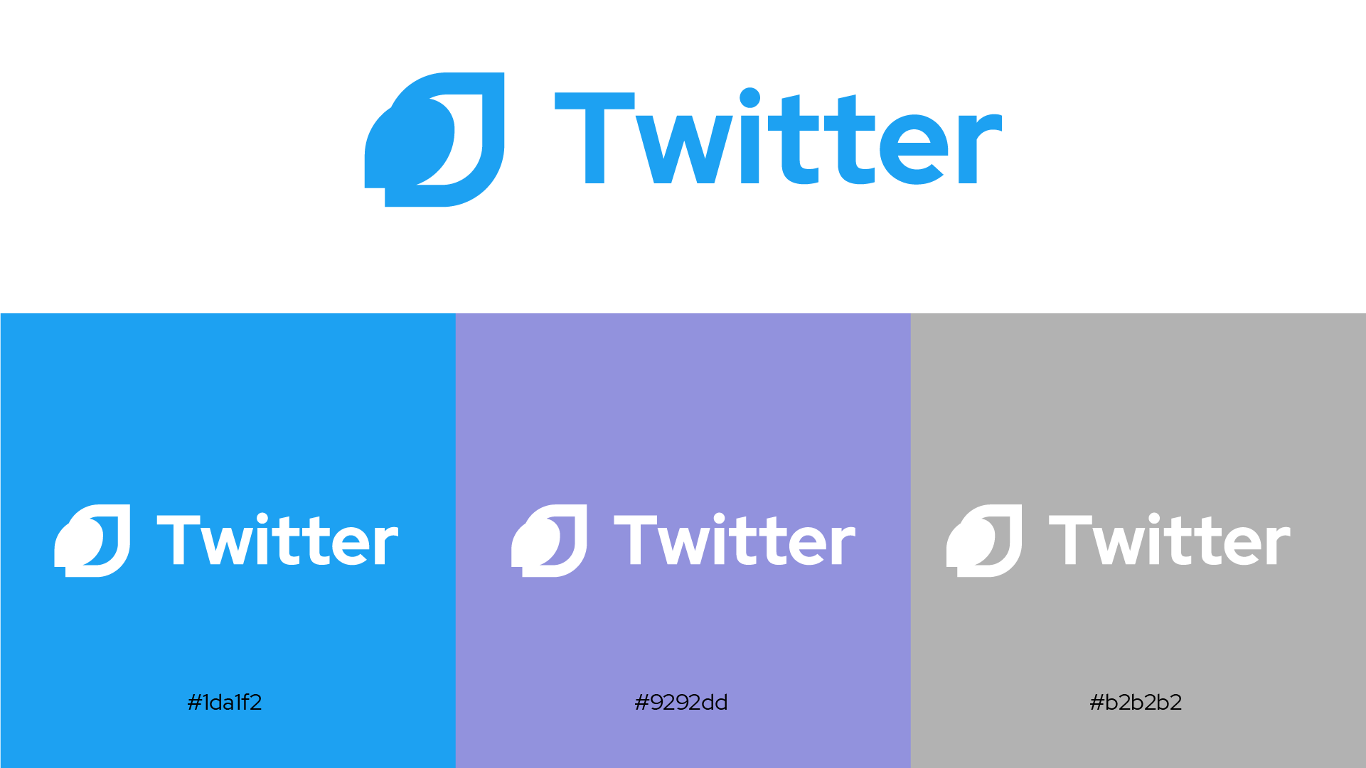
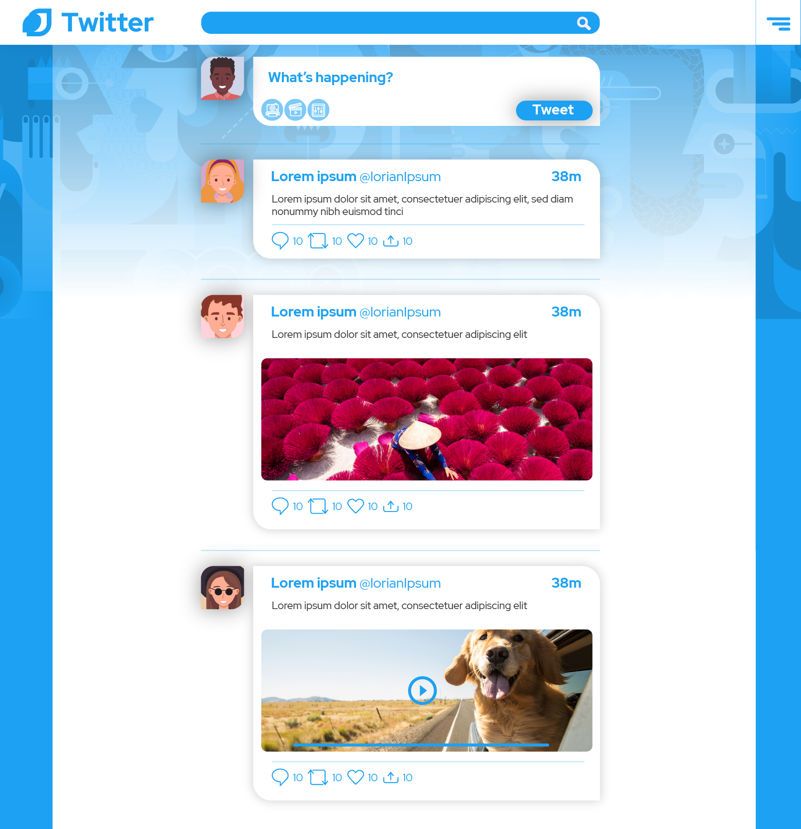
A design expert from Fiverr has given the Twitter logo and UI a makeover

Sign up for breaking news, reviews, opinion, top tech deals, and more.
You are now subscribed
Your newsletter sign-up was successful
Join the club
Get full access to premium articles, exclusive features and a growing list of member rewards.
As part of a new series, TechRadar Pro has asked designers from freelance platform Fiverr to give the branding of a selection of well-known companies a makeover.
The idea isn't to return to the drawing board completely, only to imagine what famous branding might look like with a few tweaks here and there.
First up, a rethink of the Twitter logo and user interface by UX designer Yaeliroz, who also talked us through her decision-making process.
- Check out our list of the best drawing software right now
- Here's our rundown of the best graphic design software out there
- We've built a list of the best Photoshop alternatives around
A simpler, reimagined view of an iconic brand combined with a bold vision of the web-based interface with a clear inclination for gradients, random shapes and curves. Here's what she came up with:


Yaeliroz's rationale
"Twitter is a well-known brand, very recognizable by its main specific color and the bird logo."
"This is exactly why I wanted to keep the layout the same, just change the logo to be less graphic, and more of a bird layout, keeping the legendary color, adding only one secondary color to be used in some places around the website."
"Furthermore, I decided to make the solid look, a bit more vibrant and edgy. I also wanted to make it approachable to younger audiences, by adding the illustrations elements, giving them only a hint of color. The rounded corners also give the website a new look and feel, making it more accessible, and less strict and old fashioned."
Sign up to the TechRadar Pro newsletter to get all the top news, opinion, features and guidance your business needs to succeed!
- Here's our list of the best laptops for graphic design

 Become a TechRadar Insider


