I was wrong about the Nothing Phone 3 design – here's why
They weren't wrong when they said it would grow on you
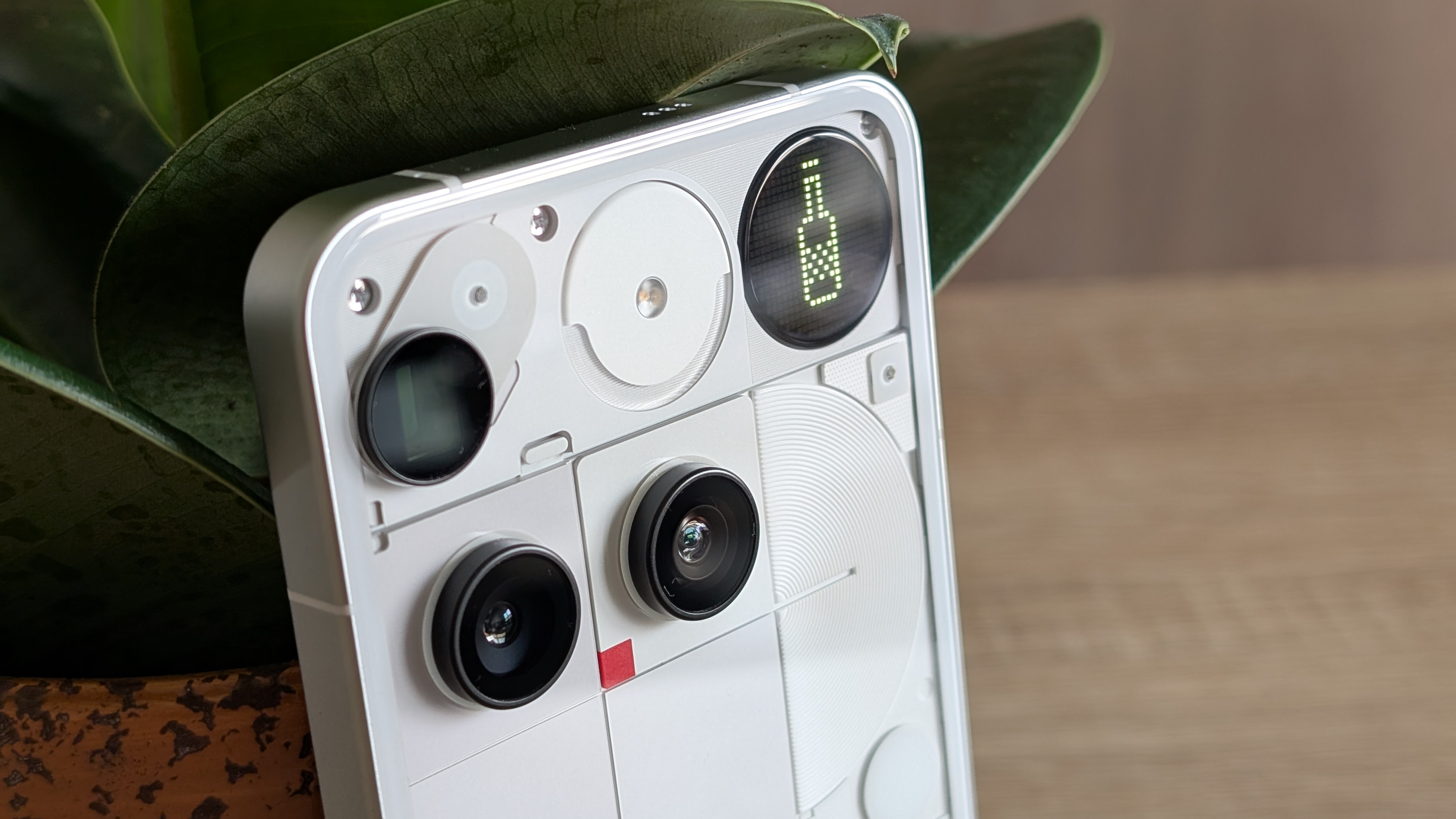
We’ve all heard the phrase 'maybe it’ll grow on you', often in response to a sudden case of buyer’s remorse around something you’ve just acquired. It’s meant as a term to uplift your spirits, but while it rarely does, sometimes it can take you by surprise.
This is the case with the Nothing Phone 3. The leaks before the launch suggested we’d see a design that looked somewhat perturbing, and when I first saw it in London, my initial impression was mostly reaffirmed.
Yet, two weeks later, the design of the Phone 3 has grown on me. It’s one of the most polarizing designs on any smartphone, but it has a enough left-field charm to be a fun phone to use. From the transparent design, which fits the Nothing design language, to the capacitive rear button and Glyph Matrix, here’s why I still like the design... to my surprise.
Article continues belowThe Nothing Phone 3 has the most polarizing design
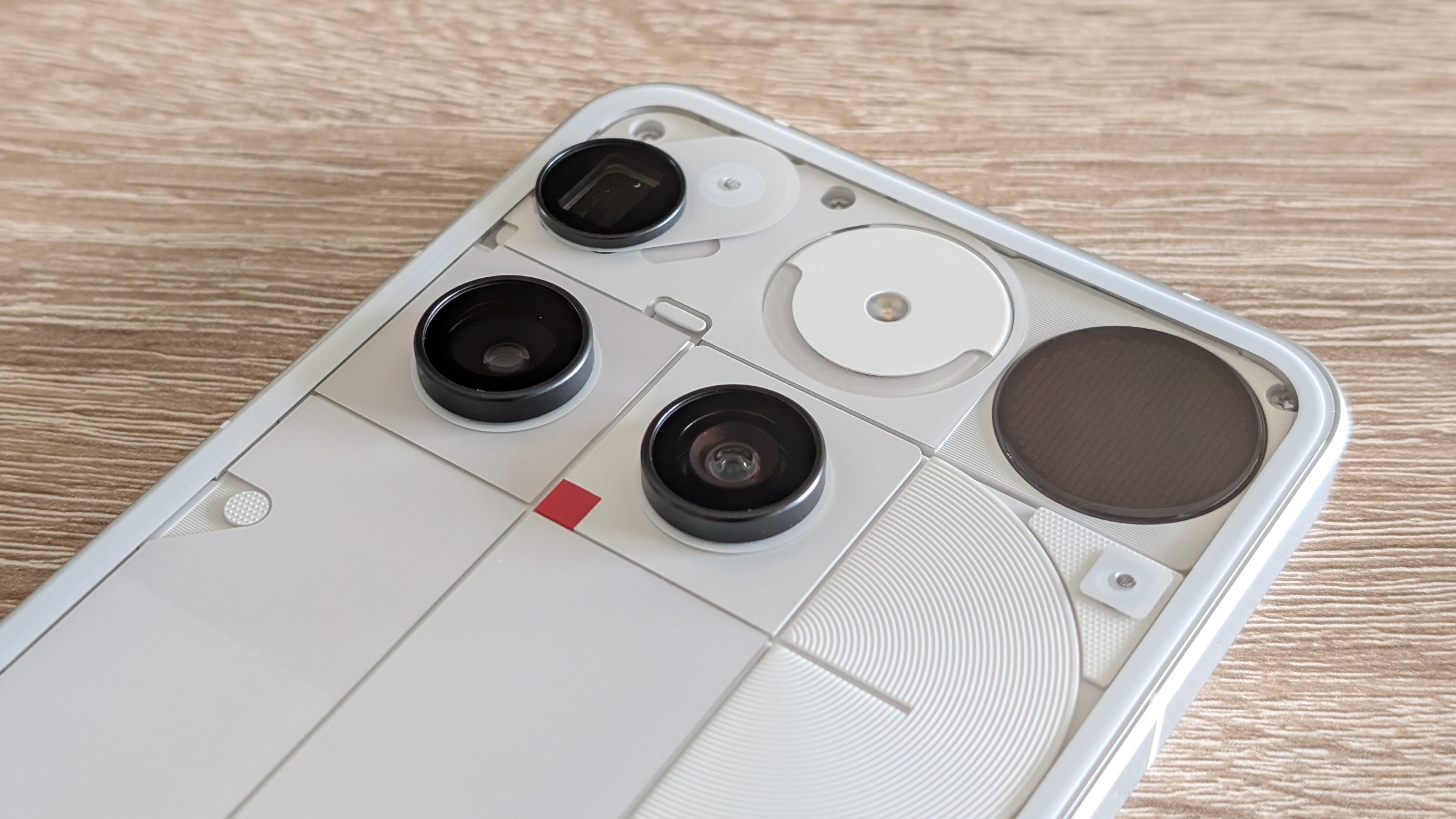
The Nothing Phone 3 features one of the boldest designs on any smartphone. While most phone makers go for symmetry in camera alignments, the Phone 3 features a misaligned telephoto camera that's immediately obvious.
Nothing is mentioned about dividing the design into three distinct columns. While there is symmetry to it when viewed through that prism, the camera's alignment immediately deflects your attention away from recognizing this.
The surprising thing about this is that two weeks later, the alignment bothers me far less than it did initially. Considering my prior vehement feelings towards the design, to feel less passionate about the same topic just two weeks later proves that the design may divide opinion, but it will grow on you.
The Glyph Matrix is a key part of the Nothing DNA
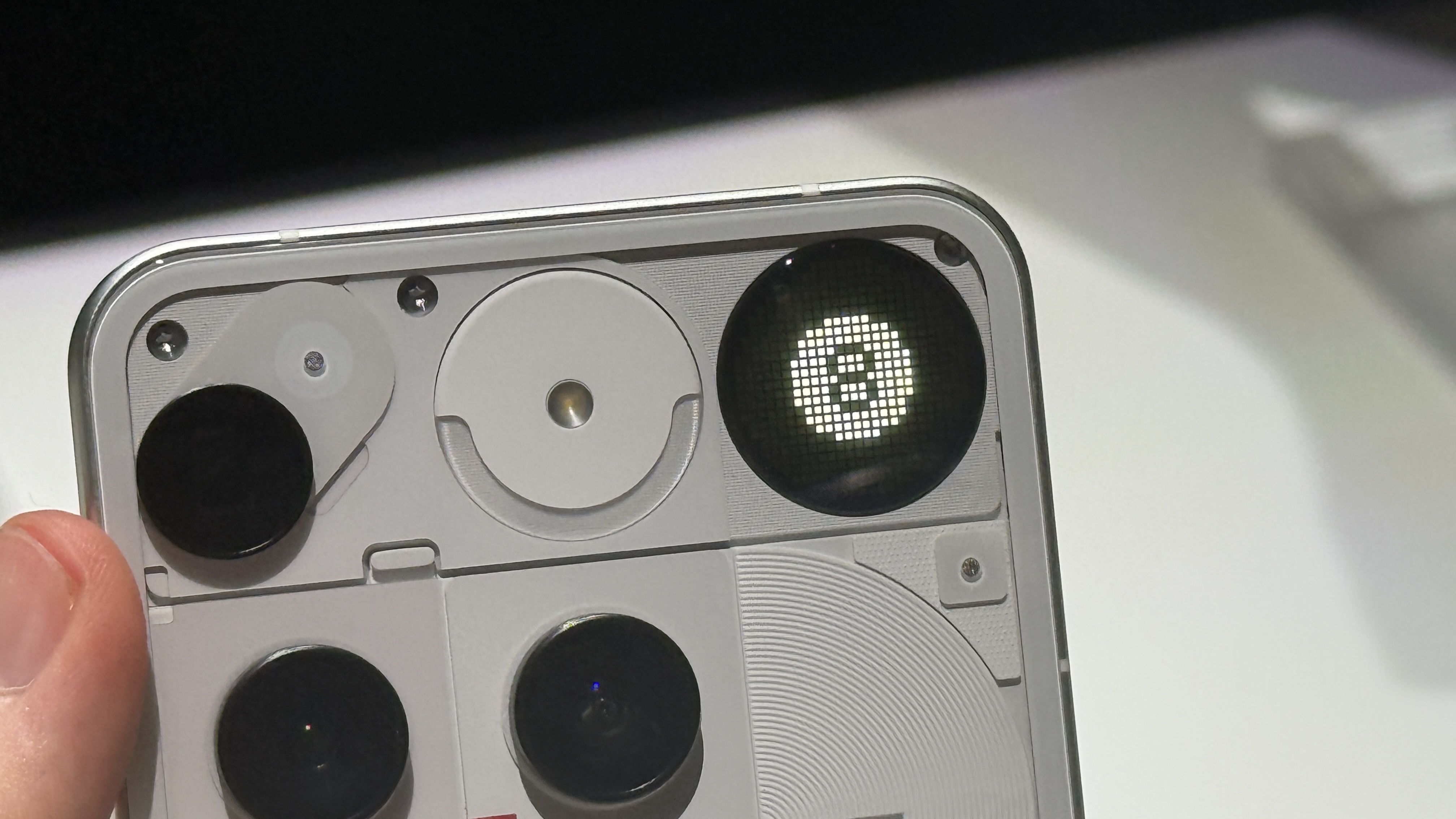
The Glyph Matrix is equal parts an excellent idea and a gimmick. It’s a fantastic idea because it evolves the iconic glyph LEDs into a micro-LED dot-matrix display that can be used to alert you to new notifications, set timers, spin the bottle, or seek the oracle that's the Magic 8-Ball.
Sign up for breaking news, reviews, opinion, top tech deals, and more.
The concept is genius: more LEDs with precision control can be used to create a display that can show tidbits of information. The execution is both better and worse than expected: the former because I can see the small display being genuinely useful once there is a broader suite of Glyph Toys, and the latter precisely because there aren’t many useful Glyph Toys right now.
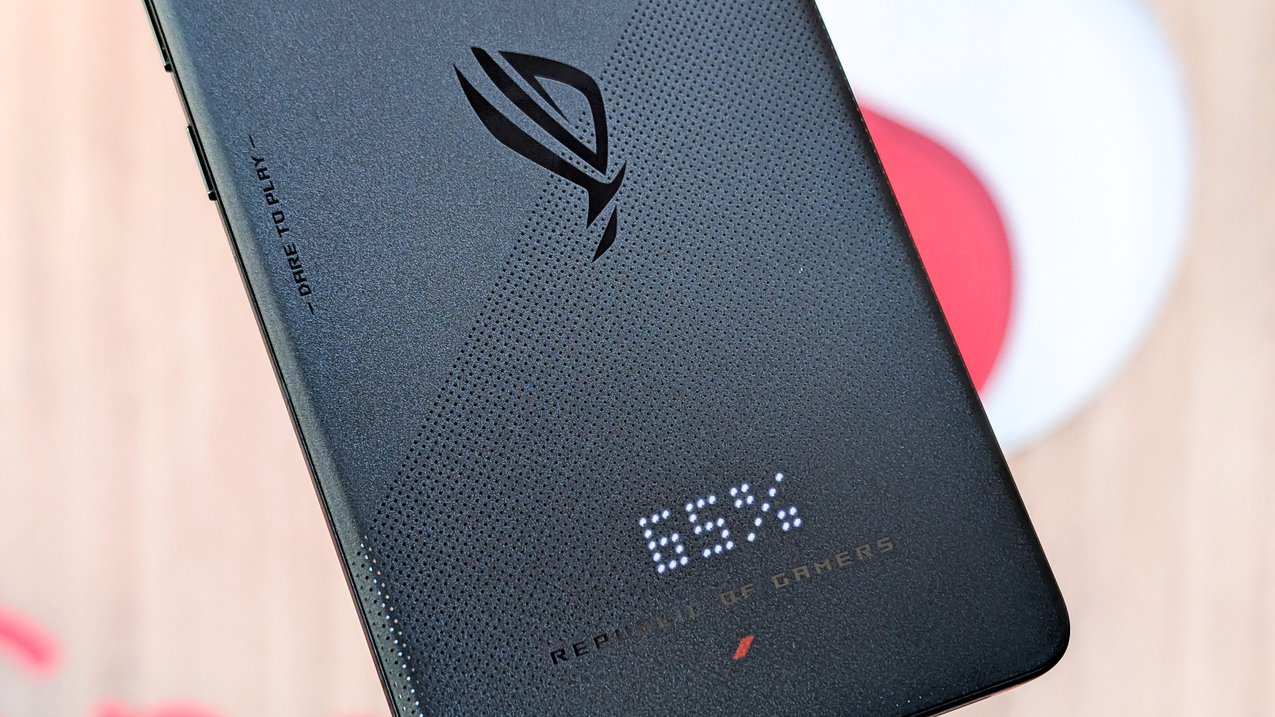
I think there’s room for Nothing to build a bigger version of the Glyph Matrix. Imagine an LED billboard — the type you may see outside a building or restaurant — controlled by your phone. The current iteration of the Glyph Matrix is likely to garner significant community support, especially considering that Nothing has previous form for this.
Nothing also has a track record of thinking outside the box, and a bigger Glyph Matrix display would give it a larger canvas to dream up incredible features that help its phones stand out. Considering the Phone 3 is the first flagship Nothing phone in two years, I can’t help but wonder if the company should have attempted this with the Phone 3, especially as it would help it stand out against intense competition.
More phones should have buttons on the back
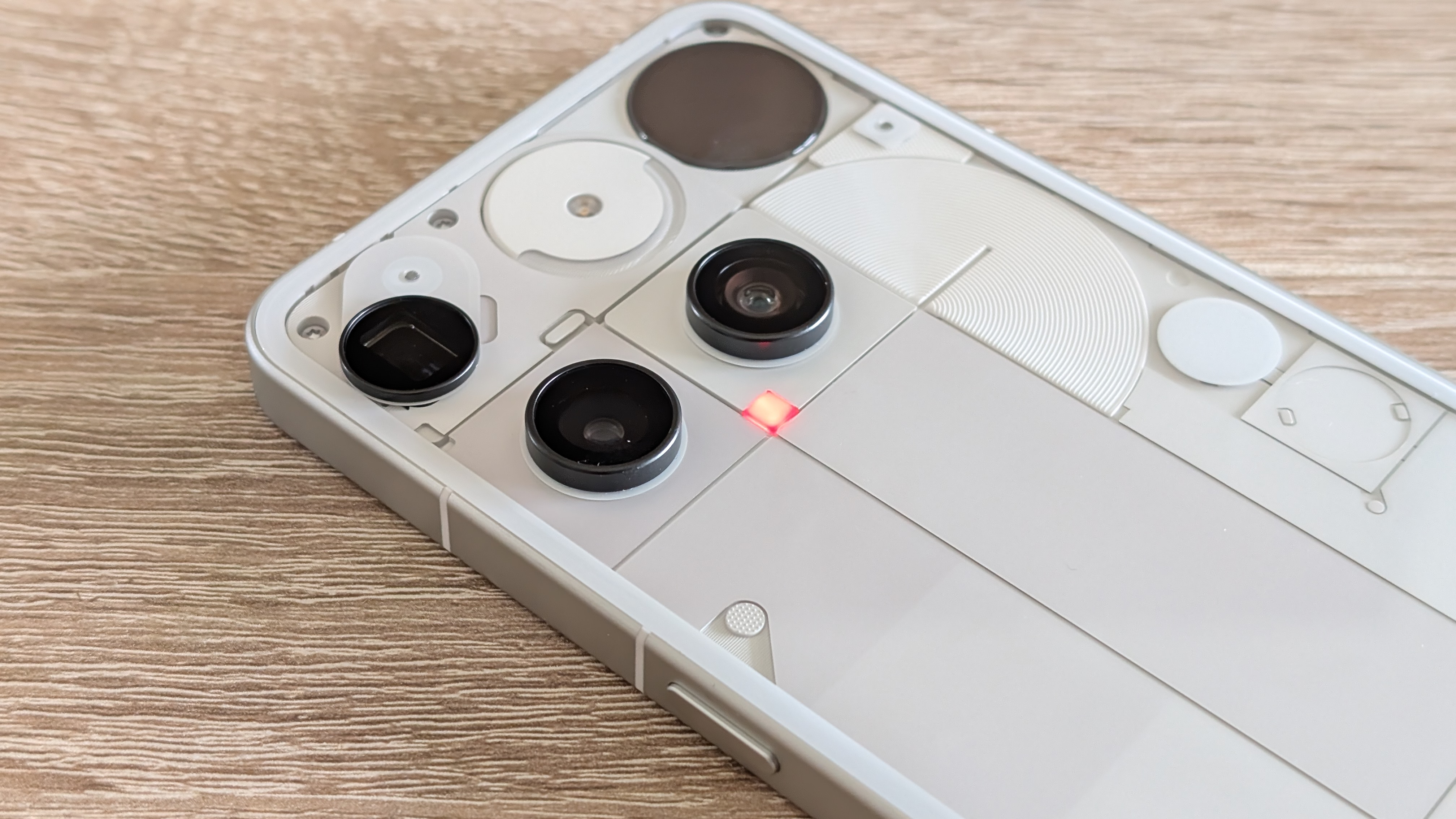
I’m also surprised at how much I like the button on the back of the Phone 3, located in line with the Glyph Matrix display. Specifically, I don’t like the implementation as much as the idea itself and the possibilities it could entail.
Imagine if every phone had a programmable button or two that could be used to launch different shortcuts, quickly take a selfie, start/stop a voice recording, or even cycle through different sound profiles. It’s an odd concept at first, but after using it on the Phone 3, the idea and its possibilities have begun to grow on me.
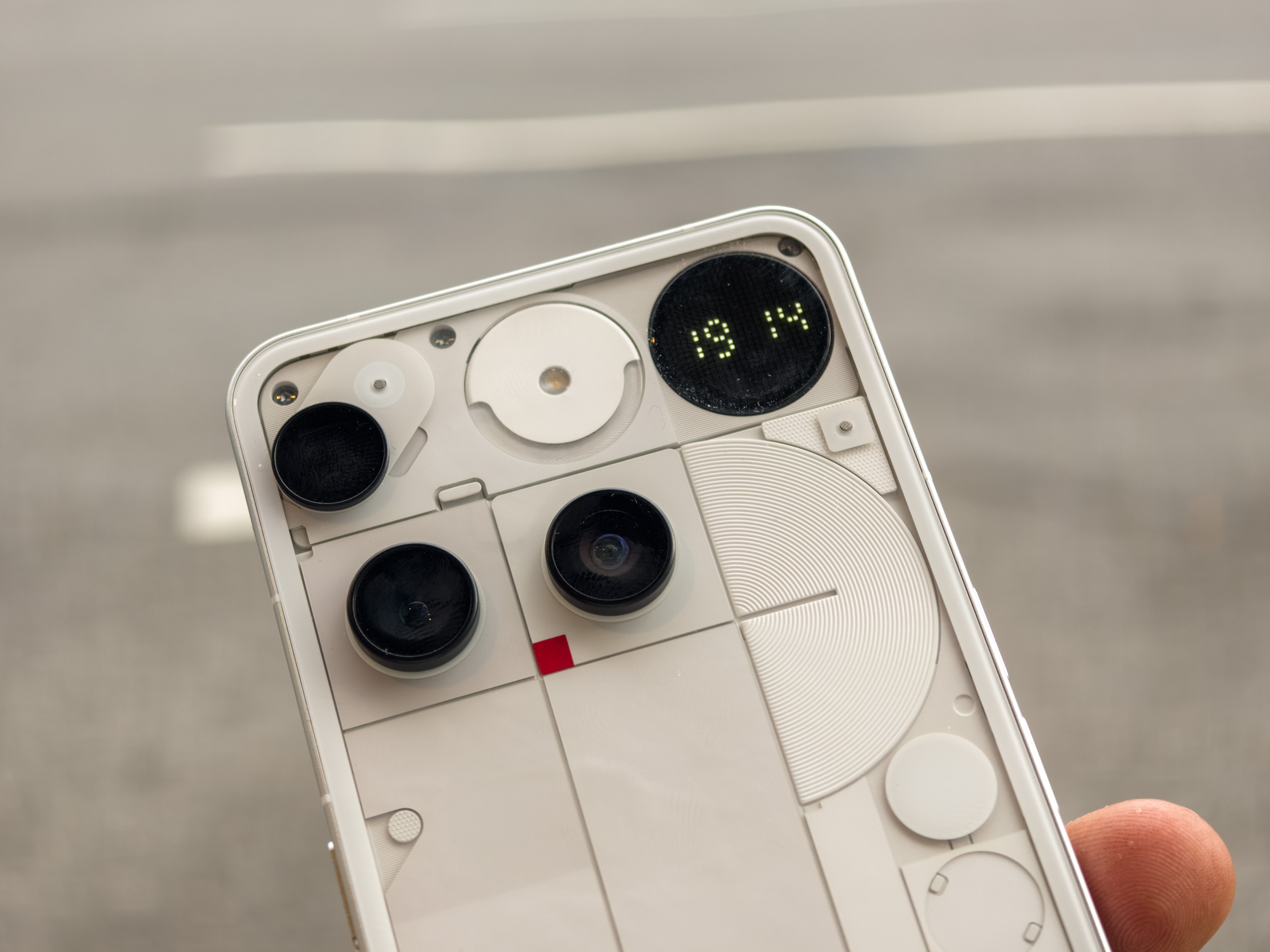
One area where it doesn’t quite live up to it, however, is in the type of button used. Unlike most phone buttons used for core functionality — such as volume and power — that physically move, the Phone 3 uses a capacitive button reliant on electrical capacitance changes when touched. In short, it’s the same technology used in the touchscreen on all phones, and it has the same pitfalls.
The biggest of these is the lag in time. Rather than a physical switch, which can initiate a command or state change immediately, the capacitive key has input lag and is more frustrating than exciting. There are also skipped presses, and while it's likely unfeasible to use a key with full travel considering the space constraints inside the phone, the current approach needs improvement.
There’s one thing I wish that Nothing would change immediately
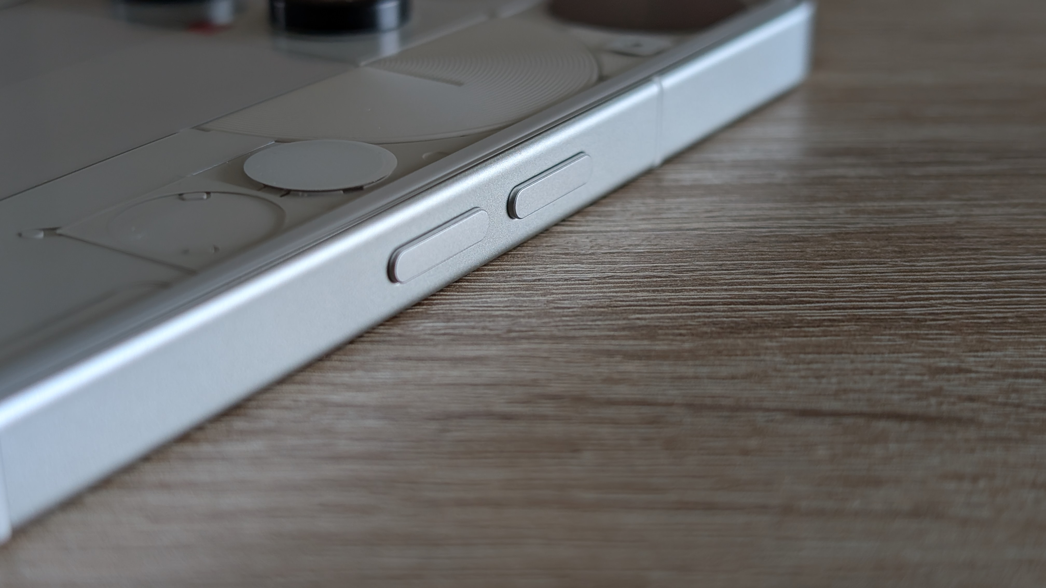
Having become accustomed to the design of the Phone 3, there’s only one design feature that makes it challenging to use the Phone 3 as my daily phone: the position of the four keys.
On the right side are the Power and Essential Keys, while on the opposite side, and perfectly aligned, are the two volume keys. There’s just one problem: the positioning.
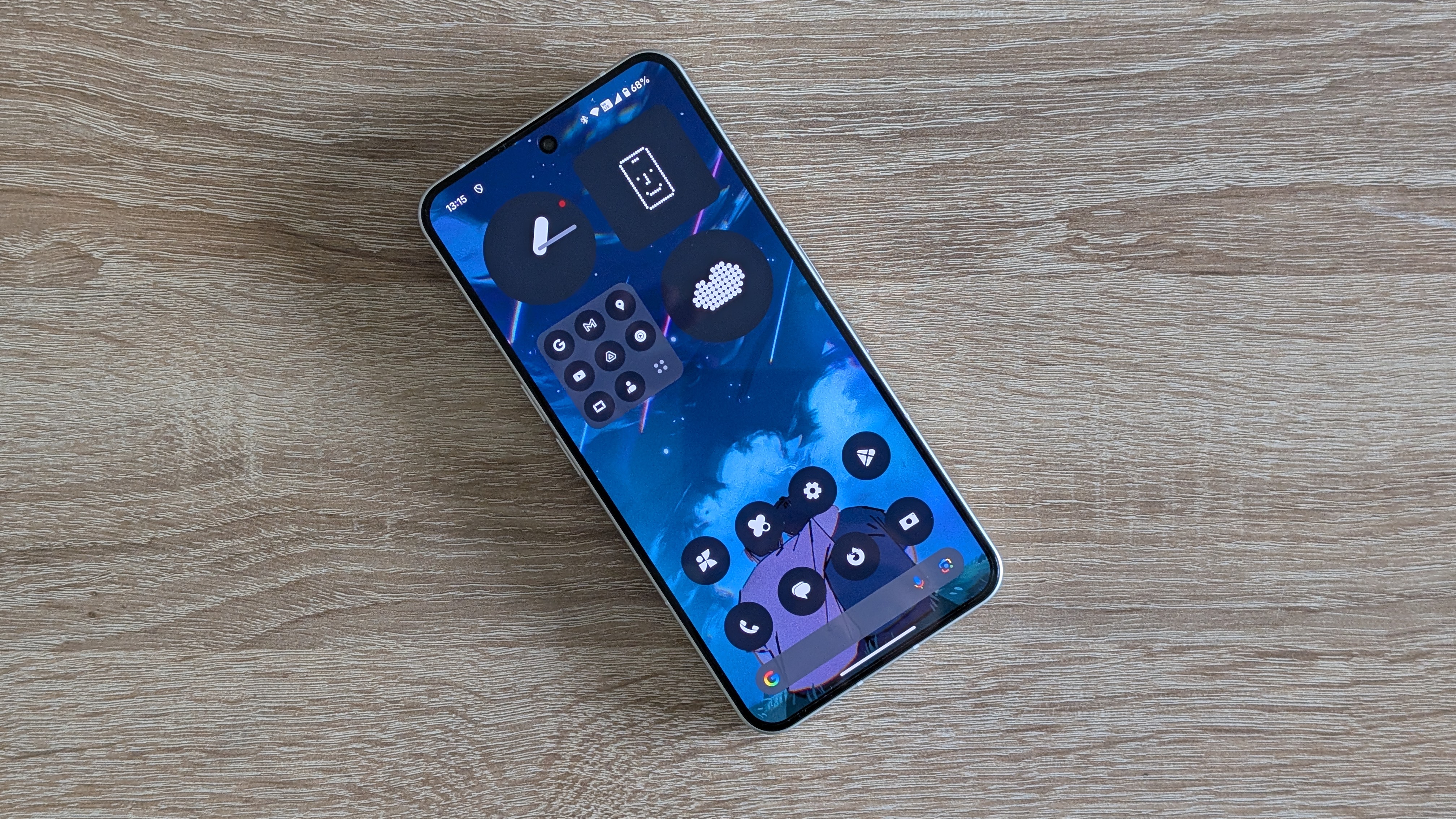
Nothing has a habit of moving its keys to a lower position along the side frame, but the Phone 3 feels challenging to use when relying on muscle memory. I can normally adapt to any idiosyncrasies within a couple of days when changing phones. Two weeks later, something as simple as taking a screenshot quickly feels alien and often fails to work.
When they said it would grow on you, they were probably referring to the design of the Nothing Phone 3.
Nirave Gondhia
The Phone 3 already sports a polarizing design, so that it won’t appeal to everyone, but beyond Nothing’s core community is a much broader set of potential customers who want something a little different. Those customers may be seeking change, but having worked in retail for over a decade, I know that phones still need to feel familiar in hand.
Perhaps the Phone 3 will continue to grow on me, and I’ll eventually get used to the layout of the keys. More likely is that I’ll use an alternative phone, which is a shame as I’ve begun to like just how unique the Nothing Phone 3 design is. There’s nothing like it on our list of the best Android phones.
You might also like

Nirave is a veteran tech journalist and creator at House of Tech. He's reviewed over 1,000 phones and other consumer gadgets over the past 20 years. A heart attack at 33 inspired him to consider the impact of technology on our physical, mental, and emotional health.
You must confirm your public display name before commenting
Please logout and then login again, you will then be prompted to enter your display name.
 Become a TechRadar Insider


