


Not a day goes by without Netflix spending billions on new content, but its latest move is actually one that may save the company a whole lot of money and it's all to do with the font it uses on its service.
Currently Netflix uses a font called Gotham but that is all set to change, thanks to it adopting a new typeface that's been developed in house.
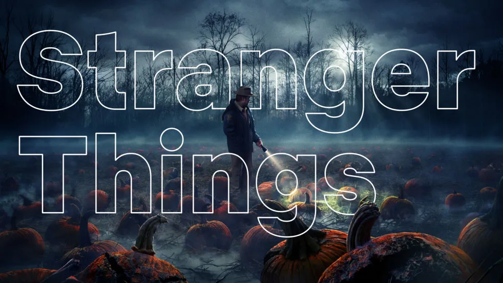
It's called, drum roll, Netflix Sans and takes its inspiration from the current logo, mainly the cinemascope-esque curves that have become a main feature of the look of Netflix.
Netflix sans costly fonts
The font is the brainchild of designers Tanya Kumar and Noah Nathan (the current design lead at Netflix), alongside typeface designers Dalton Maag, and has been made so that it looks great on the site but can also be used in big billboard campaigns and the like by Netflix going forward.
"The unique characteristics of the typeface were chosen very carefully as it is meant to serve both display and functional purposes.
"The clean and neutral lines give without taking, favoring art over distraction, and eliminating excess," explains Nathan on his site.
"The arched cut on the lowercase 't' is discreetly inspired by the cinemascopic curve that is so iconic to the brand’s wordmark and symbol."
So, there you have it: a non-distracting font that will be clear enough for you to see at a distance, when you are on your sofa staring at your big shiny TV.

The move away from Gotham will also mean that Netflix won't have to pay out to lease that font anymore, which means it may have a little bit more money to spend on CONTENT.
In an interview with ItsNiceThat, Nathan notes that the new font "saves the company millions of dollars a year".
Whatever the reason for the change, typeface geeks now have another font to look at and argue about the kerning, and that is nothing but a good thing.
If that is something you are into, then we'd recommend checking out The Art of Design on Netflix - a great series that showcases some of the best designers in the world and the things they've poured their heart and soul into.
Via AdWeek and NoahNathan
- Here are also 60 more of the best shows on Netflix to watch right now.
