Why you can trust TechRadar
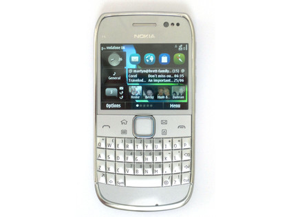
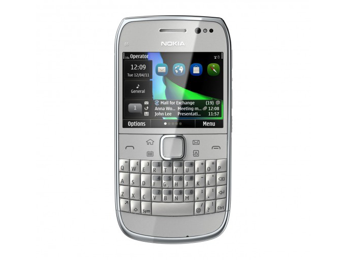
The Nokia E6 is the second E-Series mobile phone to support both the True-Type-esque keyboard and a touchscreen – a combination initially debuted on the Nokia E5.
But the Nokia E6 has a lot more to offer, with the Symbian^3 firmware providing four independent home screens, which is one more than the remainder of the Symbian^3 family, with the ability to add a fifth.
The numerous home screens enable the user to separate work and home life, with separate home screens for each and the ability to add up to three Favourites widget bars on each home screen, with four application shortcuts per widget. This makes the Nokia E6 screen interface more iPhone-like in appearance, with the ability to lateral swipe between screens.
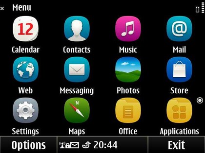
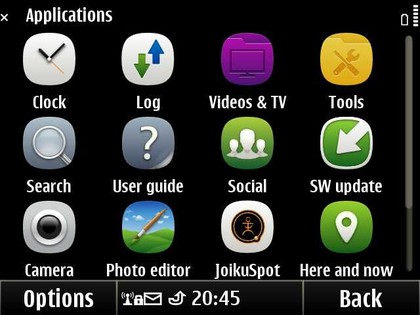
Once you enter the main menu, you're welcomed with the standard Nokia application and folder structure provided on Nokia S60 and Symbian^3 devices, as finally incorporated into the iPhone 4.
A continuing frustration is that some folders have dedicated folder icons but others don't, making it harder to differentiate between folders at a glance. With the length of time Nokia has provided folder-based menus for, it would be nice if it provided user selectable folder icons like those on Windows PCs.
It takes a while to adjust if you're either a QWERTY or full touch user, but once used to the mixed interface the phone is a dream to use, providing the best of both worlds with easy touchscreen navigation and the advantages of a physical QWERTY keyboard for text entry.
One area where the Nokia E6 disappoints compared with the rest of the Symbian^3 family is in its small 2.46-inch screen when using applications such as Ovi Maps This being said, the Nokia E6 screen has by far the highest pixel count on a Nokia device for its size, at 640 x 480 pixels.
Sign up for breaking news, reviews, opinion, top tech deals, and more.
That's much higher than other E-Series phones with similar screen sizes, and far better than the Nokia E7, which has a disappointing 360 x 640 pixels on its 4-inch screen. In comparison, the BlackBerry Bold 9780 has a 360 x 480 pixel 2.44-inch screen and BlackBerry Bold 9900 has a 640 x 480 pixel 2.8-inch display.
Additional to the touchscreen and QWERTY keyboard, the Nokia E6 sports four dedicated hard keys, three of which can be user modified.
The fourth is the home screen/main menu button, which also opens the task manager on long press. The three user modifiable buttons are defaulted to Calendar, Messaging and Contacts, with icons to match.
The two modes of operation – long and short-pressing – of the buttons can be reassigned to any item in the shortcuts list used by the Shortcut home screen widget. Calendar, Messaging and Contacts each have two modes – open application and create new - which is excellent for users wanting to make the experience their own.
As well as these, there are the standard Options, Home screen switcher and Main menu buttons along the bottom of the home screen.
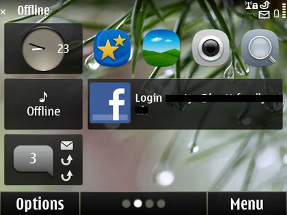
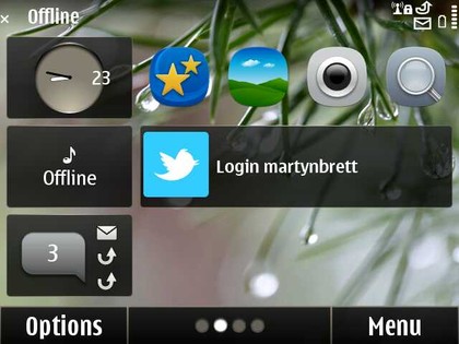
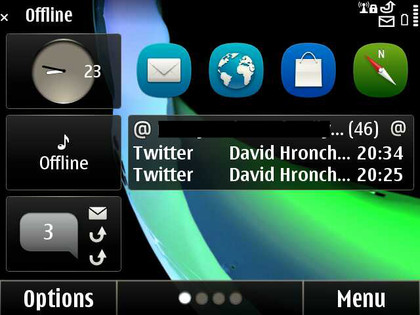
The home screens have two sections with three small, fixed widgets to the left: Clock for the date, Profile and Notifications for received calls, messages and emails.
To the right is the user configurable space, with a maximum of three widgets per home screen allowed here. Preinstalled options include News, Mail and Media offerings, or app links that users select themselves.
Transition between screens is fast, and the user interface is familiar for any existing Nokia owners, but may of course take some getting used to for others.
The new Symbian Anna icons are fresh and clean, but are also available on non-Anna Symbian^3 handsets by buying any of the Symbian Next+ themes by NovaG from the Ovi Store.
One of our favourite minor yet very welcome improvements introduced by Symbian Anna is that Main menu organisation can now be accessed by long pressing any application icon, instead of having to select Options and organise.
The Home screen and Main menu are easily modifiable through the above widgets and the user-configurable folder functionality provided on all Nokia handsets.
However, this is still clunky - you have to move icons up and down through the menu levels using the options list, and app icons can only be arranged in groups of four in a certain widget. Nokia has shown it can do much better on the N9, so we can't wait for it to use the same thing on Symbian devices as the current method feels very outdated.
Another issue is the opening of applications - the E6 sometimes decided to leave us staring at the spinning icon for loading on a few occasions, which doesn't give the impression of a high-end speedy smartphone - especially when you compare it to the hyper-quick dual-core brigade.
Current page: Nokia E6: Interface
Prev Page Nokia E6: Overview, design and feel Next Page Nokia E6: Contacts and calling