Fitbit, what in the world are you doing right now?
The new-look graphs are coming under fire

Poor Fitbit. With the Fitbit Sense 2 and Versa 4 presumably on the horizon, all of its focus should be on the upcoming releases, which are sure to be excellent fitness watches and among the best Fitbit devices you can buy. Instead, it's busy putting out fires caused by disastrous updates to its existing technology.
Fitbit has become a name that's almost as synonymous with fitness trackers as Google is with search engines – but if it’s not careful, it risks damaging its brand and losing customers.
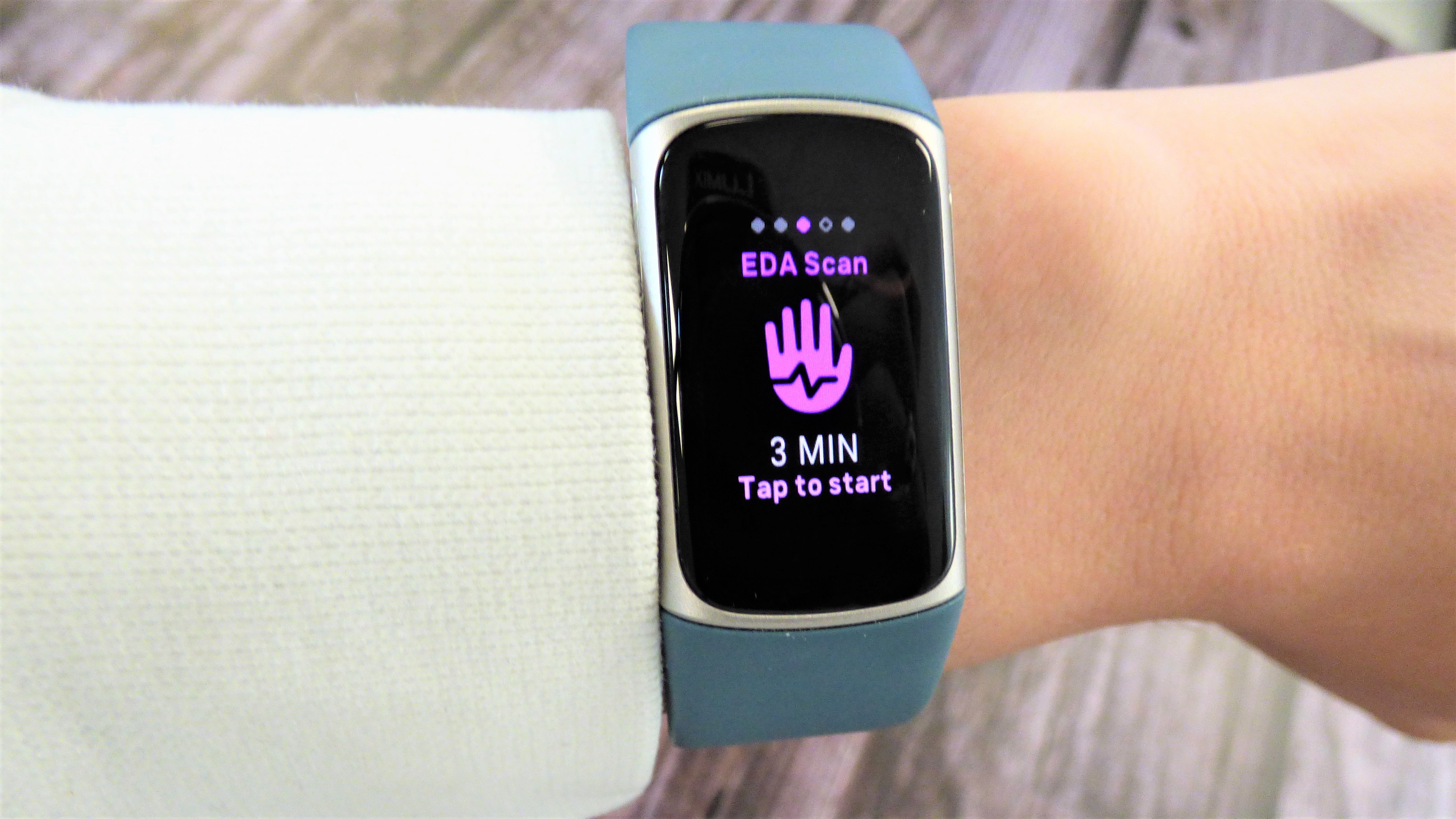
Fitbit has been having a bad few months with the otherwise excellent Fitbit Charge 5’s occasional battery and connection issues. Some Charge 5 units have been frequently disconnecting from users’ phones, while others are reporting draining battery life – rapidly not a good look for a flagship fitness tracker.
Article continues belowThese problems have been compounded by the latest update to the Fitbit app sparking anger among users. A change in the way the app presents information has led to confusion, and even worries of sleep apnea among some users.
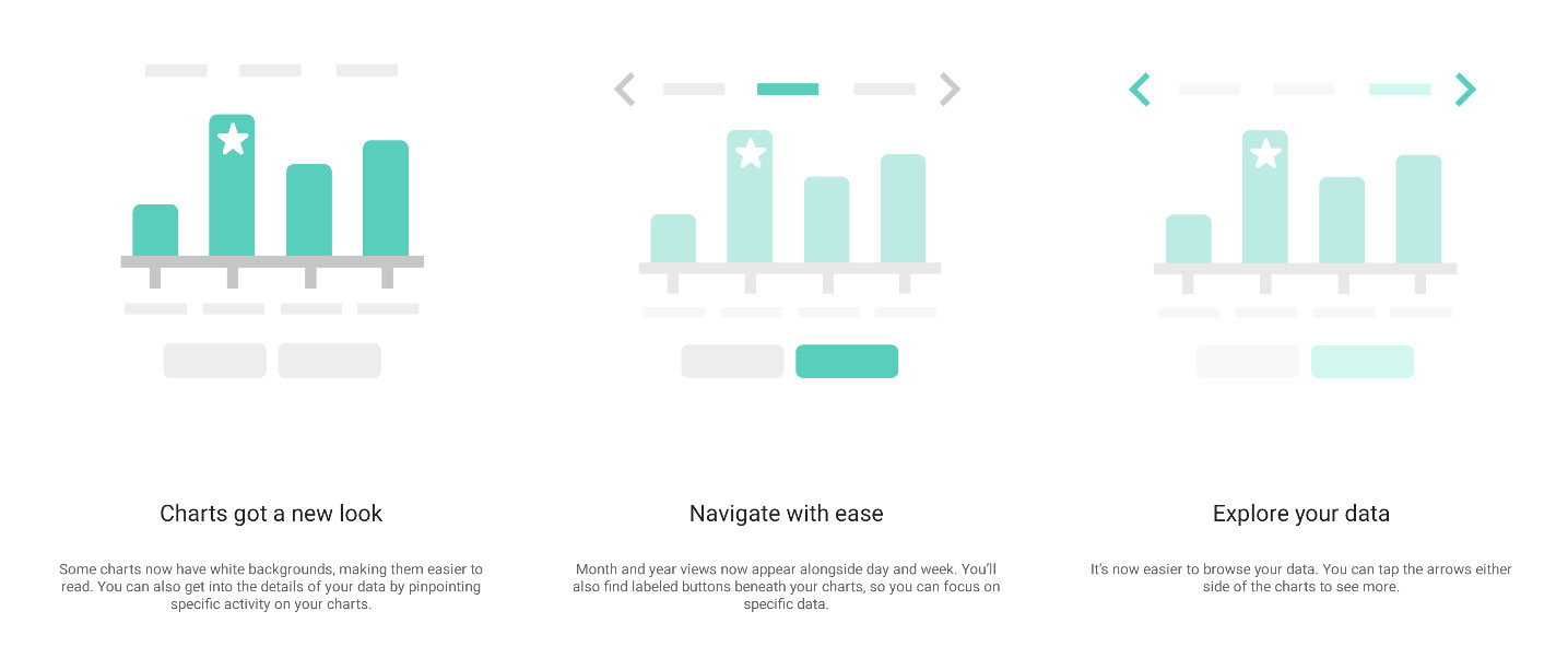
Version 3.64.4 of the Fitbit app, which was rolled out to users in late July, is designed to make Fitbit’s charts and graphs “easier to read”, according to the company, by changing the presentation of distance, sleep, and heart rate data among other metrics.
On presenting the change to its users, Fitbit said that “some charts have been given white backgrounds, making them easier to read. You can also get into the data by pinpointing specific activity on your charts. Month and year views now also appear alongside day and week. You’ll also find labeled buttons beneath your charts, so you can focus on specific data.”

In practice, the update was a bit of a hot mess. Fitbit’s new graphs can be easily switched between daily, monthly, quarterly and annual trends in order to help you see how your data fits into a larger picture of your long-term health. However, more granular data, like the ability to select a particular point on a graph, is now gone. The backgrounds are gone, with all the graphs on white to “enhance readability”, somewhat unnecessarily.
Sign up for breaking news, reviews, opinion, top tech deals, and more.
Problems abound with specific graphs, as well as with general presentation. The oxygen variation graph, recorded during sleep, has been changed to register “high” points of variation in big spikes of yellow. Overnight, lots of people went from being told they slept relatively normally, to seeing big scary, bright yellow spikes on their morning sleep graph. As high oxygen variation is a sign of sleep apnea, this worried some users.
@fitbit #Fitbit what in the world did you do with that last update? You have half the world thinking we all developed breathing problems while we sleep! Thank God for other users on the forum, I was ready to book a sleep study! pic.twitter.com/E5S98SwN5rJuly 28, 2022
Unsurprisingly, people are annoyed. The Google Play Store has been hit with a slew of (verified) negative reviews, criticizing the changes to the graphs and the oxygenation chart. We were alerted to this new change by an email from a concerned reader, who reached out after seeing the barrage of negative reviews. The word “useless” has been seen a lot, especially with reference to the sleep data.
Predictably, Twitter is also up in arms, with Tweets like the ones above and below voicing users’ concerns. Even Fitbit community forum users are getting in on the act, with the general consensus being that the update is “a downgrade in usability”. We've reached out to a Fitbit representative for comment, and we'll update this article if and when we receive a reply.
Fitbit changed their metrics just enough to wipe out my sense of doing a good job with all the diet and exercise and breathwork I've been doing. I guess my sense of data-driven accomplishment was an illusion after all. I'm less healthy today than before the firmware update.😕July 29, 2022
When it comes to data, presentation matters. Presenting the same information in two different-looking graphs can lead you to two very different conclusions. One chart might make you believe your health is normal, while presenting the same information in a different way might make you ring the doctor in a panic. Fitbit is more popular than some of its contemporaries because it presents data in an easy to read and accessible way. But with this latest update, that seems to be changing.
In his landmark book about data presentation, How Charts Lie, mathematician Alberto Cairo says “Even common charts such as bar graphs and pie charts can be ambiguous, or worse, incomprehensible. This is worrying because numbers are very persuasive, and so are charts, because we associate them with science and reason. Numbers and charts look and feel objective, precise, and as a consequence, seductive and convincing.”
If you’re convinced you’re more unhealthy than you are, you might feel that you need to make more adjustments to your life, consume more fitness content, get more medical assistance, pour over your Fitbit app for more hours. The implications aren’t good: Fitbit, and fitness trackers in general, should be tools to improve your life rather than detract from it, and scaremongering with data, even if the numbers are correct, should be discouraged.
It's likely that this change has been implemented simply in order to standardize data presentation before a slate of new Fitbits hit shelves later this year, and an initial misfire can quickly be corrected. We hope Fitbit listens to user feedback and acts on it: no line of fitness devices, except possibly the Apple Watch, has been quite as good at getting people moving as Fitbit, and we’d hate for all that goodwill to be lost to a few bad updates and faulty Charge 5 units.
However, if the Fitbit Versa 4 and Sense 2 receive similarly poor feedback, Fitbit could find itself relinquishing its crown as the king of the trackers.

Matt is TechRadar's expert on all things fitness, wellness and wearable tech.
A former staffer at Men's Health, he holds a Master's Degree in journalism from Cardiff and has written for brands like Runner's World, Women's Health, Men's Fitness, LiveScience and Fit&Well on everything fitness tech, exercise, nutrition and mental wellbeing.
Matt's a keen runner, ex-kickboxer, not averse to the odd yoga flow, and insists everyone should stretch every morning. When he’s not training or writing about health and fitness, he can be found reading doorstop-thick fantasy books with lots of fictional maps in them.

 Become a TechRadar Insider


