Cobbling together an Apple Watch app is simply a matter of scale, right? You take your successful iPhone app (which you already shrank down a notch or two from your website and added some over-fussy icons to), scale the pixels to 319 by 390 and throw in some pingy notifications, right?
Congratulations! You're probably a software design product manager. Actual software engineers, however, know that successful UIs are incredibly difficult to create, especially on an entirely new product.
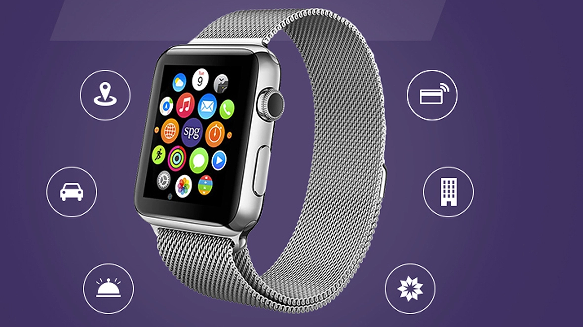
Article continues belowSmall screen future
Suddenly the five-or-so inches of real estate, with acres of space to pinch, zoom and spell words inexpertly on vexing keyboards has been swapped for a postage stamp of screen with very little space to interact, and possibly the most economic interaction with tech we'll ever see. And how do you make apps work in that environment?

Well, if you're The Guardian and you aim to have your app out for day one, you start coding months before the Watch hits pre-order, with no earthly idea about what the infrastructure platform may be. Use your imagination, says Helene Sears, senior user experience architect at Guardian News and Media: "Because we designed the Guardian App for Watch before seeing or using one we had to imagine user behaviours and expectations."
This may seem like an exercise in the bleeding obvious, but in practice it's a curiously intangible process. How do you design an end product based on projections and theories? And how far can you commit time and resources until you're sure there's some kind of standard established?
And, of course, if you haven't got an actual watch, you make one. Out of paper, it turns out. Like you would on CBeebies. Sears again: "We did our best to simulate Watch with other wearables and a rather amusing paper prototype version that we wore while working. As the screen real estate is extremely small and a lot of apps would be competing for attention, we quickly realised our app would have to offer fresh content best suited for the reader's context in the few seconds they might be using it. A lot of thinking went into a complex timetable to produce something simple, relevant and quick for the reader."
Sorting out the differences
A good first step is to work out what theoretical differences there are between your familiar iPhone apps and the new Watch platform? Will tweaked phone app UIs work, or do you need to start completely from scratch?
Sears: "The Watch is more immediate and the apps can be more intrusive as notifications are harder to ignore. One of the most interesting aspects is the micro-interactions with Watch, the on-the-go scenarios where holding a large phone becomes cumbersome. It is not so much a philosophical difference as another step towards technology integration in our lives." So a Watch app is more about creating another front to push tech integration, with those difficult-to-ignore notifications taking point.

But the small screen clearly is an issue. "The biggest challenge was trying to predict how customers would use the new device and deciding what features would be most useful on such a small screen," Tamique Weekes, Mobile Product Owner at Ocado told us. "We had to make educated guesses by focusing on quick interactions – actions that a customer could complete in just seconds that were easier to accomplish on the Watch than having to take your phone out."