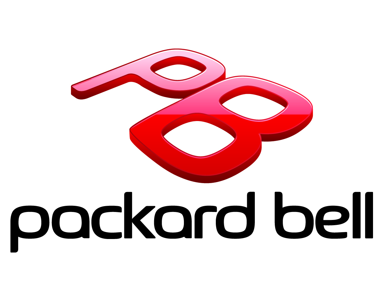
Packard Bell over-enthused by PB rebrand
Issues press release of madness

Sign up for breaking news, reviews, opinion, top tech deals, and more.
You are now subscribed
Your newsletter sign-up was successful
Join the club
Get full access to premium articles, exclusive features and a growing list of member rewards.
With a press release that can only be described as bemusing, Packard Bell has, in its own words, "undergone an incredible makeover that would leave anybody breathless," and in our words started calling itself PB and using red letters as its logo.
Packard Bell is seemingly so keen to change its image that it reveals the change in a gushing public statement, that left us wide eyed.
Packard Bell says: "The new visual identity of Packard Bell is furthermore expressing the brand's understanding of trends and its ability to reinvent them, understanding the origins of desire and transformation, evolving and creating thanks to its unlimited imaginative mind: the Packard Bell spirit reinvents today's trends and set the stage for tomorrow's breakthroughs.
"This is more than technology. It's a lifestyle, a life experience, and a reflection of the way we see the world."
But what does it all mean?
"We were carefully analyzing the Packard Bell brand proposition resulting from the group multi-brand strategy," says Gianpiero Morbello, Acer Group Vice President Marketing & Brand.
"We are now completing one of the most relevant evolutions in the history of the Packard Bell brand – and of the group itself. We are moving on. From sharp edges to more rounded ones. From purple to red. From Packard Bell to PB."
Sign up for breaking news, reviews, opinion, top tech deals, and more.
Of course, we all wanted to know what the move from purple to red signified, and we weren't left disappointed.
Red is colour at its best
"While purple connotes luxury and sophistication but also mystery, envy and introspection, red is associated with heat, energy and blood, and also emotions such as excitement, passion, love and more. Purple does not energize the outside world, but relaxes and calms it," continues the release.
"Red communicates ambition, power, vitality, enthusiasm and a desire to conquer. Red speaks to the outside world in a clear, distinctive and visually appealing language. Red is a personality amplifier, a life enhancer. It draws attention, captures it and keeps it there.
"Red is colour at its best. Red is the perfect colour to infuse the Packard Bell brand with the personality and strength of identity to position it as the leader in its particular segment.
"But Packard Bell's visual identity is not only changing colour from purple to red. It's expressing the entire concept of the renewed Packard Bell, evolving from sharp to round, towards products which will be more and more distinctive for their strong commitment to pure design, mobility, ease of use."
"So cool!!"
And just when you thought it couldn't get any more amusing, the release ends.
"Moving from Packard Bell to 'PB': That's so cool!!"
Multiple exclamation marks may be a sign of madness, but it's a fine line from that to genius. However, this is just marketing madness.

Patrick Goss is the ex-Editor in Chief of TechRadar. Patrick was a passionate and experienced journalist, and he has been lucky enough to work on some of the finest online properties on the planet, building audiences everywhere and establishing himself at the forefront of digital content. After a long stint as the boss at TechRadar, Patrick has now moved on to a role with Apple, where he is the Managing Editor for the App Store in the UK.
 Become a TechRadar Insider


