The evolution of the Linux desktop
How we got to the Linux desktops we enjoy using today
Sign up for breaking news, reviews, opinion, top tech deals, and more.
You are now subscribed
Your newsletter sign-up was successful
Join the club
Get full access to premium articles, exclusive features and a growing list of member rewards.
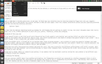
The Ayatana team weren't limiting themselves to just notification bubbles, though. The next goal was to fix the system and application notification area; an area that had become something of a wasteland in the Linux desktop. There were multiple problems with the notification area.
To start, the notification area typically had a number of notification icons for applications that used it, and you couldn't click once and scrub through the icons – you had to click each individually to use it. In addition, the user interface on these icons was often inconsistent. Some have certain types of menu in left-click menus, some in right-click menus, some had strange and inconsistent widgets, and some had other odd bits.
The icons in the notification area were the same as in the application launcher – typically full-colour icons – and this often looks sub-optimal in different themes.
As an example, in a dark theme you usually want single-colour icons in the notification area for clarity and definition, but also normal bright-coloured icons in the application launcher. All of these issues caused accessibility problems for blind and disabled users, and made it difficult to navigate the notification area with a keyboard.
The Ayatana team wanted to fix these problems in a cross desktop way. To do this they based their work on the System Notifier Specification that was created and used by the KDE project, and created a new application programming interface (API) that developers could use to put an icon in the notification area for Gnome applications.
The technology had a number of benefits, including the fact that you can now click one icon in the panel and scrub through the icons and each notification area menu would drop down (similar to how you can move your mouse through the menus in an application). Additionally, applications can set a specific icon in the notification area, which made single colour notification area icons a reality while keeping the application icon a normal full colour icon.
Notification area menus were made more consistent. No more confusion about left- or right-clicking to see a menu; you can only left-click, and only standard menu items, checkboxes and radio buttons are supported. This results in a much simpler and more consistent user experience. Everything was made far more accessible, and functions in the notification area can be controlled by the keyboard, which makes it much easier for blind and disabled users.
Sign up for breaking news, reviews, opinion, top tech deals, and more.
When the technology was ready, it was shipped in Ubuntu and was well received by users. With these indicators being fully open and with APIs for C, Python and Mono, application developers had a field day and more and more applications were adjusted to support the technology.
What is particularly interesting from a cross-desktop perspective is that due to the technology being built on a standard cross-desktop specification, KDE applications running in Gnome have their notification menus rendered in the native GTK toolkit and using native Gnome icons. The same works for Gnome applications running in KDE: those notification menus are rendered in Qt. This makes applications that aren't designed for your desktop feel much more native and integrated.
System indicators
Another feature of the technology is the concept of system indicators: notification icons that group together similar types of content (such as messages) or present system related content (such as battery, power and sound).
A key technology here was the messaging menu: a small envelope-shaped icon that presents all of your incoming messages in one place. With it, applications can put content there; you can see how many new emails you have, new social network messages, chat messages and more.
Again, due to the cross-desktop specification, any application can put content in the messaging menu and many projects surfaced to bring support in Zimbra, Gmail and more. Other system indicators have also been produced in Ayatana too.
A good example is the sound menu, which not only enables you to adjust the volume of your soundcard, but also shows which song you're listening to and gives you the ability to skip through songs when listening. This is handy because typically when you want to listen to music on shuffle, you never need to interact with the music player other than for skipping tracks. With this feature you can hide your music player and just use the sound indicator to skip tracks.
Application menus
The final indicator-related feature that the Ayatana team have focused on is making an application's main menu also use this specification. The driving influence here was the netbook world.

On netbooks and other small form-factor devices, vertical space is a premium, and putting the application menu in the top panel saves space. This was developed as part of the work on Unity, a new netbook interface.
The application menu indicator technology was developed and applies to almost all applications; all KDE and Gnome, GTK and Qt applications get the benefits of the technology without any changes to the application. Consequently, if you run an application with these new application menu indicators switched on, the application's menus appear in the panel and work in exactly the same way.
Like the notification indicator icons, this is an entirely cross-desktop technology, so running KDE applications in Gnome means that the application menus are all rendered in native GTK widgets and icons, and vice-versa. It's pretty stunning to run KWord in Gnome and see all the application menus rendered as native widgets; again, it makes applications designed for other desktops feel more native and more accessible.
Over the last three years, the Ayatana team have gone from strength to strength and some important lessons have been learned along the way. When Notify OSD was first launched, there was a pretty severe lack of interaction between the Canonical designers and the community, and this rightly caused some irritation among those in that community.
However, we took those lessons onboard and now new technologies are not only discussed first in the community, but running code is released as soon as it's available. As an example, when the application indicator work was started, running code was available within a few weeks, and the community could play with it, explore the code and contribute bugfixes and improvements. This improved transparency has its most notable benefit in application support.
A number of applications have built support into their projects for the application indicators and Notify OSD, and more and more applications are harnessing these features because Ubuntu ships all this technology, too.
Looking forward
We've come a long way on the Linux desktop. It only feels like yesterday when having a graphical desktop in the first place was a huge novelty on Linux, and luxuries such as consistent user interfaces, great usability and quick and easy access to devices and applications seemed like a world away.
The community has come together, fuelled by inspiration for making a better experience for everyone, and we're seeing the benefits of many these changes. While we have made great progress, the future holds so much more potential.
Linux is now an unstoppable force and, unlike back in 1998, we now have a great portfolio of technology that has the ability to touch the lives of computer users around the world.
We also have a rich range of hardware to target – laptops, desktops, netbooks, tablets, phones, appliances and more – the world is our oyster, and driven by our continually growing community, who knows what Linux will look like in 2018?
- 1
- 2
Current page: Fixing system and app notification areas
Prev Page The evolution of the Linux desktop Become a TechRadar Insider


