How to encourage your site visitors to upgrade from IE6
Friendly prompts that work
Sign up for breaking news, reviews, opinion, top tech deals, and more.
You are now subscribed
Your newsletter sign-up was successful
Join the club
Get full access to premium articles, exclusive features and a growing list of member rewards.
Design and placement
Once you've got your general content ideas sorted, you need to decide how your warning will look. Unless you want to start mucking about with overlays and pop-ups (perhaps not the greatest idea when targeting users of older browsers, who might once have disabled JavaScript for paranoid reasons), you essentially have two choices.
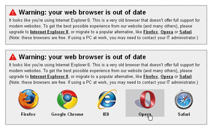
The first option is to create a prominent box somewhere on the site's homepage. A couple of starting-point examples are below. The first has a heading that warns that the user's browser is out of date, followed by a paragraph of text that includes links to modern browsers.
Article continues below 
WARNING: A simple and polite reminder is often all that's needed to convince someone to upgrade
The colours in our example are mostly grey (bar the red warning sign) and this would be a suitable colour scheme for most websites that use a white background; it's strong enough to stand out, but not excessively distracting. Obviously, for sites that have a different colour scheme, this design would need amending to suit.
One variant on the initial design provides icon-based links to current browsers. This is probably a bit much for most site designs, but it adds a splash of colour and could prove a useful aid to users who've seen icons for the likes of Firefox (or have even installed an alternate browser in the past, but haven't got around to using it) and therefore have a level of familiarity with them.
A box only really works on one page though, and users often discover websites via search engines and can enter via any page within the site's hierarchy. If your site has major problems in IE6, you may therefore want to add a small ribbon or strip to the top of every page.
Sign up for breaking news, reviews, opinion, top tech deals, and more.
If you use this method, make the warning copy as succinct as possible – no more than two lines of text. Otherwise, too much of the user's screen will be taken up with the warning, leaving insufficient room for the content they're trying to access.
Again, you should ensure that the warning stands out, but that it doesn't present a significant distraction from content elsewhere on the page.
Applying the warning
When you've settled on a design, you need to make use of conditional comments to apply it to your website. One way of doing this is by wrapping a conditional comment around the relevant code block:
Compliant browsers will just ignore the block entirely, treating it like a standard HTML comment; versions of Internet Explorer below 7 will display the block and more recent incarnations will ignore it.
This is the best method to display a single instance of a warning, but if you've decided to use a strip or ribbon on every page you might instead consider setting the display property of the warning div to 'none' in CSS and then overriding that to block through an IE6-specific style sheet attached via a conditional comment.
What about standards support ?
It's also worth bearing in mind that part of the reason so many web designers are falling over themselves to see the back of IE6 is because of its poor standards support. Therefore it's best to avoid doing anything particularly elaborate with the warning div and its contents.
Perhaps one of the most important factors to remember when designing your warning is that IE6 doesn't support PNG transparency. Normally, if you wanted to add a warning symbol or browser icons to a site, you'd use a transparent PNG to do so.
For an IE6 warning, you either have to flatten those images onto a background colour, or use a script such as Drew McLellan's SuperSleight JavaScript to get around the problem. Bear in mind that any limitations that brings, such as JavaScript not working if the user disables it, and the manner in which it deals with positioning, forcing box backgrounds to the top-left of the box.
In conclusion, keep it simple, keep it polite and reassure and assist IE6 users rather than having a go at them. There's no doubt whatsoever that the venerable IE6 will eventually have a market share so low that no one will really care about it any more. However, if we can all do a little to hurry that moment along, the web will be a better place.
-------------------------------------------------------------------------------------------------------
First published in .net Issue 190
Liked this? Then check out Opera not happy with browser-free Windows 7
Sign up for TechRadar's free Weird Week in Tech newsletter
Get the oddest tech stories of the week, plus the most popular news and reviews delivered straight to your inbox. Sign up at http://www.techradar.com/register
 Become a TechRadar Insider


