How Windows 8 touch relies on IE10
Windows 8 builds on new web standards

Sign up for breaking news, reviews, opinion, top tech deals, and more.
You are now subscribed
Your newsletter sign-up was successful
Join the club
Get full access to premium articles, exclusive features and a growing list of member rewards.
Is the full-screen touch interface for Windows 8 'just a shell' on top of Windows?
Not really; there isn't an application running like Media Center that you could shut down and it isn't just a browser – this is another mode for the interface that you can switch in and out of. But it is the browser that powers it.
Apps for the immersive Windows 8 interface are written in HTML5, JavaScript and CSS (and presumably, Silverlight – this is the IE10 engine and there's no reason for it not to run plug-ins) and packaged up in an AppX container.
Article continues belowIn fact, if you dig into the web standards support that Microsoft has added to IE10, it's clear to see that despite the resemblance to the Silverlight-powered Windows Phone 7 'Metro' interface, the layout of this new user interface is the biggest reason for adding those standards now.
One standard that Microsoft added to IE9, Media Queries, is always suggested as a way to have one web page display appropriately on different-sized screens – not just shrinking the page but reflowing the layout and adding or removing extra details to fit.
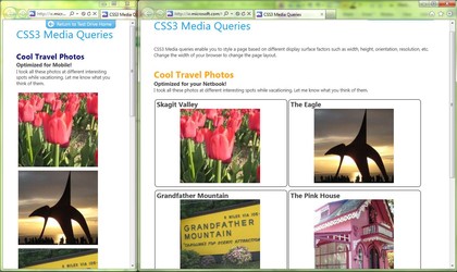
IE9: Media Queries change the layout of the page as you resize it
The IE Test Drive demo for Media Queries shows a page of pictures optimised for a smartphone, a netbook and a notebook or desktop: the images change size, lose the headline and caption and switch from a grid layout to a stack.
Sign up to the TechRadar Pro newsletter to get all the top news, opinion, features and guidance your business needs to succeed!
That's exactly the same change you see in the News application in the Windows 8 touch demo: when the app is full screen, you get large thumbnails with captions underneath them and the heading for each section has several links.
The layout is the same when another app takes up a slice of the screen, but when you slide the News app over so it takes up a smaller area, you only get one image and heading in each section and the images turn into small thumbnails to make room for the caption.
It's the same with the video player; as the window gets smaller the video doesn't just get resized – the layout changes with the title appearing underneath it, along with the playlist. That's exactly what you'd expect from an interface based on Media Queries.
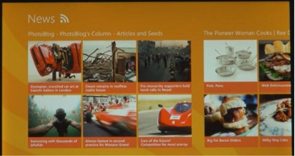
WINDOWS 8: When the News app is full screen, you get a page of large images…
Incidentally, Media Queries let you change the layout of a page based on the orientation as well as the size. So far we've only seen the Windows 8 immersive user interface in landscape format, but we've also only seen it on a breadboxed ARM system that would be pretty hard to pick up and rotate, so it's still entirely possible that there will be a portrait version of the interface.
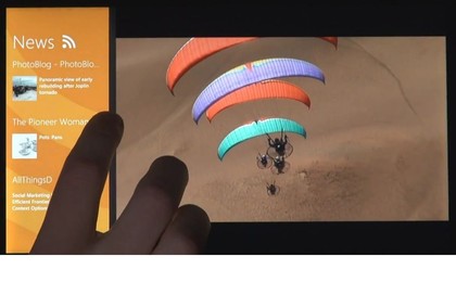
NEW LAYOUT: Drag the video player to take most of the screen and the News layout changes completely
Media Queries retrieve different layouts and views of the page from the server depending on the window size but getting a flexible layout in the first place takes a combination of three web standards only introduced in IE10 – including one that Microsoft came up with and only proposed to the W3C group that standardises HTML in April.
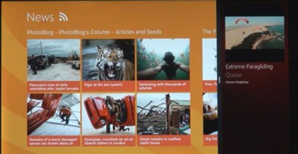
VIDEO THUMBNAIL: Give the News app more room and the video player changes layout instead
Mary (Twitter, Google+, website) started her career at Future Publishing, saw the AOL meltdown first hand the first time around when she ran the AOL UK computing channel, and she's been a freelance tech writer for over a decade. She's used every version of Windows and Office released, and every smartphone too, but she's still looking for the perfect tablet. Yes, she really does have USB earrings.
 Become a TechRadar Insider


