Best data visualization tool of 2025
Communicate your data effectively

Sign up for breaking news, reviews, opinion, top tech deals, and more.
You are now subscribed
Your newsletter sign-up was successful
Join the club
Get full access to premium articles, exclusive features and a growing list of member rewards.
We list the best data visualization tools, to make it simple and easy to transform raw data into graphs and charts so you can better investigate trends.
Data visualization can be used in the form of anything from presentations to workflows, each of which can benefit from better charts and diagrams to provide information visually.
Ultimately, data visualizations will provide clear indicators of trends from existing data, or present otherwise important information such as core tasks or assignments in management processes. Graphic representation of key data helps you to get the point across quickly, in a way that others will find easy to understand.
The key to visualization is simplicity in the presentation, no matter how it is applied, and irrespective of industry-specific applications of visualization.
Below we list what we think are the best data visualization tools and apps currently available.
We've also featured the best data recovery software.
The best data visualization tools of 2025 in full:
Why you can trust TechRadar
Best data visualization tool overall
1. Tableau
Reasons to buy
Reasons to avoid
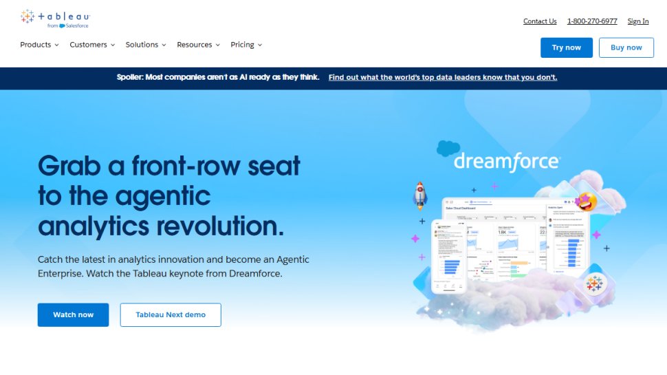
Tableau comes in strong as a market leader when it comes to showing how visualization can help with general productivity management. It's a flexible and powerful solution that provides for business intelligence, and it's with large data sets that Tableau really comes into its own.
Tableau offers a range of different software tools for data visualization, starting with Tableau Creator which allows for both a desktop and online version for individuals, to allow for the processing of data to output visualized analytics.
There are also versions for teams and organizations, either as a standalone to provide data mining with visualization and interactive dashboards, while there's also a version for live analytics processing with existing software apps.
Altogether, Tableau is a powerful analytics tool for producing all manner of useful charts and graphs, all of which make it easier to communicate insights and answers to questions with different levels of stakeholders.
Best data visualization tool for dashboards
Reasons to buy
Reasons to avoid
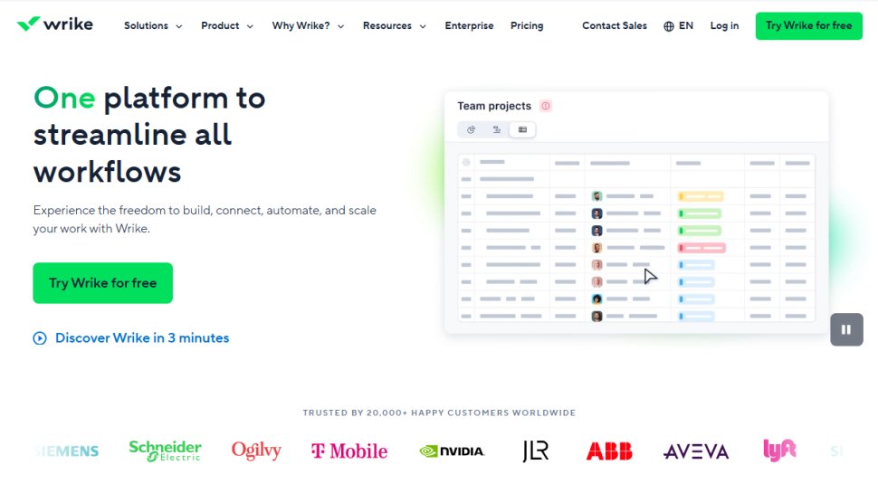
If Gantt charts and dashboards are your thing, Wrike should be on your data visualization tool shortlist.
Wrike makes it easy to create tasks and workflows, and then manage these tasks visually in a Gantt chart or calendar format. One feature that’s great about Wrike is that you can visually create custom workflows for your project.
Data visualization is also a strong point for Wrike, which lets you set up custom dashboard items that visually show the progress of key project metrics. In one quick view, you can see the status of each area of the project.
The free tier supports up to 5 team members and an unlimited number of collaborators. A series of paid tiers unlock additional team members and premium features, with bespoke options available for large organizations.
Furthermore, Wrike is highly scalable, with many integrations to other platforms and support for large teams.
Read our full Wrike review.
Best basic data visualization tool
3. Quire
Reasons to buy
Reasons to avoid
Quire allows you to manage and visualize projects that don’t require advanced functionality.
Quire works by letting you map out tasks and thoughts in a simple to-do list format that can easily be rearranged and assigned to team members. Once tasks have been defined in the app, you can visually organize and assign these tasks using a Kanban board built into the system. The software makes it easy to flip between task lists and the Kanban board as needed.
The beauty of Quire is that it also offers a number of visual representations of your task list that you can choose from, including pie charts, project summaries, and graphs. All the basic visual data representations are there except for Gantt charts, the one strike against this platform.
Overall, though, Quire delivers a streamlined interface that works very well for exploring workflows and improving project management. It strikes a good balance between simplicity and power, earning it a place among the best data visualization tools available right now.
Best data visualization tool for features
4. Targetprocess
Reasons to buy
Reasons to avoid
If you want all-in-one project management software that includes a host of data representation options, Targetprocess is for you.
Taking a dashboard approach but also working in Kanban and Gantt chart formats, Targetprocess basically gives your project the full suite of features. Complex task lists can be configured and rearranged, and it comes with a multitude of data representation views that can be added to the dashboard for quick progress assessment.
Targetprocess is geared towards agile software development projects, and it can be overwhelming in its feature set and clunky in its interface, but this solution visually represents data in more ways than rivals, and does everything a software project manager could want.
In summary, a comprehensive feature set makes this one of the best data visualization tools available for users who aren't intimidated by the wealth of options.
Best data visualization tool for flowcharts
5. Casual
Reasons to buy
Reasons to avoid
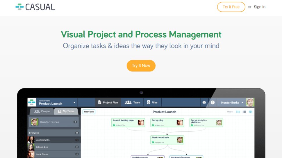
There are many ways in which you can visually organize your project. If your preferred style is flowchart-based organization, you’re going to love Casual.
Instead of Kanban boards or Gantt charts, Casual is built exclusively around a single flowchart interface where you organize projects by drawing lines between tasks, and assign team members to each step in the flowchart. Each team member gets a task list based on the flowchart, but essentially project managers that use Casual track progress through the single-pane flowchart.
In terms of price plans, all tiers share the same features. The only differentiating feature is the number of users. For example, the personal tier supports two users while the enterprise tier supports fifty or more. There is currently a free 14-day trial on all tiers, so you can see if it's for you before committing to an ongoing subscription.
Casual is easily the best data visualization tool if you prefer to work with flowcharts and have a project that can be represented in that format. If you want a range of charts and other ways to organize or manage a large team, however, Casual is not for you.
We've also featured the best mind map software.
Best data visualization tool FAQs
What are data visualization tools?
The best data visualization tools transform raw data from spreadsheets, databases, and other sources into easy-to-read graphs, charts, and other graphic assets.
Why would you want to do that? These visualizations help bring data to life, making it easy to see performance over time, trends, and other vital metrics. As well as being an excellent addition to reports and presentations, data visualizations can help you analyze your data in new ways, drawing out details you may have otherwise overlooked.
How to choose the best data visualization tools for you
The best data visualization tool for you will depend entirely on your business needs. If you simply want to look at your data in new ways, a standalone data visualization solution could be the best option.
However, if you want to connect data from various sources or monitor metrics in real-time, a cloud-based solution with advanced features would be more appropriate. There are also software packages that offer a complete project management suite, alongside data visualization tools. This would be a solid choice for companies that want one program to do it all.
How we tested the best data visualization tools
Where possible, we register for and use every program in our best data visualization tools guide. We use the software, recreating real-world use cases to assess ease of use and functionality. Where there are features beyond the scope of data visualization, we test these too to give you a full overview.
We also look at ongoing technical support and the price tiers, investigating free versions where available. If we can't physically test a piece of software, we consider information displayed on the company's website, peer reviews, and testimonials from existing customers.
Read more on how we test, rate, and review products on TechRadar.
Get in touch
- Want to find out about commercial or marketing opportunities? Click here
- Out of date info, errors, complaints or broken links? Give us a nudge
- Got a suggestion for a product or service provider? Message us directly
- You've reached the end of the page. Jump back up to the top ^
Sign up to the TechRadar Pro newsletter to get all the top news, opinion, features and guidance your business needs to succeed!
 Become a TechRadar Insider


