Better management through business-minded dashboards
Help is at hand from data-driven dashboards

Sign up for breaking news, reviews, opinion, top tech deals, and more.
You are now subscribed
Your newsletter sign-up was successful
Business runs at the speed of light, but keeping track of data can be a monumental challenge. How do you know whether that sales forecast from marketing is matching up with reality? When you launch a new corporate website, is there any way to see if users are sticking around reading about your new products? Plunging into the data takes hours.
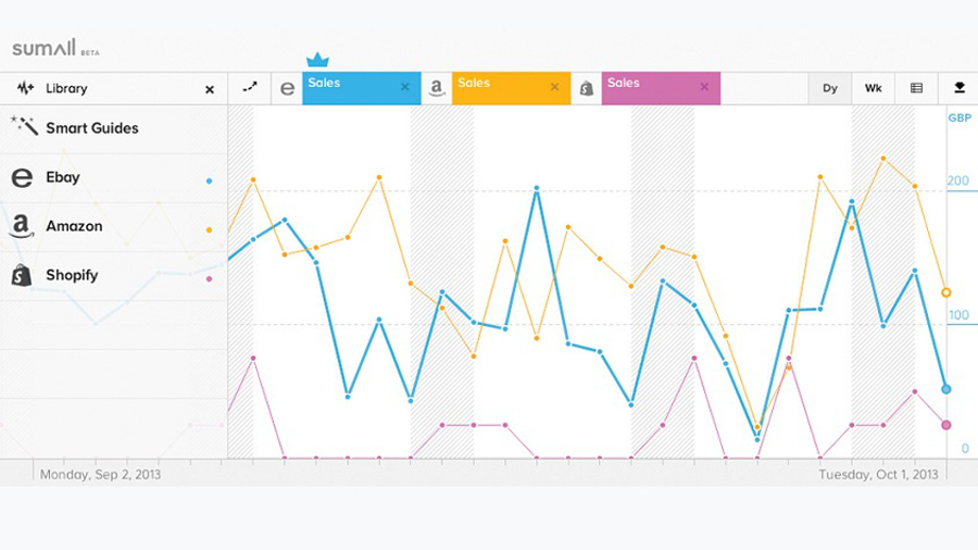
These business intelligence dashboards present data using some visual flair to help managers make sense of complex data with just a glance. They are highly configurable so the dashboard only shows the data most relevant to your business without inundating you with too much data.
What can they do? In the complex world of business management, a dashboard presents data in a way that encourages action and decision making. Good data means good decisions.
Article continues belowThese tools provide a quick glance at complex data like sales orders at an e-commerce site or how long visitors stay at a corporate site so managers can act quickly and correct problems. Without them, managers and employees have to drill into data sets and try to understand the summary, which can take hours longer when the goal is to understand performance and action items.
1. Cyfe
Web: http://www.cyfe.com
Billed as the "all-in-one" business dashboard, Cyfe seems to live up to that claim. It allows you to monitor websites including analytics like traffic and how long a new customer stays online, plus you can keep tabs on sales progress and support issues by department, and pull data from multiple sources like Salesforce.com or Google Analytics.
It's the rare tool that focuses both on business intelligence (sales and support) and web success (number of users engaged) at the same time.
Sign up to the TechRadar Pro newsletter to get all the top news, opinion, features and guidance your business needs to succeed!
Best feature: Clear presentation in a dashboard to help understand complex data streams. This means no wading through complex data or poorly contrived thumbnail views.
2. Domo
Web: http://www.domo.com
Domo is a powerful business intelligence dashboard which aims to help companies run their operations using a visual thumbnail approach. You can connect sources like spreadsheets, cloud apps, data warehouses, CRM databases, and social media activity. The dashboard is highly visual and shows large numeric data points like total sales, cash balances, sales order on record, and year-to-date expenses across the entire organisation.
Best feature: Focus on business intelligence data to manage sales, CRM, and social media. It means employees do not need to use as many dashboards.
3. Hootsuite Pro
Web: https://hootsuite.com/plans/pro
Hootsuite is focused on social media management, and the columnar dashboard presents a wealth of information in one main view. You can quickly see mentions for a brand, track multiple social media profiles, and respond to customer issues.
The dashboard supports multiple team members, scheduled posts, and admin approvals to help a large company track social media. Reports show detailed info about social media follows, mentions of a brand, and how many people are viewing a post about that new product launch.
Best feature: The columns that present social media data in one glance. This means those tasked with managing social media have more data to act on in one view.
- 1
- 2
Current page: Introduction and Cyfe, Domo, Hootsuite
Next Page Tableau, Geckoboard, GoSquared and SumAllJohn Brandon has covered gadgets and cars for the past 12 years having published over 12,000 articles and tested nearly 8,000 products. He's nothing if not prolific. Before starting his writing career, he led an Information Design practice at a large consumer electronics retailer in the US. His hobbies include deep sea exploration, complaining about the weather, and engineering a vast multiverse conspiracy.
