Why you can trust TechRadar
Office 2013 takes the clean, unadorned principles of what used to be called Metro design and applies Office 2013 takes the clean principles of the Microsoft Design Language and applies them to desktop apps. This puts your documents centre stage, with tools such as the ribbon fading slightly into the background. The ribbon looks much more spacious but takes up no more space on screen.
Office 2013 is also designed to showcase Windows 8 and the touch features (the same is true of the Windows RT versions). Even the desktop apps are ready for touch. Press the Touch Mode button that Office automatically puts on the quick address toolbar if your PC has a touchscreen and the layout of the interface changes, with bigger buttons and more space to touch them without pressing the wrong thing.
In the final version of Office 2013 this is a big improvement on the version you may have tried in the Customer Preview. Instead of a fiddly and confusing little round button it's a clear pointing finge. Tapping it brings up a mini menu explaining the differences – on big icons that you can easily press with your finger.
It's not perfect but it makes Office 2013 far more touch friendly but not too big and chunky to be efficient when you use mouse and keyboard.
These are several improvements to the ribbon compared to Office 2010. Word has a new Design tab on the ribbon, which is a more logical place for the formatting and page background tools previously found on the Page Layout tab.
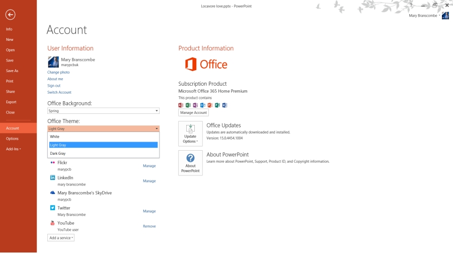
If you've seen the preview of Office 2013, the final version of the ribbon has some other subtle changes, making some of the tool icons clearer and crisper. The icons for the individual programs have also been redesigned to look better on the tiles of the Windows 8 Start screen.
The layout features are far better than in Word 2010; you can now embed videos directly into Word documents, or search your Facebook and Flickr accounts for photos to place in documents without having to save them first. These are both well designed, easy to use tools.
Sign up to the TechRadar Pro newsletter to get all the top news, opinion, features and guidance your business needs to succeed!
Getting your pictures in the right place is much easier with the new alignment guides that appear as you drag objects around (so you can see when the object is in the centre of the page or lined up with another element), and the layout options tool that appears so you can set text wrap.
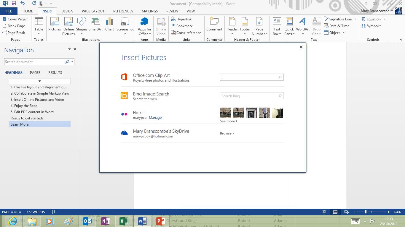
The alignment guides make it much easier to tweak Word Art quickly, instead of spending hours adjusting spacing and sizes if the default Word Art layout doesn't fit what you want to show.
The improved layout options may be why the new PDF reflow feature works so well. This opens PDF files as if they're Word files – converting the layout so you get a Word document that looks like the original PDF, complete with fonts, layout, images, tables, charts and page numbers and making it all editable. This is fast (for a two-page file it takes only a few seconds longer than opening the PDF in Acrobat Reader) and remarkably accurate.
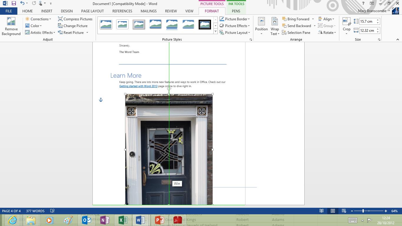
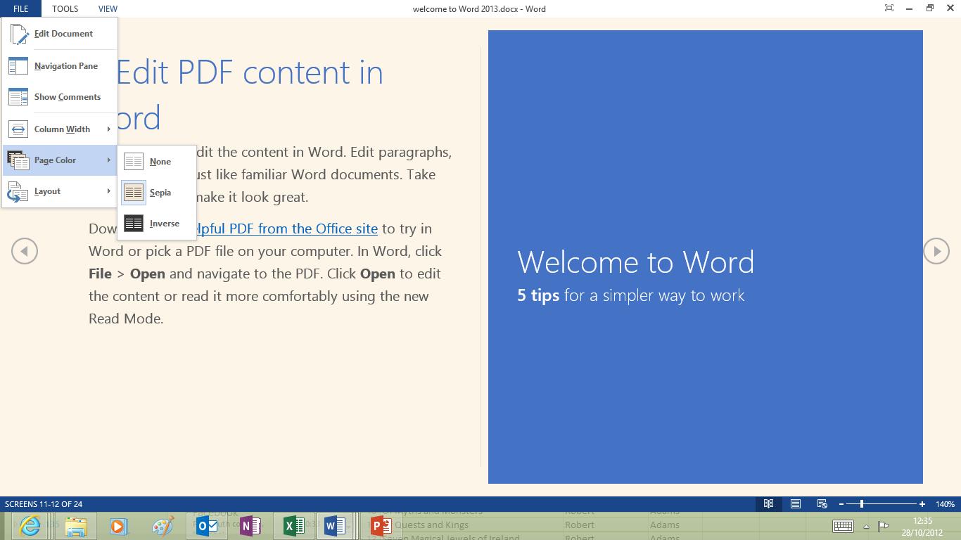
One option, Read Mode, removes most of the Word interface, reflowing documents to fit on screen with thumb-friendly buttons either side of the page. You can choose wide or narrow columns and set the page colour to sepia or even white on black. Tap on pictures, videos and charts to pop them out of the page in a larger window, or collapse sections you're not interested in (you can do that in page layout view as well).
But cleaning up the interface also means losing some useful tools; the handle that you can drag in Word to divide the document window into two scrolling panes (so you can see two separate sections of your document on screen at once) disappears, relegated to a button on the View ribbon so it takes twice as many clicks to get the split view.
Maybe you won't need it as often with the handles that enable you to collapse sections of your document under their headings or the vastly improved Navigation pane that turns document headings into a handy outline (you can even drag sections around in the pane). But when you do it shouldn't be more work than it used to be.
Also, the AutoCorrect features have disappeared from the menu when you right-click a spelling mistake; you have to go all the way into Word's huge Options dialogue to add corrections you want to use. Handy tip: if you're one of the handful of people who add their own AutoCorrect entries, pin the AutoCorrect dialogue to the Quick Access Toolbar on the ribbon.
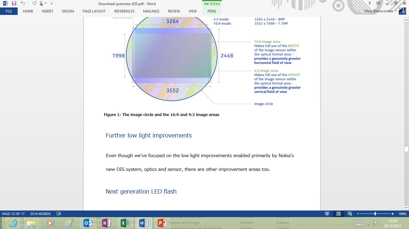
Office 2013 seems to be designed for widescreen tablets: for example, task panes are back. In what feels like a flashback to Windows XP, dialogues such as spell check sit at the side of your screen rather than floating over the document and obscuring a few lines.
Install a dictionary app from the Store on Office.com and you get definitions and synonyms for words below the spelling suggestions. This is useful, but is it worth that much screen space? On a high resolution screen on a 16:9 tablet, these panes at the side work well; on an older notebook your screen starts to feel cramped.
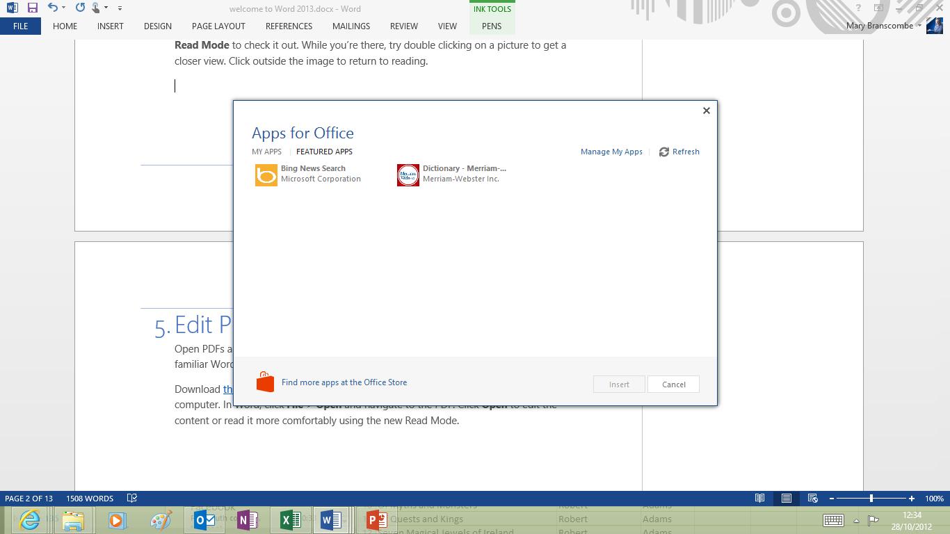
Thankfully, you can undock the Spelling dialogue and drag it around (and Office remembers your preference), but the default is for Office applications to spread out on screen and get comfortable rather than to cram in all the information and functions you're used to in the same small space. The newer your PC, the more you will like this.
The new interface is great on a touch-friendly widescreen tablet with the 1366 resolution you need for Windows 8 and space to spare (and even better at the 1920 resolution of a high end notebook), but it's a step backwards for working on multiple documents on a low resolution notebook or desktop.
Snap two windows open side by side and press F7 to start the spell check. In Word 2013, on a 12-inch 1024 x 768 screen, the 5-inch snapped window sacrifices 1.75 inches of space to the spelling task pane. Add the navigation pane and you see only a thin strip of your document in between. Do the same thing on an 11.6-inch 1920 x 1080 tablet and you won't find much to complain about.
Mostly the space is very well used. If you collaborate on documents with others, using tracked changes and comments, the improvements to these are extremely welcome and can save you hours of frustration. Instead of turning the page into a sea of red strikeouts and blue underlines to show deleted and inserted text, there's a new Simple Markup view that shows you the final version of the document with a line in the margin to show where there are edits.
Click it to see the details of those changes (which turns on the old All Markup view); click it again to hide the changes and keep reading. A speech bubble shows where there are comments to read; click to open a floating comment view that you can drag around the page, or switch to All Markup and see the comments in a wide margin at the edge of the document.
You can finally leave a reply to a comment rather than just leaving a comment nearby, and you can mark a comment as dealt with. This greys out the comment so it's not distracting, but it's still there if you need to refer back to it later.
If you're collaborating on a large document, Word 2013 (on a high resolution screen) is hands down the best way to do it, especially as having your document on SkyDrive or SharePoint means multiple people can edit it at the same time (they can't change the paragraph you're working on and you don't see their changes until you save when they're highlighted in green, so the page won't ever change without you knowing about it.)
Mary (Twitter, Google+, website) started her career at Future Publishing, saw the AOL meltdown first hand the first time around when she ran the AOL UK computing channel, and she's been a freelance tech writer for over a decade. She's used every version of Windows and Office released, and every smartphone too, but she's still looking for the perfect tablet. Yes, she really does have USB earrings.
