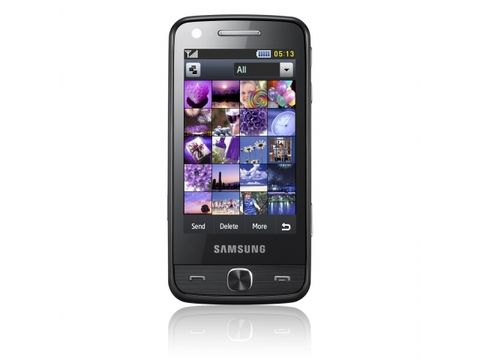
Why you can trust TechRadar
The TouchWiz interface is once again back in full force (and named 2.0 for good measure) after its main outing with the Samsung Jet S8000. It's a limited OS though, and while Samsung has put a lot of effort into honing it into something usable, it's still a little clunky and miles behind the simplicity of the S40 effort from Nokia.
Of course, Samsung believes that things need to be more than just menus, and to that end continues to plug away at the home screen widgets system.
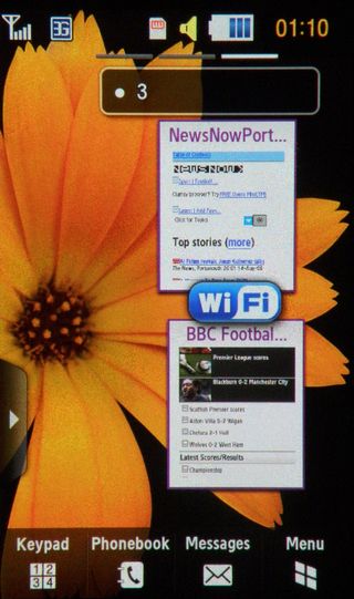
This means you can drag any number of widgets onto up to three home screens, which are accessed simply by swiping left and right, so you can group your work, play and whatever else together as you see fit. You can even store web clips - little thumbnails of your bookmarked internet sites - on here too for easy access.
There are some widgets that are more important than others - access to Wi-Fi and Bluetooth settings is great, but a link to Facebook and MySpace is less so. And we don't talk about the 'Go on a diet' application... it does nothing but count days and bring guilt.
Thankfully these can be altered in the settings menu, so you only have the widgets you care about on offer.
We've never been the biggest fans of the TouchWiz interface, mostly because of the way it handles applications, but we understand Samsung's need to put this on its feature phones in the same way LG has developed the S-Class UI for its less-than-smartphones.
What we cannot fathom here is that Samsung, having built a good camera into a phone and charged over £500 for it (we still can't believe the price) has decided to put its basic OS on there too. Surely the excellent implementation of the Symbian S60 OS, as seen on the Samsung i8910 HD, would have been a better choice here?
The touchscreen is decent though, ably helped by 3.1-inch OLED screen delivering deep and vivid colours. The touch response is once again improved, but the presence of a resistive screen is something of a disappointment. In fact, we were a little surprised at the resistive choice, as there's no stylus in the box, which Samsung has traditionally provided.
The Pixon 12 M8910's screen is probably up there with the best TouchWiz efforts Samsung has put out there, but it still doesn't react to the slightest touch in the way the iPhone and Palm Pre do (and now the HTC Hero as well). While it's not fair to compare this phone with any of those top-end smartphones in terms of functionality, for the price we expected much better.
For instance, some menu options ask you to double tap, most require a single input. But the annoying thing is there's no way to choose between the two. Internet browsing always requires a double tap on the hyperlinks - and we just can't imagine why.
We're not the most sausage fingered of users, but even we have problems with such an interface, and we imagine those with bigger digits will find themselves endlessly prodding at the smaller elements on the screen. For instance, to pick up a widget on the home screen and dump it back into the pop out list on the side takes dexterity and a half second wait - by now we'd be expecting this to be far more intuitive.
One other thing the Samsung Pixon 12 M8910 adds is the ability to unlock the screen by writing a letter on the lock display - not only was this a slow to respond system, it refused to recognise if we'd written a C (our unlock letter) and sometimes instead decided we'd written a T, which started another application.
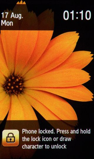
If a company is going to put a feature like this on the phone, it should include some pretty wide parameters, or else the rest of the world will do like we did and swiftly turn the feature off.
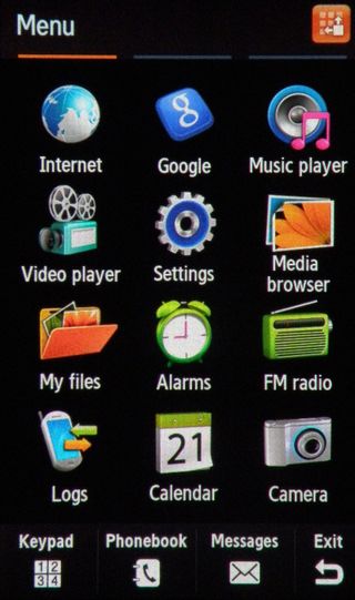
One new option is the ability to reorganise menu options from the screen itself - it's no 'hold and reorganise' as we've seen on other phones, but all you need to do is press a button at the top of the screen and drag icons around to your heart's content.
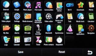
Samsung has followed Apple's lead with TouchWiz 2.0 and allowed you to view practically everything on the menu, with three displays taken up with icons.
Of course, with no application store, it's unlikely you'll be filling these up with any thing more, but you can take heart knowing there's no need to actually open a menu (God forbid) to access the calculator. Now you'll shave valuable milliseconds when needing to work out your portion of the bill.
Current page: Samsung Pixon 12 M8910: Interface
Prev Page Samsung Pixon 12 review: Overview, design and feel Next Page Samsung Pixon 12 M8910: Calling and contacts
Gareth has been part of the consumer technology world in a career spanning three decades. He started life as a staff writer on the fledgling TechRadar, and has grown with the site (primarily as phones, tablets and wearables editor) until becoming Global Editor in Chief in 2018. Gareth has written over 4,000 articles for TechRadar, has contributed expert insight to a number of other publications, chaired panels on zeitgeist technologies, presented at the Gadget Show Live as well as representing the brand on TV and radio for multiple channels including Sky, BBC, ITV and Al-Jazeera. Passionate about fitness, he can bore anyone rigid about stress management, sleep tracking, heart rate variance as well as bemoaning something about the latest iPhone, Galaxy or OLED TV.
