Why you can trust TechRadar
There are two properly new apps bundled with Mavericks: Maps and iBooks. Both are further efforts by Apple to bring aspects of the iOS ecosystem to OS X, and both are long overdue.
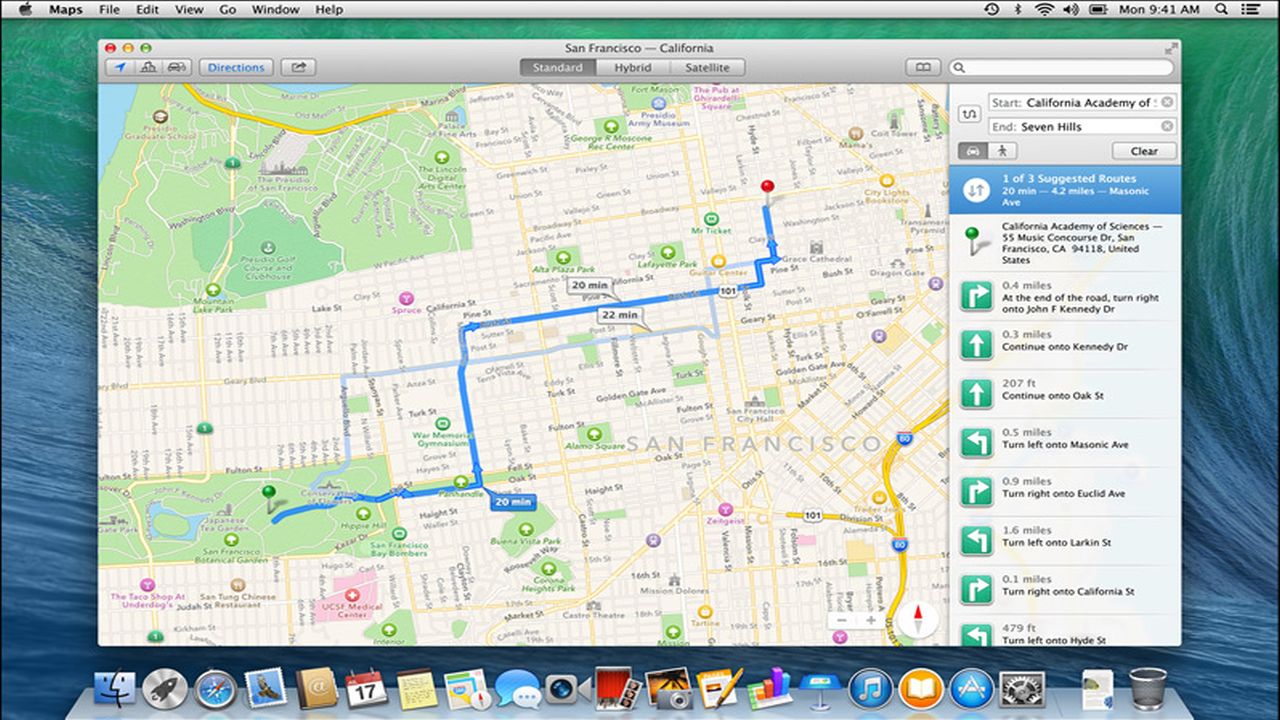
Maps will either prove a joy or superfluous, depending on how immersed in the iOS ecosystem you are. The app is a fairly straight translation from iOS, providing zoomable maps and driving/walking directions.
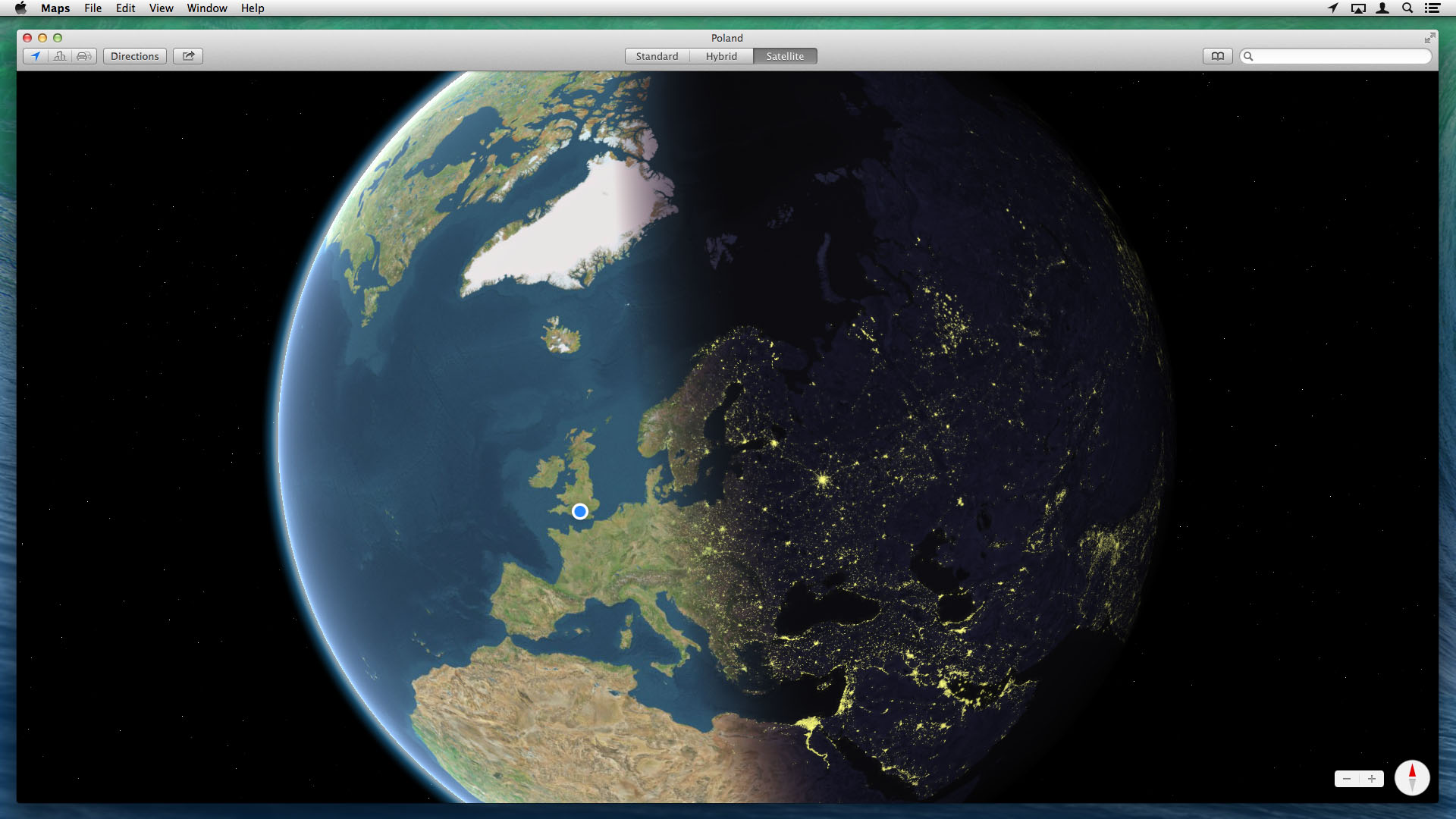
There's also Apple's half-hearted 3D zooming that Google Street View probably laughs at behind Apple's back, although Maps counters with a rather lovely fully zoomed out live view of Earth, city lights gleaming in the inky blackness of space.
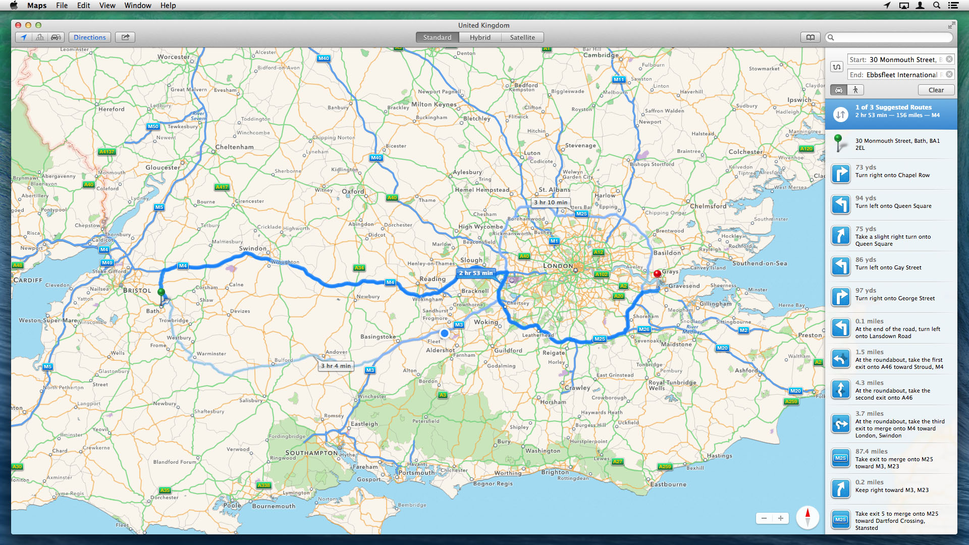
As with the iOS version, the data in Maps is uneven, but tends to be robust for postcode-to-postcode directions and poor for locating specific businesses. Sharing and export is also variable.
If you're running iOS 6 or higher, it's great - you fire a location or set of directions at a device and this instantly shows up in Notification Center.
Otherwise, you must send directions via other means: for example, email provides recipients with a vCard and a PDF.
This shows how Google's online-first mentality can pay dividends under certain circumstances, although there's no denying the user experience of Maps is otherwise generally superior to Google Maps in Safari - and, unlike Google, Apple also uses standard UK map colours.
Sign up to the TechRadar Pro newsletter to get all the top news, opinion, features and guidance your business needs to succeed!
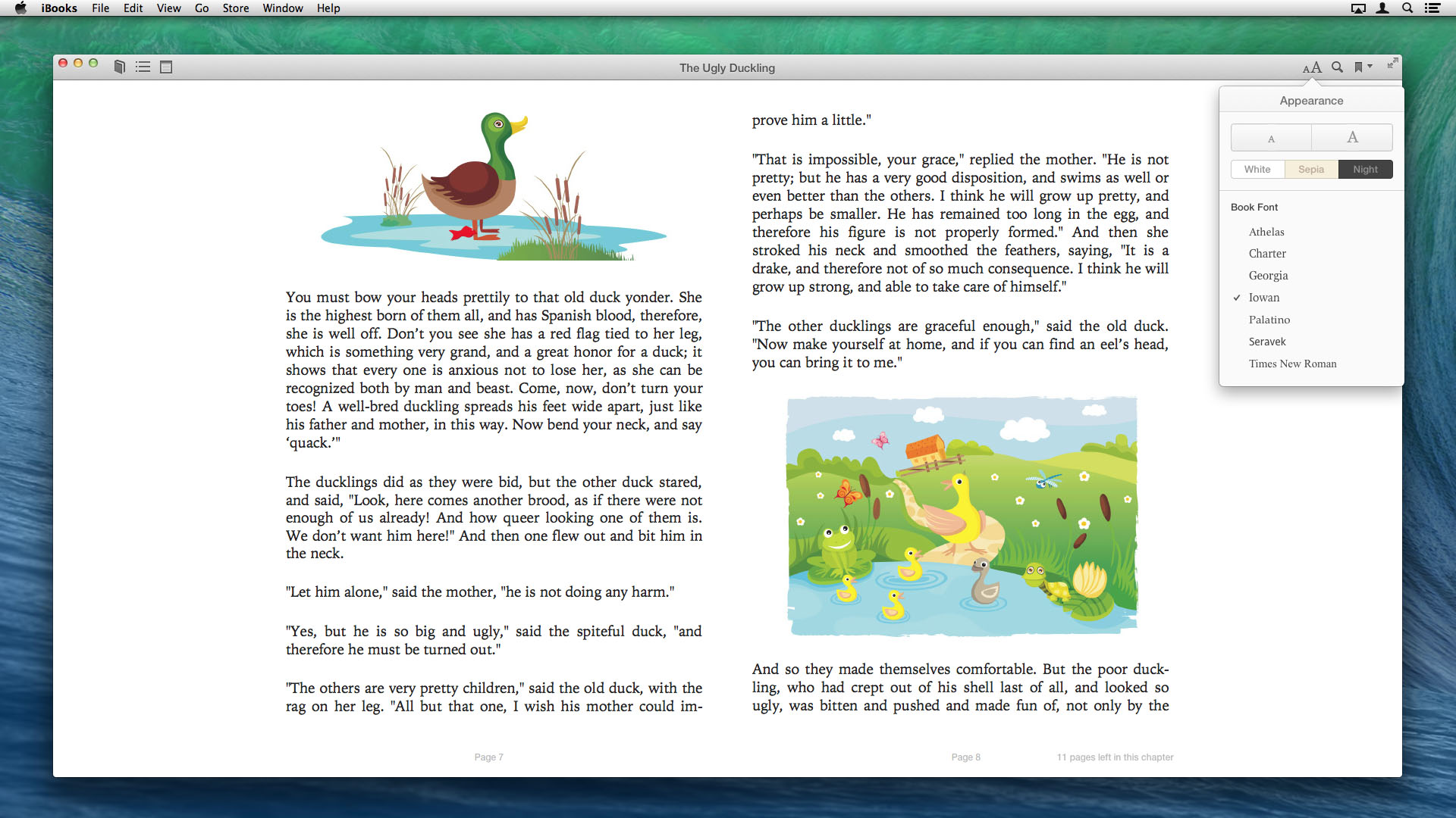
iBooks is a rather simpler affair, but we mostly loved it. The app doesn't seek to replicate the fake-book mess that iBooks is saddled with on the iPad. Instead, the chrome is basic and grey, and then almost vanishes entirely when you're reading, allowing the content to shine.
A smattering of reading adjustment settings is handled ably, and the app intelligently collapses from a spread to a single page as the window is narrowed.
Outside of books, it's a touch less impressive. The store is clunky and slow, like the Mac App Store, and although PDFs can be imported, Preview is required to view them. However, the reading part of iBooks is spot-on, making this a suitably impressive Mac debut. (Now roll on Newsstand…)
Notes, Contacts and Calendar
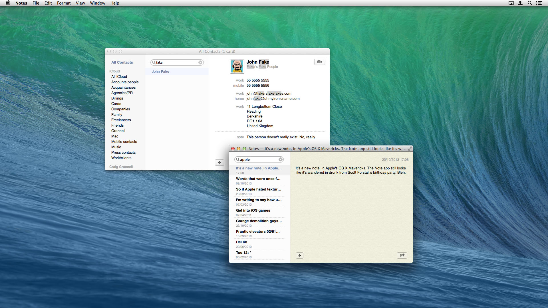
Three OS X apps are similarly notable to iBooks in being stripped of interface chrome. Notes, Contacts and Calendar are now rather plain and almost dull. However, in use, only Notes (which retains the most texture with a sort of drab yellow paper background) fails to impress, being a simpler but still ugly app.
Contacts no longer pretends to be a real address book, and works a lot better for it. There's no distracting interface "leather," but also the three panes - groups, contacts, details - can be resized. It works as you'd expect an OS X application to, rather than a book, and that alone is a big plus.
Calendar now also sets the right expectations. This is not a digital facsimile of a desk calendar, but a product that works within the realm of OS X.
Although initially appearing to be functionally identical to its predecessor, Calendar offers useful additions: week view has infinite scroll, rather than snapping to a predefined start day of each week, although controlling this was finicky on our test Mac with a Magic Trackpad and Magic Mouse.
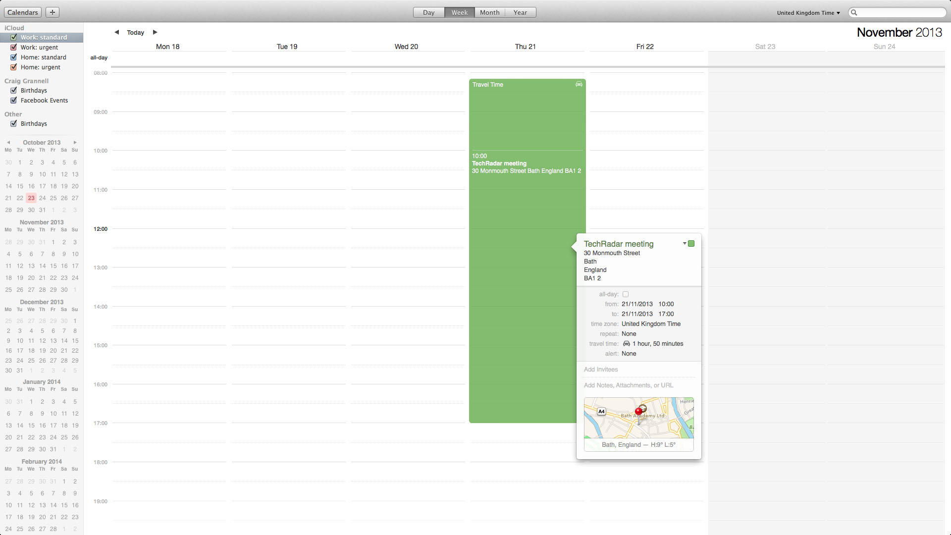
Individual items can also have mapping and travel times assigned if you include an address. Oddly, Calendar only bothers adding travel time to the start of an event, though, not the end. Presumably it imagines all your meetings are on the Enterprise, whose crew will benevolently teleport you home once you're done.
