How Windows 8 touch relies on IE10
Windows 8 builds on new web standards
Sign up for breaking news, reviews, opinion, top tech deals, and more.
You are now subscribed
Your newsletter sign-up was successful
That's the Grid Layout standard, which "allows us to align content and create regions within an app," according to Markus Mielke, a senior lead program manager on the IE team – and IE10 is the first browser to include Grid Layout.
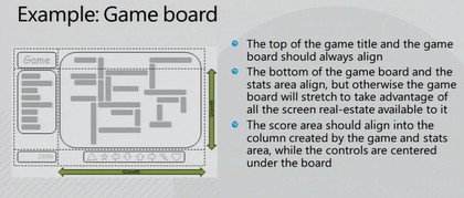
HOW GRIDS WORK: This IE10 tutorial shows how an app can be divided into regions that align and stretch…
Grids can have headers, footers, main sections and gutters to divide areas. You can define the proportions of the areas as fractions of the page and use layers and alignment to position content inside the grid rather than counting pixels. "If you're familiar with the WPF grid [for laying out applications], some concepts should sound familiar," Mielke points out and grid is ideal for web apps – including the Windows 8 user interface.
Article continues below 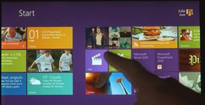
START GRID: The Start screen layout uses a grid of tiles…
Look at the way the tiles in the Windows 8 Start screen are laid out in grids, with three columns that can have one or two tiles in each cell of the grid, with a gutter between them to mark the edge of a 'page' (like the panoramas in Windows Phone 7 that means you can always see that there's more content than fits on screen). The Photo Feedr app has the same kind of grid layout, with different sized pictures arranged to fit into the grid.
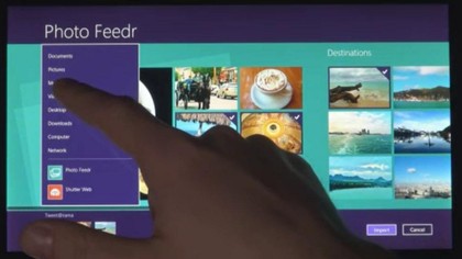
PHOTO GRID: …and the Photo Feedr app has a grid layout of thumbnails
Within the grid layout the elements of an app don't have to all resize or stretch in the same way; that's handled by the flexible box standard (flexbox for short). And when there's content arranged in columns that you want to reflow as the window changes size, that's done by the multi-column standard.
Sign up to the TechRadar Pro newsletter to get all the top news, opinion, features and guidance your business needs to succeed!
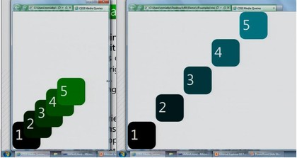
STRETCH: As you make the window larger, flexbox stretches the layout but keeps the boxes aligned.
The flexbox standard is "in flux," Mielke says and it's only just entering the working draft stage, which is about stable enough to fit the IE team's maxim of only implementing standards that are ready for developers to work with. But the multi-column standard he calls "super stable"; it hasn't changed since the end of 2009, so it could easily have been in IE9 on that basis. It's most useful when you have flexbox and grid layout as well and our guess is that the IE team waited until it could work on them all together in IE10 – so the Windows team could use them to build their interface.
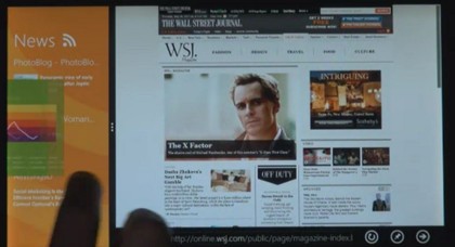
RELATIVE: Set the proportions for flexible boxes and different content areas get more of the space in a larger window
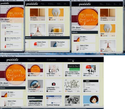
MULTISIZE: This IE10 demo app gets different layouts and content details depending on the window size – exactly the same principles you see in the Windows 8 touch apps
Another new standard implemented in IE10 is CSS3 transitions; the new HTML5 SkyDrive photo view uses this to rearrange image thumbnails using subtle animations as you resize your browser window – so the images flow into place rather than jumping. That looks very like the way the tiles on the Start screen flow into place as you scroll sideways.
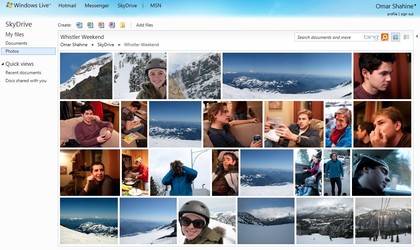
HTML5 SKYDRIVE:Animated transitions rearrange your photos and SkyDrive keeps the aspect ratio (like flexbox)
"If you think small you should not forget big as well," Mielke says of web apps; "it's not just about small devices, it's also about scaling up." Similarly the Windows 8 immersive interface isn't just for tablets; we're expecting a variant for big screen systems – perhaps one you can control with Kinect.
Mary (Twitter, Google+, website) started her career at Future Publishing, saw the AOL meltdown first hand the first time around when she ran the AOL UK computing channel, and she's been a freelance tech writer for over a decade. She's used every version of Windows and Office released, and every smartphone too, but she's still looking for the perfect tablet. Yes, she really does have USB earrings.