 Become a TechRadar Insider


As a long time Windows user, I've seen the good, the bad, and the ugly. Not the least of which was coming to the realisation that it would be quicker for me to hop in my car and drive the 12 minutes to the office than trying to boot my aging Windows 2000 machine to address a couple of "quick" work things from home.
But about a year ago I switched to a Surface, and I'm really impressed with the way Microsoft has taken the bull by the horns to address their customer needs with Windows 10.
- Everything we know about Windows 10
Of course, trying something new rarely comes without a few unforeseen obstacles. But Microsoft is making some much needed progress. Their epiphany of moving towards the Universal App strategy is a long time coming and will clearly contribute to their success and adoption as new consumer touch points manifest.
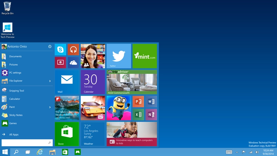
Article continues belowWhile the UI for Windows 8 made leaps and bounds with regards to stability, the one thing that really has confounded me from a user standpoint has been the "Start" experience, which is a rewrite of the screen with the metro style.
There have been few times in the past year that hitting the Microsoft Windows Key has not been followed with hitting the Desktop App on metro to get back to more of the classic Windows OS view. Far from an ideal user experience.
In Windows 10, the best update is bridging that gap between the new and the old by taking the old start widget and combining it with the metro style. It is the very definition of a perfect union. I especially like how you can drag menu items directly from the start widgets and make the metro objects.
And not only that, you can resize and organise them into sections and groupings based on how often you use them or how they relate to each other. This is highly compelling for users looking for a more intuitive experience.
And this brings me to another excellent feature: Task View. Task View is based on the notion of having multiple levels defined across multiple screens. In the past few years, it is clear that we humans need 2-3 screens operating simultaneously to be content. Because if one is good, more has to be better, right?
Well, hat's off to Microsoft for taking this experience to a new level. A layer of abstraction added between the tool bar and the screens allows you to switch between an unlimited amount of multi-screen experiences.
Honestly, I'm not clear from the beta how they have one application running across multiple levels. It seems like there are still some things that need to be worked out – either that or some professional orientation is needed.
Microsoft, in spite of the press and the wild success of Apple, continues to lead the way in desktop business usage. And with Windows 10 we are headed to a far better place than we've been before.
Adam Wolf is the CTO of digital marketing agency, Possible.