Why you can trust TechRadar
OneNote 2013
OneNote 2013 is the best hidden secret in Office, a note taking application that's easy to use, organised like a paper notebook and crammed with features.
You can link notes to the original document, or a meeting from your Outlook calendar (handy to get the agenda or job titles and the correct spelling for everyone's names), or send information from any file or web page into OneNote. Insert an image and optical character recognition picks up any text in it automatically.
You can take audio and video recordings of meetings and have your written or typed notes time synced to them (a feature that's sadly missing in the Windows RT version).
OneNote now enables you to embed even more information – embed Excel and Visio files and you can see the live content in your notebook. The table tools are much better than in previous versions, and you can turn a table into an embedded Excel spreadsheet to get more formula options.
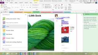
All the Office 2013 applications have the Touch Mode button; the core apps (but not Publisher or Access) also have a Full Screen Mode button next to the minimise and maximise buttons.
Instead of just hiding the ribbon, status bar and most of the rest of the interface to enable you to concentrate on your document (as it did in the Customer Preview), this now brings up another mini-menu letting you choose between hiding the ribbon, only showing the ribbon tabs or showing the full ribbon. This duplicates the little arrow on the ribbon that collapses the commands, but it's easier to find if you don't already know how the ribbon works.
OneNote has an even more extreme view that hides everything but the notebook picker (and the button to get the rest of the interface back), leaving you the full page to take notes on - ideal on a tablet. Click the arrow at the top of the page and your note expands to fill the screen or see the normal interface.
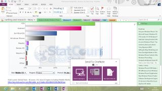
There are some new ways of presenting tools that can get irritating. OneNote's handy screen clipping, Send to OneNote and quick note features are combined into an odd pop-up window that showcases these useful options but proves intrusive once you know what they are and how to get to them, and the pop-up doesn't even close properly.
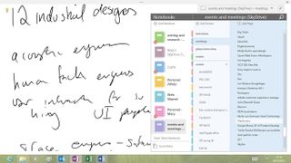
It also commandeers the Windows-N shortcut for making a new quick note (renamed from side note because it's not really at the side of the screen and hasn't been for several versions), so you have to press Windows-N N. Thankfully Windows-S still works for clipping information from anywhere on screen into your notes.
It's hard to show new users an important feature without irritating experienced users by getting in their way, and you can turn off the popup. But the detailed options for choosing where different types of information go when you send them to OneNote are very welcome; you can set default folders and other options for email, web pages and other sources individually.
OneNote was the first application to sync between PCs, onto SkyDrive and the OneNote web app and to a wide range of smartphones. That now includes Windows RT; what's rather confusingly called OneNote for Windows 8 is a free WinRT version of OneNote.
This has a large proportion of the OneNote tools, and even more touch features, although it only opens notebooks you keep on SkyDrive.
Select text in the OneNote WinRT app with your finger and you get the new radial menu - the finger equivalent of the mini Office bar that fades into view when you select text with a mouse, and even easier to use than the finger-sized version you get in the Office 2103 desktop apps.
You can tap to choose a pen colour, then swipe round to pick the shade you want. Tap to change text size and swipe round to pick how large you make it.
There's an undo button and a button to apply tags. This puts the most useful OneNote features quite literally at your fingertips, with the radial menu appearing on the right of the screen, where your thumb is if you're holding a widescreen tablet in both hands (as you might notice, Microsoft has definite views about how most people will hold tablets).
You might have seen something in the Microsoft Research Inkseine prototype app, which takes those ideas and makes them so easy to use it will give you a reason to like Windows RT. This should help OneNote come out of the shadows and get the recognition it deserves.
You might have seen something in the Microsoft Research Inkseine prototype app, which takes those ideas and makes them so easy to use it will give you a reason to like WinRT. This should help OneNote come out of the shadows and get the recognition it deserves.
Access 2013
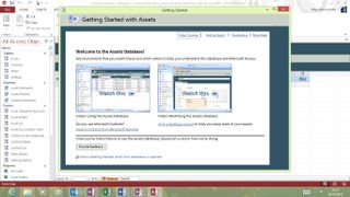
Access continues its journey to being less a database and more a database app development tool. It has the same clean new interface as the rest of Office and that carries through to the applications you can build and the controls you put in them.
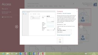
You can still create both desktop and web apps as well as SharePoint lists, but web apps now run on SharePoint or Office 365 and now look like WinRT applications, complete with an app bar and other navigation options.
Publisher 2013
Publisher gets the same tool for inserting pictures from online services as Word and PowerPoint (but not videos, even if you're creating a web publication), and the same task panes and formatting tools, as well as the rest of the new interface.
It even has Touch Mode, which is probably more useful for checking publications than laying them out. Oddly for a DTP package, it's one of the last applications to keep the small floating spell check dialogue.
Replacing and switching images is far easier than in previous versions. Publisher now puts new images you insert in a column in the scratch area rather than dumping them all on the page. Drag an image from the scratch area or elsewhere in the layout until it's over an existing image and a pink highlight appears around the existing image; let go and the new image appears there instead.
If you want to use an image as a full page background you can just right-click and choose Apply To Background (as a fill or a tile). There are also lots of new formatting options for images and text.
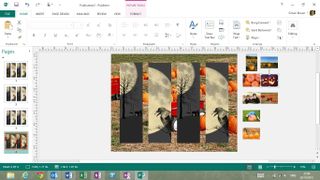
We like the new 'photo printing' option that saves each page of your document as a JPEG; ideal if you want to use a photo book printing service to create an album as a keepsake using your own layout.
Publisher already had features ranging from a full set of alignment guides to support for OpenType stylistic alternates to 'building blocks' for creating common objects such as pull quotes, banners, calendars, adverts and more. These new features may not be major but they're certainly welcome and this is a powerful DTP package that's easy to use.
Mary (Twitter, Google+, website) started her career at Future Publishing, saw the AOL meltdown first hand the first time around when she ran the AOL UK computing channel, and she's been a freelance tech writer for over a decade. She's used every version of Windows and Office released, and every smartphone too, but she's still looking for the perfect tablet. Yes, she really does have USB earrings.
