Why you can trust TechRadar
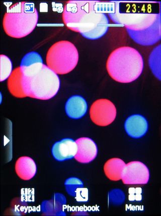
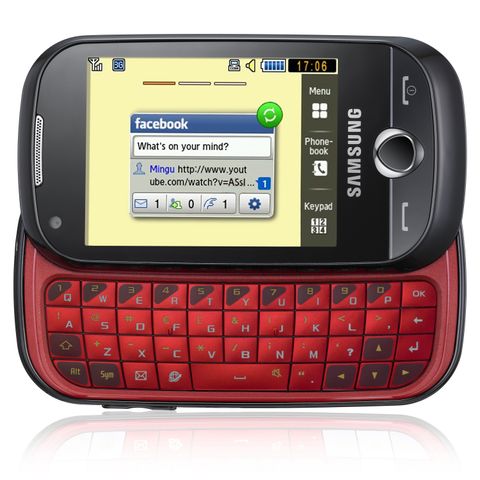
The Samsung Genio Slide uses a version of the TouchWiz user interface Samsung has rolled out on many of its touchscreen models, which incorporates onscreen widgets for the phone's home screen.
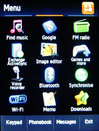
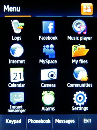
Brought up onscreen by a tap of the central menu button or one of three onscreen buttons at the foot of the display (marked Keypad, Phonebook and Menu), the main menu system is arranged in familiar grid formation.

Rather than one menu screen, however, there are three main menu screens, with up to 12 icons on each screen representing applications and features (again similar to the Samsung Jet).
Users can slide between screens with a sideways finger stroke, bringing a nicely usable spread of features to hand without having to delve too deeply into sub-menus to find useful apps.

As well as being visually attractive, it's more intuitive to see key apps laid out like this.
The main menu icons can easily be rearranged to suit how you use the phone, so you can cluster certain applications together if you prefer.
Four buttons remain consistently at the base of the display as you swipe through the main menu – Keypad, Phonebook, Messages and Exit – giving handy access to core functions.
The resistive touchscreen responds well enough to finger action. The user interface allows enough room for fingers to select and scroll without any major mis-pressing issues.

The screen isn't as slick to the touch as the iPhone 3GS or the HTC Legend or other higher end models, and doesn't gave the kinetic scrolling feel of such devices, but it isn't noticeably laggy, and haptic feedback acknowledges presses.
It feels comfortable enough to use without being particularly whizzy. We'd have preferred visible scroll bars in some sub-menu lists (these appear only when you're scrolling) so that you don't miss options as you flick through, but otherwise the menu system was straightforward to handle in a functional way.
Current page: Samsung Genio Slide: User interface
Prev Page Samsung Genio Slide: Design and handling Next Page Samsung Genio Slide: Widgets
