TechRadar Verdict
Yosemite does make compromises in its quest to integrate further with iOS, but there's a lot to like here, and some really neat new features.
Pros
- +
Free upgrade
- +
Easier than ever to switch between iOS and OS X
- +
Can make phone calls from your Mac
Cons
- -
Hefty system requirements for Continuity
- -
Pulls users ever deeper into Apple universe
- -
Increased translucency will be problematic for some users
Why you can trust TechRadar
Note: The successor to OS X 10.10 Yosemite, OS X 10.11 El Capitan, can be downloaded from the Mac App store. It introduces a ton of new features including a split-screen view, Spaces Bar and under-the-hood performance improvements. Not sure if you want to upgrade? Check out our OS X 10.11 El Capitan review. If you're interested in what might be coming after El Capitan, here is everything we know about OS X 10.12, which is likely to be unveiled at WWDC 201 in June.
Original review follows...
Yosemite is the second version of OS X since its reboot last year, when Apple switched from naming its annual OS X updates after big cats to places in California. It also neatly side-stepped the problem of where to go after 10.9 by avoiding the use of numbers altogether (although they do still exist in the geekier parts of the OS like System Information, where Yosemite is referred to as OS X 10.10).
So, what's new? Quite a lot, actually, and nearly all of it in the name of greater consistency between OS X and iOS. That's not to say that Apple is gradually merging the two operating systems – there's no evidence at all that's on the agenda. Nevertheless, several alterations and additions in Yosemite do tie OS X more closely with iOS 8.
Even in the early days of its tenure, Yosemite can already be counted as a success in one way. According to metrics company Net Applications, Yosemite accounted for 36.6% of all instances of OS X, setting a new Mac adoption record in the process. Like OS X 10.9 Mavericks that came before it, Yosemite was made available as a free download, racing out of the traps on October 16. In comparison, Mavericks, which hit the App Store on October 22, 2013, gained a Mac-only user share of 32% after its first month of availability.
Apple has released an update to Yosemite, bringing the operating system to version OS X 10.10.3. The new update brings a number of performance improvements, bug fixes, enterprise features, support for the new Force Touch touchpad, a new Photos app, improvements to Wi-Fi and Bluetooth performance and more racial diversity with emoji. Additionally, 10.10.3 expands the number of supported Macs that can use 4K, 5K and Ultra HD TVs.
Interface
The most obvious change, visually at least, is the new interface. Yosemite does to the Mac what iOS 7 did to the iPhone and iPad. Its user interface is flatter – though not flat, there are still drop shadows and other nods to the third dimension, it's just that now they exist for a purpose rather than being merely eye candy. No more glassy textures.

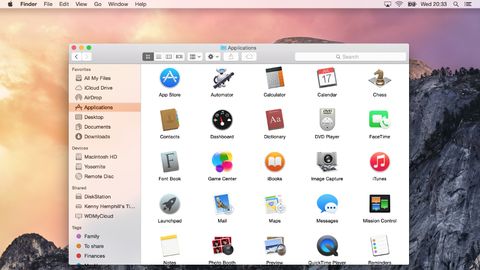
There's more translucency in Yosemite than its predecessor, Mavericks. Where once it was limited to the Finder's menu bar, it now pops up in lots of places, including Finder menus and the sidebar of Finder windows. It's been tweaked so that the underlying image is blurred and less distracting than in Mavericks, but we suspect it will still be a love it or hate it feature. If you do hate it, you can 'reduce' it in the Accessibility pane of System Preferences.
- Want to get more out of OS X? Check out these OS X Yosemite Tips & Tricks from Mac|Life!
Perhaps the most controversial change in Yosemite's user interface, however, is the switch in font from Lucida Grande to Helvetica Neue – another alignment with iOS. It takes a bit of getting used to, and for some it will never be right, but we found ourselves warming to it over time.
Some of OS X's application icons have changed to resemble their iOS counterparts. iTunes, for example, now has a red icon instead of a blue one.
Finder
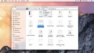
Not a huge amount has changed here, but there is one key addition: iCloud Drive. Your iCloud storage drive now shows up in the Finder and you can drag and drop files and folders to it just like any other location. It also displays the files you've opted to store there from apps like Pages, Numbers, and Text Edit.

Folders are now a brighter blue, but Apple hasn't taken the opportunity to rethink its confusing implementation of tags, which is a great disappointment. For those of us who used to mark Finder files and folders with a specific colour to indicate action that needed to be taken, for example, the tagging system is an irritation more than an aid.
Dock
The shelf has gone, which will be a great relief to many, and the Dock has now reverted back to its original format, a rectangle. Not so good is the loss of the Dock preferences from the Apple menu – to change things like magnification or show/hide, you must now pay a visit to System Preferences. However, on the plus side, the dock is fairly customisable using a free app called cDock, which allows you to change the dock's theme, add spacers, show only active apps and more.
Windows and buttons
The traffic light buttons at the top left of windows have, like everything else in Yosemite, lost their glassy texture and are now flat matte red, amber, and green. But there's a more significant change – the green button now acts, by default, as the full-screen switch in apps that support full-screen use. The arrows at the top right corner of windows are gone. In apps that don't support full-screen operation, the green button reverts to its regular duty of maximising windows. Holding down the Option (Alt) key also switches the green button from full-screen to maximise.
Dark Mode
Brand new in Yosemite is Dark Mode, which turns some aspects of the OS a much darker shade of grey, to make it more comfortable to use your Mac in dim lighting. These include the Finder menu bar, Dock, and application switcher. During the beta period some elements of Dark Mode, such as Finder menus, were poorly implemented, and it remains to be seen whether they have been fixed in time for the full release.

