Why you can trust TechRadar
Nokia's new operating system, Symbian^3, has a lot that feels familiar about it, while offering some interesting new stuff.
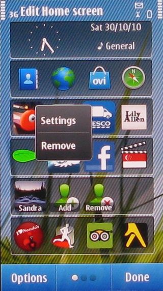
You get three home screens that you can fill with widgets and shortcuts. That's a big step forward for Nokia, although the process of stepping through the screens is still a bit clunky.
The handset doesn't respond to finger sweeps as quickly as we would have liked. Having come to the Nokia C7 straight after the ultra responsive HTC Desire HD we really noticed the time lag between sweeping and the screen actually moving.
Rather like Windows Phone 7, the home screen system is a bit constrained. In both cases, widgets have to be the same size and Symbian^3 can accommodate six on each screen.
We can see precisely why Nokia likes this idea. When you tip the screen into wide format, the widgets neatly rearrange themselves.
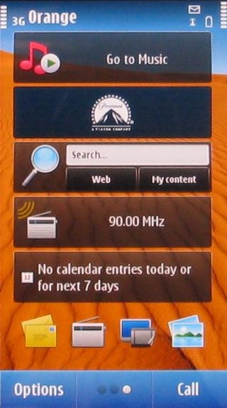
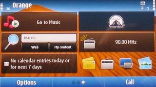
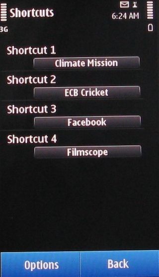
And you've got some flexibility in that a widget can contain an application controller, such as for the media player or FM radio, information such as calendar or Facebook updates, or app shortcuts – four on a widget and six widgets per screen means a max of 24 app shortcuts on a screen.
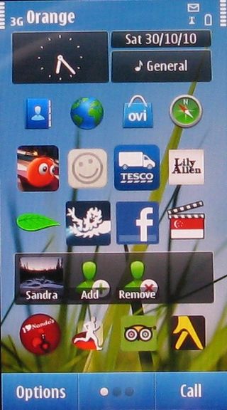
But setting things up can be a pain, especially for app shortcuts. On an Apple or Android handset, you just tap and hold and app icon to put it onto a main screen. In Symbian^3, there's a lot more tapping to go through. The multi-stage approach makes the lure of dropping that great new app you just acquired onto a home screen much more of a grind than it is with Android or the iPhone.
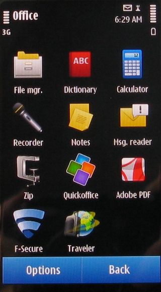
When it comes to the main apps menu, Nokia shows that it doesn't have a clue how the modern smartphone user likes to work. Instead of offering one straight list of all the apps on the handset, Symbian^3 falls back to the old S60 days of nesting.
Take the File Manager for example. To find it, you need to choose Applications from the main menu screen, then choose Office, because that's where Nokia thinks the File Manager should be. Ditto the voice recorder, calculator and a number of other apps.
There's one other aspect of the interface that needs a bit of attention. Voice commands. The idea always sounds like fun, but tends to turn out to be a bit silly. Who really wants to talk at their phone to launch an app? The touch screen should be all you need.
In the case of the Nokia C7, the voice commands system proved a waste of time.
To start the process, you tap that side-mounted Voice Commands key we mentioned earlier – on the right-hand edge of the chassis. Then say a command and you get a choice of possible matches that pop up on screen. If what you want is at the head of the list, wait a second and it will kick in. If what you want isn't at the head of the list, scroll around and tap what you want.
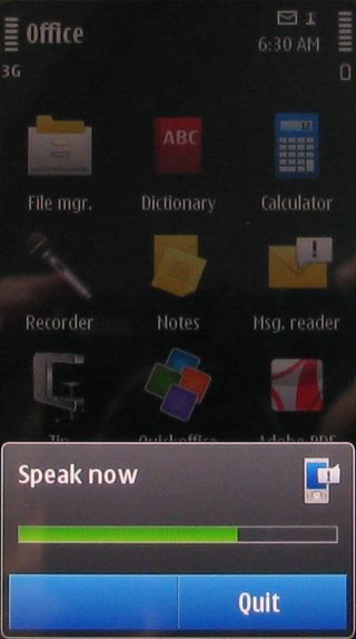
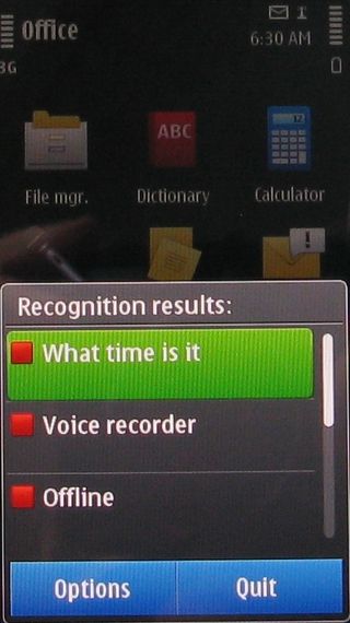
So, we said "Facebook". But the handset offered us things like the voice recorder and music player. Turns out that to launch Facebook you have to say "application manager", then tap the screen to choose "installed apps" then tap again for Facebook.
So we tried a different tack and used a phrase we found out is available by looking at the commands list – "What time is it?" This was recognised first go, so we waited a second and a horrid computerised male American voice said, "It is one oh 15." Frankly, we'd rather glance at the clock on screen.
Add in the fact that the button is a bit of a fiddle to press, and you can deduce that we left this feature alone pretty quickly.
Current page: Nokia C7 Interface
Prev Page Nokia C7 Overview Next Page Nokia C7 Contacts and calling
Meta’s massive OS announcement is more exciting than a Meta Quest 4 reveal, and VR will never be the same again

World's fastest broadband connection went live down under — Nokia demos 100 gigabit internet line in Australia in record-breaking attempt but doesn't say when it will go on sale

Don't miss the Samsung Galaxy S23 Ultra for just $849 at Best Buy right now
