Why you can trust TechRadar We spend hours testing every product or service we review, so you can be sure you’re buying the best. Find out more about how we test.
Features and setup
- Helpful notification system
- Can’t fully delete messages
- Proprietary OS needs some work
When discussing the MyKronoz ZeTime’s features, it would be good to note that things would have been better if the watch had a full-fat version of Android OS (let alone Wear OS). Instead it’s got its own proprietary OS (due to having real hands) which does an okay job, but lacks the slickness of Android’s operating system.
It’s the little things like being able to open up an email, read it on the watch and delete it from both watch and server. This is something you can't do on the ZeTime and it's frustrating.
Then there’s the lack of an app ecosystem. Sometimes you don’t miss it - as you can do things like control your music through the dedicated app, track fitness and receive pretty much all your phone notifications on your wrist - but there was a constant ache to pair it up with the Google Play store and download something like Strava.
If that’s sounds like a thing you'll miss, the ZeTime is not for you.

Other features include a heart rate sensor, proprietary charging - we actually really like the charger that sits under the base of the watch - the ability to set up activity goals, an anti-loss alarm and 'find my phone' functionality.
Setting up the MyKronoz ZeTime is done through the accompanying app. The app is fine. It’s the main place where you can see all the data you’ve accumulated through the watch, namely steps, distance, calories and how long you’ve been active for. You can also see this data on the watch, thanks to an activity screen - a screen that uses a similar circle system as the Apple Watch.

When you initially set up the watch, you have to prime the real hands with the software which means a lot of winding the crown to move the hands to the corresponding areas the app wants you to.
This part of the calibration process is fiddly but also rather fun - so much so that it's easy to forget that it isn’t mechanics that is controlling the hands but a CPU.
Performance and battery life
- Three button setup is fiddly
- Decent activity tracking but this isn’t a sports watch
- Proprietary OS needs some work
The screen resolution is something that will irk some. You have to look close, but when you do pixels start to appear, making some things on the watch a little blocky. It’s there on a number of screen faces and if you are staring at the screen in stark daylight.
It’s a minor quibble but one that would be quickly resolved with improved resolution. At least when you do turn it on, it’s lovely and bright.
To turn the screen on it’s a case of pressing one of the three buttons, or activating the 'flick to wake' option. The top and bottom lozenges will let you access whichever your main watch face is. Press the crown once and it will offer a nice glowing version of the watch time, highlighting the real hands.
It’s the real hands that are key to how the ZeTime works and maybe the reason why battery life is so good with the device. With every other smartwatch, you need to ‘wake’ it to do it’s prime function of tell the time. This is not the case with the ZeTime, the hands are there for you to see.
Yes, they are in front of a rather uninspiring black screen but they are there, so no button presses are needed. The ZeTime, thanks to its traditional watch elements, is the perfect at-a-glance smartwatch - it’s only when you try and start to use the smarts that things don’t always go to plan.

The first issue is the slightly confusing button setup. The upper button is there as a ‘home button’. You can press it to get the main smart screen up, but then it’s designed to be pressed to get you back to the main screen, no matter what menu you are in.
The lower button is a bit like the upper button but will only take you back one screen. So, if you are in Spotify and before this had looked at the calendar, you will be transported back to the calendar; click again and you will get to the main screen. And if you are already on the homescreen, this acts as a quick link to your calendar.
We spent a lot of our time mindlessly clicking them both and either getting lost or finding ourselves back at the home screen when we didn’t want to be.
The smart crown makes a bit more sense. You can use it to scroll through apps you are currently using. It’s worth noting that every time you go onto a screen with text to read, the hands of the watch automatically go to the 9:15 position, so they are out of the way of the words. It’s a neat touch and it never grew boring watching the hands assume this position.

The watch face is easily interchangeable. To switch it out, you just hard press on the main screen for a second and choose from the myriad variations on offer. Activity checking is a right swipe from the main screen and is showcased by a number of color rings. The data it collected wasn’t that extensive.
Step counts seemed accurate but you wouldn’t want to use this watch in full-on marathon training, it has a lack of GPS for a start.
The heart rate monitor again was okay, but the readings were something that we used out of interest instead of as part as a bigger fitness plan. The same with the sleep tracking, nothing made the ZeTime shout that it is a watch for activities. And while there is 5ATM waterproofing, we wouldn’t choose the ZeTime to track our swim strokes either.

A left swipe is the main menu, a swipe up is for notifications and one down will give you shortcuts.
You can navigate the main menu with the smart crown. While you can also do this by tapping the screen, it was much more intuitive to use the crown to navigate this area. This is also because the ZeTime’s screen never felt as quick or as intuitive as we wanted it to when swiping through it.
There is also the ability to reject and accept calls from the smartwatch - the call will actually take place on your phone but we found ourselves using this bit of functionality a number of times, especially when we were on our commute with Bluetooth headphones on.
And that brings up back to the battery. Even with moderate use throughout the day, we easily got three days out of the ZeTime. Having the hands tell us the time at a glance was a big help in keeping the ZeTime’s battery use under control. And when this does run out, the hands will keep working for a round 30 days which is another great USP for the watch.

Verdict
The MyKronoz ZeTime is truly unique in the smartwatch world. The addition of real hands is inspired and elevates what is a standard smartwatch away from mediocrity. Under the hood there are issues, though.
The screen is low res (compared to similar-priced rivals) and occasionally sluggish. The proprietary OS isn’t a patch on Wear OS (or Android Wear 2.0) but this doesn’t stop us from admiring the thing.
It’s a Kickstarter success that offers something that makes it standout from the smartwatch pack with niggles that will frustrate but, hey, real hands!
Who’s it for?
This is the smartwatch for those straddling the line between wanting something on their wrist that’s primed for the digital age but still has traditional charm.
The only issue with this is that they will have to put up with a halfway house of a device, that doesn’t quite win either way.
Should you buy it?
For the price there are better, more competent smartwatches on the market. But there aren’t any that lack the USP that the ZeTime has. If you prefer something more watch than smart, this is for you.
The competition
The MyKronoz ZeTime isn't the only smartwatch you should consider - here are some of its rivals...
Skagen Falster
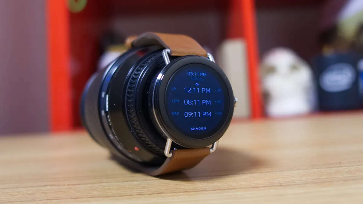
The Skagen Falster makes a tremendous first impression, looking like it should easily cost twice its price tag. But middling battery life and a lack of distinguishing features put form a bit too far ahead of function.
- Read our full Skagen Falster review
Nokia Steel HR

The Nokia Steel HR may be on the expensive side of fitness tracking, but it has a gorgeous design and could be a great choice if you don't want a normal fitness tracker.
If you're looking for a device that will encourage you to go on the odd jog or walk around more, the Nokia Steel HR will be a great option for you.
- Read our full Nokia Steel HR review
LG Watch Style

The LG Watch Style was built in close collaboration with Google so you can expect its best qualities to set the precedent for what we're likely to see more of this year. And – good news – what's here is more or less exactly what we'd hoped to see.
But some of the familiar pain points of Android Wear, like the worse-than-expected battery life, are here, and unfortunately not likely to go away any time soon.
- Read our full LG Watch Style review