Why you can trust TechRadar
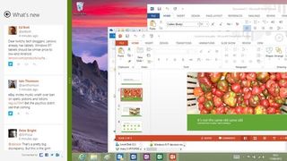
The final version doesn't bring back the Windows 7 style Start button or the Start menu. Instead it moves a little further still from the Windows 7 look towards the flatter 'modern' look of the Start screen that started with square corners to windows and square, flat edges to tabs in the ribbon interface of desktop apps rather than curves.

The most obvious difference is that Aero Glass is all but gone; the title bars and borders of windows are no longer translucent so you don't see a blurred version of the window underneath. It's an open question as to whether this was ever more a useful feature than a gimmick; it made it easier to see what window was behind the one you were working in, but it could also be distracting.
And it certainly chewed up battery life and graphics power than can be put to better use hardware accelerating applications. If you're used to it the difference can feel just a little jarring at first, but remember that the Office 2013 applications will have solid title bars to make the small icons of the Quick Access Toolbar easier to spot.
The taskbar retains a certain amount of transparency; you can still see hints of the darker elements in your desktop background image under the taskbar but it picks up a hint of the window colour rather than having the background show through as completely as in Windows 7.
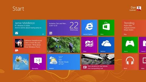
The effect is to blend the look of the desktop and Start screen a little more; they remain different experiences, but without glassy edges to windows the contrast between desktop programs, the Settings bar and the Start screen is much less dramatic.

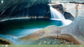
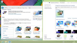
The default wallpaper is a simple flower photograph (meant to make you think 'fresh as a daisy', perhaps) and there are two new themes, earth and flowers – neither as whacky as the Start screen designs. Of course you can still choose from a multitude of free themes on the Microsoft site, including the panoramic Nightfall and Starlight theme that stretches across multiple monitors

There's no denying that Windows 8 is a different way of working; press the Start key on your keyboard and yes, you get the Metro Start screen. But if you roll your mouse into the familiar left-hand corner you get a thumbnail of the Start screen. Right-click there and you get a handy menu of most of the admin tools you need in Windows, from Task Manager to Event Viewer to the Run dialog.
You can Search, open Explorer or Control Panel, run tools such as Disk Management, Device Manager or Power Options. (It works in the Start screen as well.) It includes Mobility Centre – the handy collection of shortcuts that the Win-X keyboard used to bring up in Windows 7. Frankly, this addresses any complaints we had about losing the old Start menu; there are neat and efficient ways to get to everything you want in the desktop without ever taking your hands off the desktop or having to see the Start screen unless you want to.
On the other hand, you need to get used to the charm bar in the desktop as well as in the Start screen and 'modern' apps. Again it ghosts in to view when you put your mouse into the right corners of the screen. Like the app thumbnails in the switching pane, this hints at what you can do without getting in the way of working with windows and controls on the edge of the screen.
The Share charm doesn't work in the desktop, though it appears for consistency. Search takes you to the same full-screen search as it does from the Start screen. Settings is especially useful on the desktop; you can jump to the control panel, personalisation, PC info and help or get the finger-friendly PC Settings screen. That's the same whatever programs are running, because desktop programs can't link their options to the Settings bar, so you do have to do things different ways depending on whether you're using a 'modern' or desktop application.
But compared to the jumble of ways you could navigate to key tools, control panels and utilities in Windows 7, this is a streamlined and efficient interface - and once you pin your key apps to the taskbar the same way you would in Windows 7, you never leave the desktop unless you want to.
One welcome feature from Windows 7 survives but it's hidden; although it's no longer marked specifically as a button until you hover your mouse over it, when you press or click on the very end of the taskbar you get the full Aero Peek behaviour of minimising all open programs and showing you the desktop. Click again to get all your windows back.
Contributor
Mary (Twitter, Google+, website) started her career at Future Publishing, saw the AOL meltdown first hand the first time around when she ran the AOL UK computing channel, and she's been a freelance tech writer for over a decade. She's used every version of Windows and Office released, and every smartphone too, but she's still looking for the perfect tablet. Yes, she really does have USB earrings.

