Why you can trust TechRadar
These days, if you're putting out a mid-range smartphone, you're in the widgets business. The Nokia C6 is no exception, with a multitude of quick content on offer straight away.
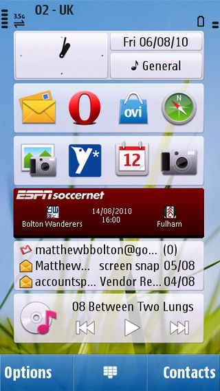
The Home screen is divided up into six rectangles, effectively. Each space can be taken up by a widget, which are all uniform in size.

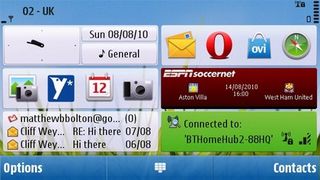
It's a great idea in practice, because it means you can can see them all in a column of six when in portrait mode, or in two columns of three in landscape mode, without any formatting change in the widgets themselves.

Different widgets vary in functionality and connectivity. Just going with content on the phone, there are two 'shortcuts' widgets, which consist of four icons each, which just take you to apps on the phone. These four shortcuts can then be customised to go to whatever app you like.
There's also widgets for Favourite Contacts, Calendar, Music Player and more.
Conversely, the email widget enables you to set up your email account and then see the subject line and sender of the two most recent emails you've received. We'll go into the connected widgets in more detail in the Internet section of the review.
For the record, our Home screen of choice was two shortcut widgets (slightly altered from their defaults to include Opera Mobile instead of the default browser and a Twitter app), the included ESPNSoccernet widget, the email widget and the music player.
The default setting was to include Facebook and Favourite Contacts instead of ESPN and the Music Player.
There's a small quirk of the Home screen that you'll probably encounter accidentally for the first time: if you swipe to the side on the Home screen, you find that everything but the static date/time/profile widget disappears.
"But Nokia don't advertise a second Home screen," you probably aren't shouting at your screen. But if you were, you'd be right.
Nokia said nothing about more than one Home screen, because there is only one. All the swipe does is hide the widgets, or bring them back. It's also possible to do this with a long press on the Home screen.
We're not entirely sure what the point of this is. So you can look longingly at your wallpaper of your best gal? After all, if you just don't like widgets, you can actually just remove them.
In any case, while the Home screen is primarily designed to be navigated using touch, you can also scroll around it using the D-pad on the slide-out keyboard. On the phone in general, the keyboard is often preferable for certain fiddly things (moving between text boxes, for example).
Sliding the keyboard out switches the C6 into landscape mode automatically. In fact, when you first unbox the phone, this is the only way to get it into landscape mode. There's an accelerometer built-in, but screen rotation is turned off by default, for some bizarre reason. Pop into the Sensor Settings menu to turn it on.
We've no idea why this wouldn't be on by default, but there you have it. There's no animation when going to landscape mode – whichever app or menu you're in just reappears in widescreen.
Sliding out the keyboard is also a way to instantly unlock the phone from sleep, as is pulling the lock slider-switch on the phone's side.
Otherwise, pressing the central key on the front will bring up a 'Swipe to unlock' screen, which can be really fiddly until you get used to it.
The reason is that the touchscreen just isn't that sensitive – or accurate. Of course, a stylus or fingernail is always going to get you better results on a resistive screen, but your first few days with the phone will likely be fraught with unheeded jabs.
Compounding this are two particular issues with the OS. The first is that some menus require you to double-tap what you want to choose. The first time selects it with a green highlight, and the second one to actually, definitely choose it. It's needless, and annoying.
This is combined with an operating system that is, quite simply, laggy. It's slow to respond, and when you combine that with not knowing whether the menu you're in requires a double-tap, you can end up staring at the phone like a lemon, not knowing whether your press was registered but response was delayed, or you need to press again anyway.
The worst part of the C6's lagginess is when waking up from sleep mode. It's not unusual for the screen to take 4-5 seconds to come on, and that includes when someone calls or texts you.
Seriously, if the phone is on the table in front of you and rings, if you want to see who it is before answering, you have to just sit and let it ring until the screen finally deigns to arise. It's ridiculous.
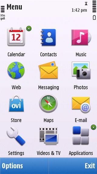
When it finally comes on, you hit the central button from the Home screen to bring up the main menu. From here, you can access most of the phone's primary functions, including Contacts, Messaging, the default web browser, Photos, Ovi Maps, Ovi Store, Applications and so on.

This is a grid view by default, but you can also view it as a list.
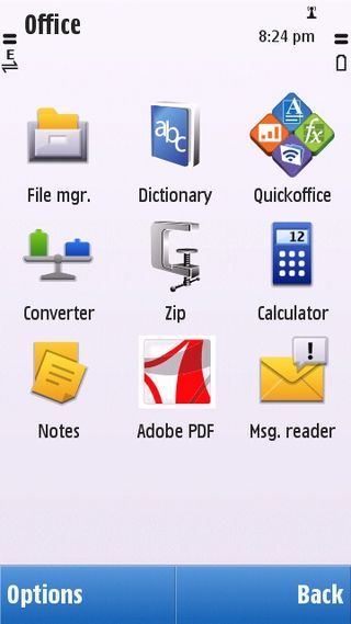
Enter Applications and you get deeper into what the C6 can do. You can find the File Manager in among these options, which will enable you to browse anything you have stored either in the phone memory or on your memory card.

It's all old hat for Nokia users – or even Symbian users in general. We'd wager pretty much anyone over a certain age (about 18) will find this interface familiar from some point in their mobile ownership history.
Different applications will sometimes have their own style – it's not as universal as apps on something like the iPhone tend to be. The Ovi Store is simple enough to navigate, though it doesn't offer much flexibility. It's not something you'd be keen to just browse through.
The Nokia C6's interface works well for the touchscreen in terms of layout and intuition – just poking around for a bit will usually teach you where you need to go – but the lack of accuracy means that you will find yourself using the keyboard often.
We don't see that as a massive downer though – after all, that's what the keyboard is there for. It's really the lag and occasional lack of responsiveness that concerns us as far as usability goes.
Current page: Nokia C6: Interface
Prev Page Nokia C6: Design Next Page Nokia C6: Contacts and calling
