Using Linux to map routes and walks
Map your trails and share them with the world
You could host all the JavaScript files on your own server.
However, you will ensure that you get all the latest fixes (and new bugs, too) if you refer to the library on the remote site.
If you are using Google Maps or the Ordnance Survey, make sure that you are using a valid API key. The key is locked to your domain name and won't work on a different site.
If you are using OpenStreetMaps, the Cycle Map layer is also the best for displaying walking data, as it displays contour lines. The code displaying the map layer is in a single JavaScript block. First, you declare some variables that tell the map what latitude and longitude it should be centred on. Various other attributes, such as showing the LayerSwitcher and the Pan and Zoom bar, are also defined. Now, you need to add the layer that displays your GPX track on the map in its own layer.
'Carneddau' is the name of the track that is displayed in the LayerSwitcher. If you want to display more than one track, just copy this section and then change the values appropriately.
// Add the Layer with the GPX Track
var lgpx = new OpenLayers.Layer. GML("Carneddau", "carneddau.gpx", {
format: OpenLayers.Format.GPX,
style: {strokeColor: "green", strokeWidth: 5, strokeOpacity: 0.5},
projection: map.displayProjection });
map.addLayer(lgpx);
Next, you define the layer that will show your Points of Interest:
Get daily insight, inspiration and deals in your inbox
Get the hottest deals available in your inbox plus news, reviews, opinion, analysis and more from the TechRadar team.
// Load our Points of Interest
var pois = new OpenLayers.Layer.Text( "POI", { location:"poi.txt",
projection: map.
displayProjection
});
map.addLayer(pois);
Finally, you can add a marker to show where you started and finished the walk.
// Add a marker to show the start point.
var size = new OpenLayers.Size(21, 25);
var offset = new OpenLayers.Pixel(-(size.w/2), -size.h);
var icon = new OpenLayers.Icon('http://www.openstreetmap.org/openlayers/img/marker.png',size,offset);
layerMarkers. addMarker(new OpenLayers. Marker(lonLat,icon));
You must define a div in the body section of the page where you want the map to appear. Note that the name of the div is the same as the layer used to define the map; being imaginative, I called it 'map':
When the page is loaded, the body.onloaded() function calls the Javascript init() function that loads all the map data. When you click on the thumbnail displayed in the POI, the full-sized photo is displayed in a pop-up window. The pop-up is created using JavaScript using the URL embedded in the text file containing the data for the POI.
Elevation charts

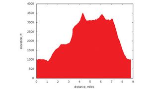
I often want to visualise my GPX track as an elevation chart, which displays height against distance. If, as we've said, GPSBabel is the Swiss Army knife of GPS data, Gnuplot holds a similar status for graphs.
You can generate charts via GPSPrune (which uses GnuPlot), but it's much more flexible if you use GnuPlot directly. We're going to use the Python gpxplot script, written originally by Sergey Astanin, but forked by the author to provide more functionality. This fork is available on Github at https://github.com/geekinthesticks/GPXTools.
The script reads data from a GPX file and can output charts in several different formats. Run ./gpxplot.py --help for a summary of options. You will also need to install gnuplot.py, which is available for most distros.
If you don't have gnuplot.py installed, using the --gprint option will generate a GnuPlot script, which you can pass directly to GnuPlot from the command line.
To plot a chart of distance travelled against altitude to the screen:
./gpxplot.py --output-format gnuplot --y-axis elevation \
--x-axis distance --tzname 'Europe/
London' \
--imperial --file
arneddau.gpx
The default output is metric (height in metres, distance in kilometres), passing the --imperial option will show elevations in feet and distances in miles. If you want to output the plot to an image file, rather than the screen, use the --image option, followed by a filename.
The image format is determined from the filename extension, so --imagetrack.png would create a PNG file. Other supported output formats are GoogleChart, Gprint, table (columns separated by spaces) and orgtable (tables in Emacs org-mode format).
Times in GPX files are normally expressed in UTC format. If you want to show your data in local timezone format, use the --tzname option and pass the time zone in the following format – 'Europe/London'.
GnuPlot has many options to set colours, titles and a whole raft of other parameters. If you want to tweak the output, create a Gprint file and edit this to produce the formatting that you require. The edited Gprint file can then be used as input to GnuPlot to generate your final graph.
Conclusion
We have covered only the basics in this tutorial - there's lots more you can do. For example, you can add map layers for the Ordnance Survey and Google Maps, so your users are able to switch between different maps.
In addition to getting all the code for this article from the archives, you can get updates from the author's github repository at https://github.com/geekinthesticks/Plotting-gpx-Data-and-Showing-Geotagged-Photos-Using-OpenLayers.
