How does this behaviour help when you're trying to identify edited photos? Imagine we have a JPG file, and we re-save it using our photo editing software to give two versions: the first generation and the second. We make no other changes - it's the same image at the same size. The two images will look very similar to the naked eye.
Now we 'subtract' the second image from the first. The second compression will produce a set of data that's very close, but not exactly the same as the original. This means, in effect, that the subtraction of the pixel values will produce numbers close to, but not exactly zero.
Since zero is black, we get a darkish image with random 'noise', and that randomness will be spread evenly across the difference image. Areas that encapsulate edges will be coloured differently, but still will show even, random noise.
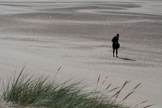
FIGURE 1: A JPG photo saved directly from a RAW photo from a Canon Rebel XTi
Figure 1 shows an original image (it was converted to JPG format from RAW) and Figure 2 the shows difference image created by comparing it with a second-generation copy. As you can see, it's just random noise, evenly spread throughout the image.
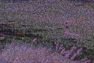
FIGURE 2: The Image Error Analysis image from the photo in Figure 1. Note the even, random noise
What researcher Dr Neal Krawetz discovered is that, if the image is altered, the altered areas become much brighter in the difference image - there will be visible 'hot spots'. This happens because the alteration leaves artifacts in the pixel data, which are magnified by the compression process.
Get daily insight, inspiration and deals in your inbox
Get the hottest deals available in your inbox plus news, reviews, opinion, analysis and more from the TechRadar team.
Consider the workflow: you have a JPG, you make changes to it and save it (it is therefore a second-generation image). Krawetz's process then creates a third-generation image in order to calculate the difference. The changes show up more. At least that's the theory.
In my own experiments (for example, cloning out the person in Figure 1), it's still hard to discern changes, Projects Editor Alex Cox asked me to try out this theory on some 'after' images he provided (see 'Spotting the fakes', below).
All in all, forensic image analysis is in its infancy, with much work needed to better what sharp-eyed viewers can do. And it's an arms race: with Adobe Photoshop's automated tools for touching up photos, it's becoming harder and harder to spot the fakes.
Spotting the fakes: Stourhead
1. Inspect the photo
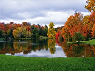
This is lovely image showing a view of the changing autumn leaves at Stourhead in Wiltshire. My first thought is to see whether the reflections in the lake show something that's not in the rest of the photo. Has the editor cloned out some people, or removed a car from the photo, perhaps? Note that even though it's autumn, there are no leaves visible on the grass in the foreground, but there are some elsewhere.
2. Zoom in, if possible
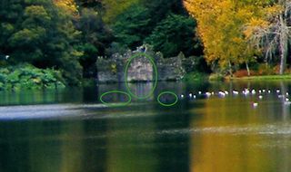
If you have the image available in a large enough resolution, you can zoom in on areas of interest identified during the visual inspection. Here, for example, I can see that there's a strange-looking blue reflection in the lake by the ruin that's not matched by anything at the ruin. Also, coincidentally in the same area, there are some obvious masked-out splotches that might have been ducks on the water.
3. Use the JPG image error analysis tool
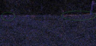
Make sure the photo is online, then go to http://errorlevelanalysis.com. I cropped part of the foreground to the right (the tool only accepts small photos) and fed it in to give the difference image above.
The randomness isn't even - the grassy area has darker splotches (possible evidence of a cloning brush). Note the hot spots along the dividing line between water and land: something's been changed here too.
Spotting the fakes: Pulteney Bridge
1. Inspect the photo
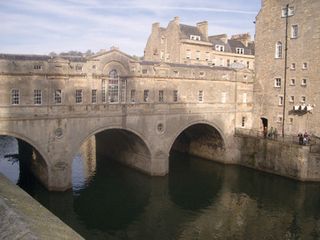
This is a shot of Pulteney Bridge in Bath. This time the reflections in the water aren't as valuable: the water is too turbulent. The most obvious edit here would be to remove some people, but that doesn't seem to be the case.
Perhaps the changes (if any) are more subtle. Since it's a well-known landmark, I pulled up some images from Flickr to cross-check - has the editor removed or added anything architectural?
2. Zoom in
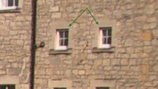
Having compared this image with another shot taken from the same angle, it seems that the building on the right has gained an extra window. Notice that when zoomed in, the added window (on the right) looks exactly like the real window (on the left).
Notice another thing - the editor has copied just a bit too much of the wall: there is a speck of black to the left of the cloned window that's been duplicated from the drainpipe.
3. Zoom in again
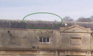
My find on Flickr shows me there's been another, more subtle change. Just above the bridge roof on the right, in the distance, there should be a church tower. It's missing from the doctored photo, and at high magnification you can just see the edit.
It must be noted, of course, that I shouldn't trust the Flickr photo either - it might have been edited too - but should find another image taken by someone else to double-check.
