Why you can trust TechRadar
Features
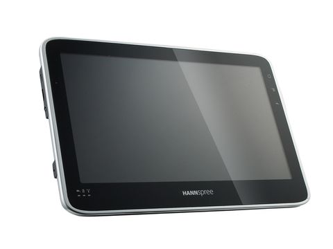
While we wouldn't want to peg the Hannspree Hannspad in with so many other tablets by saying it looks a bit like an iPad, it sort of does from the front.
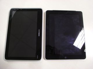
It's an all black glossy fascia, save for the silver screen surround. The screen can be quite reflective, and it picks up smudges hugely, though no worse than the Advent Vega.
The back is flat plastic. While this doesn't give it the rocking problems the iPad has, it also doesn't have the high-quality feel of Apple's aluminium case.
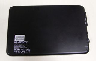
That's not to say it feels cheap. There is a bit of creaking around the joins at the edge of the screen when you apply pressure, but there's little give in the plastic back casing of the Hannspad, and it feels pretty durable.
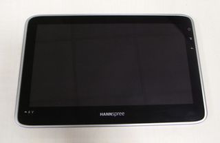
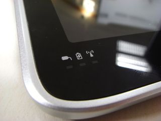
Going by the way the Hannspad has been laid out, it would appear that it's intended to be used in landscape mode primarily. The Hannspree logo sits along the bottom edge, with lights to indicate whether the unit is turned on, charging and accessing Wi-Fi in the bottom-left corner (although the Wi-Fi light never came on once on our unit).
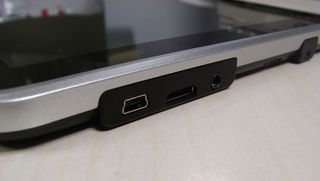
The left edge of the device houses the mains power connection, a 3.5mm headphone jack, the mini-USB port, the mini-HDMI connector and the microSD card slot. The latter of these isn't covered at all, which we weren't too keen on, though it is recessed so you'd be unlikely to unseat it by accident.
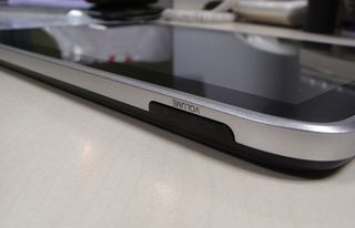
The top of the device houses an on/off/sleep button and volume controls.
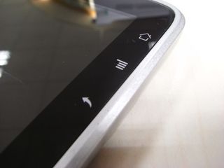
Along the right edge of the front Hannspad are touch-sensitive buttons for Home, Menu and Back. There's no search button, since it wouldn't be as useful without Google's services backing up the OS.
Yes, this is an Android tablet without Google's backing, so there's no Google Maps, no Gmail and, crucially, no Android Market.
Instead of all that, we've got the Tap UI. Rather than Android's usual plethora of Home screens and widgets, you're presented with some more reminiscent of Windows Phone 7, only not nearly as pretty.
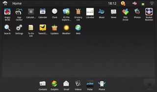
There's a screen with all of your apps on, while swiping to the side brings up a page with a couple of panes on that can house widget-like live updates. In practice, only a few of the preloaded system apps can do anything with this, but you can still have your calendar on there at a glance, as well as the weather and a few others.
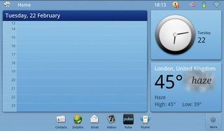
It's not totally bereft of usefulness, but it would need a fair bit of app support to become anything other than a novelty. It's also the buggiest part of the Tap UI, which we'll detail on the next page.
With the panes view not offering much, you'll mostly just spend your time going from app to app. Not that this needs to be a bad thing, of course; it's worked pretty well for the iPad so far.
Like Apple's tablet (and many others), you can move your most-used apps to a dock at the bottom, which is available on this apps screen or on the panes screen.
As we said, the Tap UI totally hides Android 2.2 and instead offers an interface that actually seems to have been incredibly carefully considered when it comes to tablet interaction.
It's all based on split screens, with new panels sliding into view as you select things, and split views where the two sides can be moved independently. Of course, it's the same additions that Apple added to iOS when it launched the iPad, and Android 3.0 is based on a similar premise.
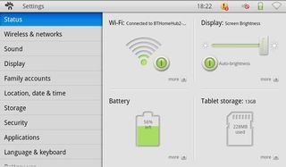
But it's reproduced so well here that we wonder something like the Samsung Galaxy Tab didn't get there first. Android is clearly a strong base, and when coupled with such a thoughtful custom UI, Android 3.0 almost seems unnecessary (that's a big 'almost', though).
The Android underlayer is still here. That means Flash support when browsing and claimed multitasking. In practice, there's no fast app switching, so you don't really feel like there's much multitasking going on when you're traipsing back to the Home screen every time.
One of the things that is familiar to both Tap UI and Android 3.0 is the ability to navigate without needing the physical buttons. The bar at the top of the HANNSpad's screen tells you what app you're in, and displays buttons to tap you to the Home screen, or to bring up the menu options or go back.
It's something the Advent Vega really could have done with, considering its total lack of physical buttons. On the Hannspad, it's less necessary, but it does mean that you can't hold the device the 'wrong way up', since you'll always have these buttons at the top of the screen.
One of the Tap UI's touted features is separate user accounts, but this was half-baked. It enabled us to create email inboxes and calendar events under a certain name, but it doesn't have separate logins for the tablet as a whole, or even in the browser that we could find.
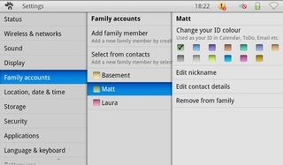
It's a nice idea, but half-hearted implementation gets it nowhere.
There are a few pre-loaded apps, but few are all that useful beyond the utilities such as the browser, mail client and media players.
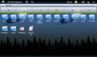
There are two apps that are really worth mentioning. The first is that a pretty comprehensive filesystem browser comes on the Hannspad, which may entice those who long for a bit of desktop organisation on their tablet. It has a Christmas theme for reasons we won't pretend to understand.
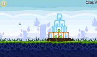
The other is that Angry Birds was loaded on our review unit. If you wanted to make us forget about not having the Android Market, Hannspree, this is totally the way to do it.
In fact, even the absence of the Android Market isn't that much of a hurdle. There's an App Center that includes plenty of paid and free apps to be getting on with.
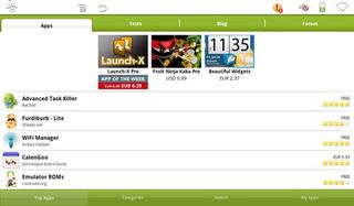
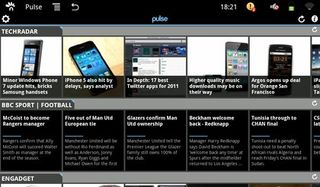
It even includes some pretty significant and slick apps, such as Pulse, the RSS reader.
However, social network support is light. TweetDeck is available, though we preferred Plume for Twitter use. Facebook apps are very thin on the ground. We hope the official apps could be brought on board.
The built-in media player is quite capable of playing back Full HD video clips, handling a variety of bitrates without a hiccup.
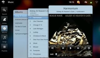
Music was also handled and sorted well. The interface really makes use of the screen space on offer, even if it isn't very pretty.
The little loudspeaker on the back doesn't exactly belt out the tunes, though it's not too bad for the occasional video.
Current page: Hannspree Hannspad: Features
Prev Page Hannspree Hannspad: Overview Next Page Hannspree Hannspad: Performance