Why you can trust TechRadar
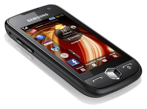
As mentioned above, the Samsung Jet S8000 uses an updated version of the TouchWiz 2.0 as well as adding in the new 3D cube system of selecting applications. We've seen a very similar thing from the likes of LG in the Arena, Viewty Smart GC900 and Crystal GD900 with the S-Class spinning cube and customisable home screens, and we weren't impressed by it then.
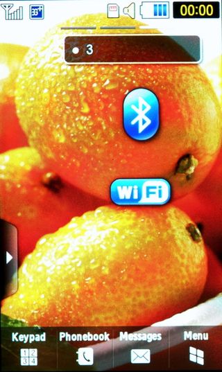
Samsung's reason for including its proprietary TouchWiz interface is apparently due to trying to keep costs down and make it affordable for consumers in these credit-crunched times. It's a strange strategy, as it makes it hard to work out where the company is trying to position the phone; at least with the likes of the Samsung Tocco Ultra Edition the style and form was top priority, which will appeal to a lot of people.
We were really looking forward to using a phone that has a less power-hungry interface coupled with an industry leading processor, and we were both impressed and disappointed in equal measure.
The great thing about Samsung is that it really listens to criticism and acts swiftly on it. There has been some ire at the low response of past touchscreens - the Jet S8000 allows much more accurate swiping when rolling up and down menus, for instance.
But there's still some way to go before this is perfected, and Samsung is still stuck in Division 2 when it comes to the touchscreen game, battling the likes of rival LGs and Nokia, while Apple, Palm and HTC are all giddily laughing in the top flight.
For instance, when you receive a text message or missed call on the home screen, it's nigh on impossible to press the 'view' button without missing a couple of times.
Similarly, when trying to scroll through names in the contacts menu, even though Samsung has provided a handle to drag through the different letters, we couldn't accurately hold this even after extended use, and was a real irritation.
Samsung was one of the pioneers of the widget-filled homescreen, and clearly has no intention of giving up on the idea with the new TouchWiz interface. The new home-screen system allows you to have three separate home screens, with each bringing new wallpaper and a full set of widgets to choose from when customising.
The latter is especially important, for if you want a screen for work and one for the weekend, then you may want to have the music player on both, but in previous iterations this wasn't possible.
However, it's easy to get a bit bored with most of the icons on the menu, as many of them don't lead to any good widgets, rather just links to mobile websites. Considering this idea is meant to be an alternative to 'proper' apps, it feels a little cheap.
Some of them are simply too big as well; we wanted a single home page that gave us instant access to Profile settings so we could whack the phone on silent in a heartbeat, but as the widget is so massive there's very little screen left to actually swipe on, meaning you end up throwing the widget all over the screen.
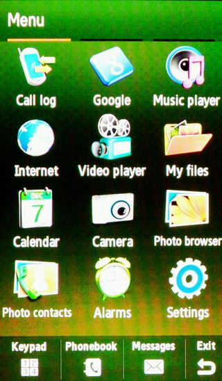
The menu system has been massively overhauled, with the Symbian style menu icons leading to another menu, leading to another menu and so on, all gone in favour of an iPhone-style layout.
In fact, it's just a little bit too iPhone-y, as we can't think of another reason why Samsung would take the 'Tools' group and explode them all over the menu - there's just no reason to see the Stopwatch, Timer, Converter and World Clock on there.
Swiping through the menu was also a little difficult one-handed, and as the screen is so busy you would sometimes find yourself wondering if you've actually switched displays, though the little orange indicator bar at the top was a little bit of help.
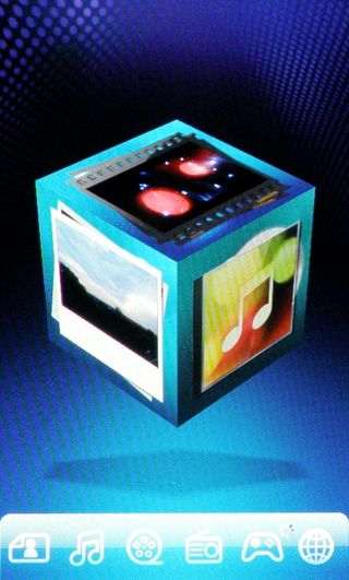
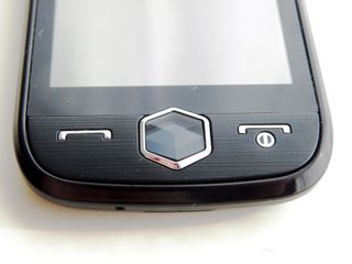
The cube, accessed by pressing the dedicated button next to the camera, is a nice touch, and shows off the processing power of the Samsung Jet S8000 nicely. Spinning the cube is a lot of fun, but ultimately a bit cumbersome when you're trying to get to the internet browser, and after pressing the button you have to wait around a second for the separate interface to load up - slick it is not.
There are buttons at the bottom that take you straight there, but it feels a bit deflating when you access the cube menu just to press a hot key. While we like the fact there's an innovative approach to accessing multimedia, it could have been better executed.
And there are other points where the processor seems to have up and left, leaving its wheezing understudy from an old Samsung D600 to take over. When scrolling through the photo list and browsing music by album cover (*cough*Coverflow*cough) the whole thing judders along badly. What is weird is that on other phones using the same(ish) UI, such as the Samsung i8910HD, which has less processing power, they manage the same tasks with much better speed.
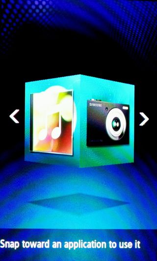
You can hold down the 3D cube key and enter MotionGate, which basically lets you select a pre-defined application by flicking the phone left and right. We would imaging the technology community will unite in declaring this a gimmick, something that looks and sounds cool, but then actually is an anti-climax once you get to it.
Similarly, unlocking the phone by drawing an icon (more on that later) is fun, but once entered the screen takes a second to unlock.
For a phone that's supposed to be so slick it can rival the speed of a superfast aeroplane (or a Jet, in case you didn't get the name) these things stick out like a sore thumb. A phone that doesn't have a super heavy interface and packs a whizz-bang processor should be infallible when it comes to speed of movement.
The Jet S8000 certainly has style and the interface in the AMOLED screen is bright and vibrant, but to position a phone as 'Smarter than Smartphone' and then to use the underpowered TouchWiz interface seems a little odd.
Current page: Samsung Jet: Interface
Prev Page Samsung Jet: overview, design and feel Next Page Samsung Jet: Calling and contacts
Gareth has been part of the consumer technology world in a career spanning three decades. He started life as a staff writer on the fledgling TechRadar, and has grown with the site (primarily as phones, tablets and wearables editor) until becoming Global Editor in Chief in 2018. Gareth has written over 4,000 articles for TechRadar, has contributed expert insight to a number of other publications, chaired panels on zeitgeist technologies, presented at the Gadget Show Live as well as representing the brand on TV and radio for multiple channels including Sky, BBC, ITV and Al-Jazeera. Passionate about fitness, he can bore anyone rigid about stress management, sleep tracking, heart rate variance as well as bemoaning something about the latest iPhone, Galaxy or OLED TV.
