Best alternative Linux desktops: 5 reviewed and rated
See how good your Linux desktop could be
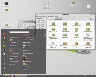
Cinnamon - 5/5

As you'd expect from a technology that was forked from Gnome 3, Cinnamon looks very similar. Shown here in its lesser-known Ubuntu habitat, it improves on the native Unity interface by having a system tray, which shows running apps and minimised windows, and keeping the toolbars at the top of the main application window, rather than using one global menu that changes depending on what app is in focus at the time.
Cinnamon also has a main menu in the bottom left of the screen, and while there is a search facility in there, your applications are still grouped in a menu structure, so you can choose for yourself whether to navigate the menus (useful if you can remember what something does but not what it's called) or type its name in the search box (useful only if you know what it's called).
It's also the shiniest of the desktops on test here, with some lovely transparency effects.
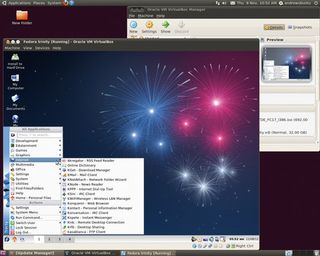
Trinity - 3/5

For our money, Trinity isn't as pretty as the others in this Roundup, but that's not where its strengths lie. It's clearly laid out, a new user can switch it on and know what to do instantly, and it doesn't overload your eyes with pointless effects.
Of the five desktops, Trinity presents the user with the most obvious ways of changing the default appearance. As always when you're given loads of themes and config options, there are many more ways of getting it wrong than there are of getting it right, but the default is to have a main application menu in the bottom-left, a system tray and virtual desktops along the bottom, and it all makes perfect sense.
For migrating Windows 7 users scared by the lack of a Start button in Windows 8, this is the most sensible choice of desktop.
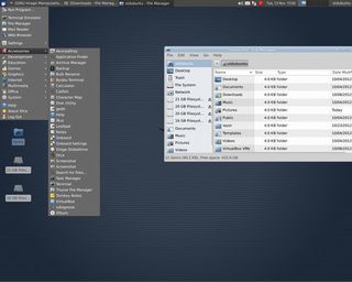
Xfce - 4/5

Before Mate became the low-fat alternative desktop for Gnome users, Xfce was the low-fat alternative desktop for Gnome users. The graphical environment is built with GTK 2, which is the same toolkit used by Gnome up until the release of Gnome 3. This has the massive advantage that all those applications that were developed for Gnome work seamlessley in Xfce, with no need to load extra libraries to clog things up.
For the user, everything makes just as much sense as Trinity, with a main application menu, system tray, virtual desktops, applets and a notification area all along the top of the screen. The icons are smaller, so are either harder to identify or are less cluttered, according to taste.
One criticism of the interface is that some of the menus are cluttered with near-duplicate entries, which makes them hard to navigate.
Razor-qt - 3/5

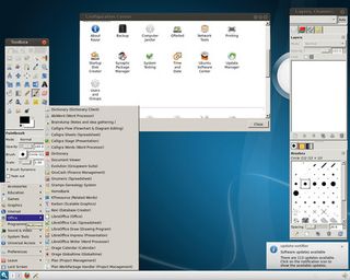
As Xfce is to Gnome, so Razor-qt is to KDE. That is, it uses the same libraries and follows the same behaviour that its heavier relative does, but it's a lot lighter and cleaner, and, by doing less, has less to confuse new users. You can see this KDE heritage in the default blue of the desktop, and in the widgets (Razor-qt uses the same graphical toolkit as KDE does; in this case, Qt).
Unfortunately, the look is a little rough around the edges - perhaps as a consequence of choosing the wrong window manager at install time (you're asked to make a decision between Xfwm and Metacity when you install Razor-qt, without being made aware of the significance of the choice - we chose Metacity). For a better-integrated look, it would make sense to go with KWin - so why give us the option of Metacity in the first place?
Documentation/support
The missing manuals are still out there, somewhere
Because they are intended as straightforward rewrites of old projects, Trinity and Mate are able to benefit from a huge amount of existing documentation. Even if you can't find the precise online HOWTO or FAQ that you need, the chances are that someone else will have asked exactly the same question in the many years of active development that Gnome 2 and KDE 3 had and will be able to point you in the right direction.
Get daily insight, inspiration and deals in your inbox
Get the hottest deals available in your inbox plus news, reviews, opinion, analysis and more from the TechRadar team.
